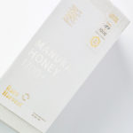
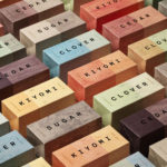
Rare Harvest by Marx Design
The True Honey Company (TTHC) dedicates itself to the production of mānuka honey, a monofloral variety produced in Australia and New Zealand from the nectar of the mānuka tree. It has a unique colour and texture and a high level of dietary Methyglyoxal, an organic compound with antibacterial and antiviral properties. With a price range starting at 60.00AUD and rising to 230.00AUD per jar,...
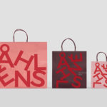
Åhléns by Happy FB
Åhléns began in 1899 as a small mail-order business. Aside from it being one of the oldest it has also grown to become one of the largest retail chains in Sweden. By carefully collating a variety of items across brands and price categories, the retailer maintains its relevance today, understanding and responding to the many ways in which its customers...
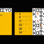
Kaiyo by Pentagram
Kaiyo, formerly Furnishare, is an online platform for the reselling and buying of used furniture, currently available in New York City and New Jersey, but with the intention to expand this internationally. Kaiyo picks up, inspects, cleans, photographs and uploads furniture to its online catalogue, easing the difficulties of selling secondhand online. It is part of a growing up-cycling movement,...
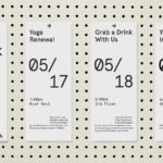
WeWork by Gretel
Founded in 2010 and headquartered in New York, WeWork began as a workspace provider and has grown to offer a broader infrastructure of community management and support, event programming and virtual network management for small and large businesses, entrepreneurs and freelancers. With significant and rapid growth WeWork worked with Gretel to align its visual identity with its purpose. “Framework”, a graphic route that...
TGC x Stenerhag by Carl Nas Associates
Tangent GC began as an organic garment and shoe care company developing products that intended to ensure longevity and entered the organic skincare market in 2016. Designed by Essen International TGC’s graphic identity, by way of a simple typographical expression, established a visual system of informational immediacy through the absence of superfluous stylistic detail and colour. This divided content and drew a...
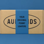
Aurlands by Heydays
Aurlands is the oldest running workshop for handcrafted shoes in Norway. It was founded in 1907 by shoemaker Nils G. Tveranger who, following time in America training as a shoemaker, went on to create the world’s first Penny Loafer in 1926. This, subsequently, became an enduring unisex fashion icon across Europe and America. Aurlands continues to build on this legacy,...
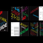
A’18 by Pentagram
AIA Conference on Architecture is an annual three-day event that explores what is new and now in architecture and design. In 2018 this took place between June 21st and 23rd at Manhattan’s Javits Center, a pioneering modernist space frame structure designed by architect James Ingo Freed. The event is made up of workshops, seminars and city tours across the five boroughs of New...
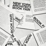
New York Architecture Book Fair by Pentagram
Storefront for Art and Architecture is an independent not-for-profit art and architecture organisation, located in New York’s Soho, dedicated to advancing architecture, art and design. To further this remit the organisation developed the New York Architecture Book Fair, an event and platform that brings together authors, designers, publishers, critics and readers to consider, through a programme of discussion, installation and pop-ups,...
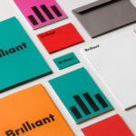
Brilliant by The Studio
Swedish employee engagement consultancy Netsurvey and Bright, experts in customer surveys, have been merged and rebranded as Brilliant by The Studio. This merger and rebranding intended to create a new platform capable of encapsulating the skills and corporate cultures of both companies and develop a visual expression that people from each could identify with and stand behind. In the same spirit as The Studio’s...
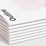
Outline by Studio South
Outline is a six lot freehold property development opportunity from Fearon Hay Architects located on Kings Road on the border of Mount Eden and Mount Roskill in a culturally and historically rich neighbourhood in Auckland. Each lot is 95m2 with the capacity to build four levels and include a roof living space totalling 300m2 of floor area. Studio South worked with Fearon Hay...
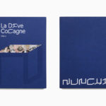
Nunchi by Bedow
Nunchi is an Italian startup and the vision of Cedric Naudon, a self-confessed gastronome. This follows his ambitious project to create an entirely new creative neighbourhood of restaurants, fashion boutiques and design stores in Le Marais, Paris. Nunchi intends to frame and connect all of Cedric Naudon’s gastronomic projects. The first of which is a reimagining of Edouard Nignon’s classic cookbook L’Heptameron des Gourmets,...

Unfolded by Commission
Unfolded is a design and print festival that celebrates the creative work happening across Europe in the disciplines of design, printing and brand communication. This was held by and at The Gmund Paper Factory in Germany on the 9th November 2018. The event created a space for sharing ideas and fostering dialogue between creative individuals, providers of printing services, brand...