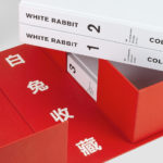
White Rabbit Collection by Toko
The White Rabbit Collection is a contemporary arts publication showcasing the work of 99 artists drawn from the White Rabbit, a contemporary art museum, gallery and archive in Sydney. The museum has become one of the world’s most significant collections of Chinese contemporary art, with over 2000 works from 700 artists. Through this new publication, designed by Australia design studio Toko...
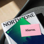
Northzone by Ragged Edge
Northzone is an early stage venture capital fund with the insight necessary to cut through the hype of funding and recognise strong teams doing good work. From their offices in London, Stockholm and New York they partner with founders at Seed, Series A and Series B stage across Europe and America. London-based Ragged Edge worked with Northzone to create a brand identity that would...

Erik Berglin: The Bird Project by Lundgren+Lindqvist
Erik Berglin is Stockholm-based contemporary artist. His work is flows from his understanding that some people find the art gallery uninviting and uncomfortable, and the artworks displayed as requiring insight to really appreciate. He himself has said that he dislikes 90% of the exhibitions he visits but adores the 10%. This clearly informs his work, which often brings the unexpected into...
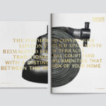
Brigade Court by Jack Renwick Studio
In The London Borough of Southwark sits the Grade II listed building and former headquarters of the London Fire Brigade, the city’s first fire station and a site currently under development. This will see it transformed into residential apartments with period conversations of the original Victorian building alongside a modern new-build. It is a one-of-kind property development that offers a...
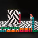
Inside Lottozero by Studio Mut
Inside Lottozero was an exhibition of international artists that covered a wide-range of artistic disciplines. It was conceived by Arianna and Tessa Moroder and curated by Alessandra Tempesti. The exhibition took place at Lottozero / textile laboratories in Toscana, Italy and ran until November 20th, 2016. Under the concept of “Non-stop Fruition”, the exhibition opened with a 12 hour overnight event in...
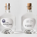
Monachus Distillery by Bedow
Atop of Croatia’s Istria peninsula, just where the land slips into the Adriatic sea sits the tiny small-batch gin distillery of Monachus. Stone shores, botanical covered hillsides, the smell of pine and scattered pin cones characterises the landscape. Drawing on this, the natural history of Istria and the name Monachus, borrowed from Monachus Monachus an endangered Mediterranean monk seal, Swedish design studio Bedow created a...
Leandro Erlich: Both Sides Now by Studio fnt
Both Sides Now, a title borrowed from Joni Mitchell’s famous song, is a solo exhibition of Argentinian contemporary artist Leandro Erlich’s work that took place at the Seoul Museum of Art between December 2019 and March 2020. Erlich’s installations, often receiving international acclaim, mirrors, reflective surfaces, water and other various materials to create optical illusions to transform familiar, everyday spaces such as...

Tangent GC Organic Detergents by Carl Nas Associates
Tangent GC began as a Scandinavian organic garment and shoe care company developing products that intended to increase the life of clothing and footwear, and entered the organic skincare market in 2016. The longevity of skin being an understandable extension of that original intention. The company’s graphic identity, a typographical system designed by Essen International under the creative direction of Carl Nas, established...
Vessel Floats by Order
In the Brooklyn neighbourhood of Greenpoint sits Vessel Floats, a new flotation and deprivation therapy spa that draws on the continuing interest in concepts such as mindful living and wellness. Through considered interior design and visual identity, the latter developed by New York-based studio Order, Vessel Floats intends to further develop and bring to modernity an experience that has been around...
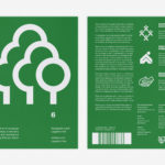
LogoArchive Issue 6
LogoArchive was conceived, designed and sent to print in a day. It was inspired by a panel discussion at Somerset House as part of the exhibition Print! Now on to its sixth numbered release, LogoArchive continues to reconfigure itself with each new issue with the intention of surprising and delighting, particularly at a moment of intentional difficulty. This issue, launched...

Queremos Sonreír by Mucho
Queremos Sonreír – Activar la Cultura Local (We want to smile – Activating local culture) brings together the voices of a variety of cultural agents–from citizen collectives and activists to artists and managers of cultural programmes–who are generating actions that intend to stimulate local culture, empower citizens, develop learning processes and further critical thinking. Through these voices the book explores questions around citizen...
Northstar Film Alliance by Bond
North Star Film Alliance (NSFA) is a joint venture between Estonia, Latvia and Finland. The Alliance intends to develop and promote themselves as one filmmaking region to international film and TV productions. It is a competitive marketplace, with other countries provide low tax rates and incentives to film big-budget spectacles on their stages using local crews. Together, the three countries...