Forest Carbon by Design Bridge Singapore
Despite the perennially frustrating widespread perception that the definition of branding is a logo (maybe a wordmark, at a push, a colour a la Cadbury’s purple or EasyJet orange ), it’s more obvious than ever as we settle into the screen-centric Digital Age that ‘brand’ is a vast and expansive thing – it’s verbal and visual and sonic, it moves...
Fhirst by Mother Design
We’ve arrived at a point where the idea of ‘y2k’ as an aesthetic has stretched beyond ‘trend’ or ‘cycle’ and morphed into an entity almost entirely devoid of the temporal placemarker its name suggests. Having been repeated ad nauseum, ‘y2k’ is no longer about a visual/cultural moment and/or collection of moments around 25 years back. Instead, it’s become a Burroughs...
OSESP by Polar
When São Paulo-based studio Polar was tasked with rebranding one of Brazil’s most important cultural institutions – the Orquestra Sinfônica do Estado de São Paulo (São Paulo Symphony Orchestra), better known as OSESP – its solution was an identity system that doesn’t just depict classical music but actively embody it. OSESP’s previous identity had served it well, with its 2003-2007...
Dark Arts Coffee by NOT Wieden+Kennedy
If a brand that fuses memes, hot takes, occultism, and coffee is going to succeed anywhere, it’s probably in east London. Dark Arts Coffee started out in 2014 in a Homerton railway arch, and managed to corner that distinct subgenre of goth/metal/biker-ish aesthetics which opts for craft ale over snakebite; Hackney over Camden; self-care over self-destruction. Where the old guard,...
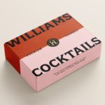
Williams Cocktails by Offff
In the last five years, canned cocktails have become ubiquitous, with offerings from MOTH: (packaging by Pentagram) and Whitebox (cans created in-house) among the strongest designs competing on the shelves of off-licenses, delis and bottle shops. Convenience and a post-pandemic demand for ‘on-the-go’ experiences have helped drive this trend, with Mintel data demonstrating that sales of spirit-based ready-to-drink beverages increased...
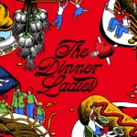
The Dinner Ladies by Universal Favourite
‘Dinner ladies’ doesn’t have the most glamorous connotations in England – depending on your experience at school, it likely conjures up memories of scoops of greying, tepid mash-adjacent slop unceremoniously plopped onto a plate; something to do with turkey dinosaurs; a troop of formidable but visibly jaded people responsible for making every school smell like on-the-turn cottage pie from around...
House of Reptile by Studio Gruhl
It’s not often that BP&O covers record label design. Unlike sectors such as fintech or FMCG, record labels naturally lend themselves to the more creative side of design and branding – they have far more niche audiences, and usually don’t have to work as hard as something aimed at the supermarket shelf to stand out or appeal to mass audiences....
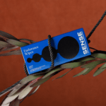
Sense by Buck
Since the pandemic, sexual wellness offerings have carved out a space on the shelves of beauty and pharmaceutical retailers, from Sephora to CVS in the US, and even Boots in the UK (founded 1849). According to business insight platform Crunchbase, that’s thanks to ‘an increased cultural shift that embraced sexual pleasure as a crucial component of physical and mental health’....
Ashton by LG2
For the rest of the world, Canada is synonymous with a few things – maple syrup; Celine Dion; wholesome, generally nice people; Neil Young; and when it comes to the realm of food, poutine (fries with cheese curds and gravy, for the uninitiated). Having opened back in 1969, Ashton is the oldest poutine chain in Canada. With 23 branches in...

Public Pool by Perky Bros
Suburban pool party culture is rather alien to us in the UK, where only the exceptionally wealthy have pools, and we muddle along in a climate that defaults to ‘grey, fair to middling’ most of the year. But we’re becoming a little more attuned to the joys of an open air funsplash: over the past few years we’ve seen the...

Tigre by Triboro
LES Tigre – not to be confused with seminal electroclash/riot grrrl combo Le Tigre – is a cocktail lounge in Manhattan’s Lower East Side area, which opened at the end of last year and apparently combines ‘sophistication and refinement in drink, sound and ambiance’ with an entrance that boasts ‘an original graffiti-worn door’. So far, so hip, amirite? It all...
Dirty Vegan by Jens Nilsson
Having been a vegan for almost 20 years now, various tropes have come and gone. In the early days, for the health conscious it was pretty much all about brown paper packaged Holland and Barrett goods, and references to the Young Ones cooking lentils. For the not so health conscious (hello!) it was ketchup sandwiches. Gradually the Quorn contingent came...