Kettle Kids by Two Times Elliott
The once laudable claim to have started a thriving business with ‘a small loan’ from a doting family member may have been muddied beyond recognition by the truth-stretching of serial tax-offender and part-time Presidential candidate Donald Trump. Despite this, turning ‘one thousand pounds from nan’ into a luxury watch and diamond dealership with a sparkling flagship store in Mayfair remains...
Black Bee Honey by OMSE
It was yesterday I made a run to the local supermarket to pick up some essentials. I had two choices, turn left to Waitrose or right to Morrisons. Despite being somewhat price conscious, I enjoy looking at the packaging at the higher-priced Waitrose, so went left–let’s say it’s the cost of being a designer. Anyway, honey was on the list....
Hometree by How&How
It’s all well and good for a design agency to make some wild, boundary-pushing, all-singing all-dancing work for things like Gen Z healthcare products; or ‘top shelf’ spirits; or craft beer. But most client projects aren’t going to be the sort of thing that merits bright orange and typography that dances around the boundaries of legibility. And arguably, it’s those...

Wholesome by Universal Favourite
Wholesome is a new breed of supermarket that doesn’t fill a gap in a market so much as it positions itself at a nexus of multiple intersecting demands. The pursuit of ethical grocery and household shopping has, for decades, been both deeply commendable and exasperatingly time-consuming, expensive and convoluted. One supermarket will stock Fairtrade products but have a scant gluten-free...
Expensify by The Collected Works
According to The Collected Works, one of the main reasons its recent client Expensify was looking to rebrand was to remedy a perceived mismatch between the ‘wacky’ vibe of the brand’s marketing and ads (namely its 2019 Superbowl commercial), and its core visual identity. Which begs the question – how far does a brand identity itself have to mimic or...
Recchiuti by Manual
Recchiuti Confections is a San Francisco-based gourmet chocolatier that creates chocolates with unique flavour combinations. Using traditional European techniques, with locally sourced ingredients from Northern Californian farms and markets, Recchiuti’s chocolates have earned a loyal customer base and several accolades. After 25 years in business, Recchiuti sought the expertise of Manual – a local design studio – for a brand...

Erbert by AUGE
Few countries on Earth take their food as seriously as Italy. It’s not difficult to justify the enormous pride Italians take in their spectacular culinary heritage, with their cuisine considered the ‘most exported’ on the planet. But while the wider world is undeniably in thrall, Italians’ patriotic palettes create and necessitate a notoriously conservative domestic cooking culture. Italian ingredients, recipes...
Monkey Baa Theatre Co. by Universal Favourite
Theatre is an artform that relies not only on its visual and verbal performance elements, but the text from which all the rest of the more showy aspects are born. An obvious point, but one that often makes me wonder: why do so many theatre companies have such terrible names? Maybe it’s a sort of in-joke, maybe I’m just missing...
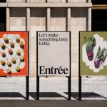
Entrée by Saint Urbain
More than three years since the outbreak of the Covid pandemic, we’re in a strange situation when it comes to all the things that flourished due to lockdown – grocery delivery services like Getir, et al; streaming services that poured literally billions into what once seemed like a never-ending gold-rush of content-consumption; flashy home-centric lifestyle brands like Peloton. Indeed, the...

Loot by Seachange
Where have all the simple playful ideas gone? You know the ones, a bit of wit, spun into a multitude of playful expressions across a number of different touch-points? Design craft has gotten so good over the last few years, but I miss the smile-in-the-mind stuff. Paul Belford’s New Chapter, Seachange’s Think Packaging and Mucho’s Art Walk. They’re not strategic...
Natural History Museum by Pentagram & Nomad
If you grew up in the UK, the Natural History Museum is likely synonymous with two things: the massive blue whale suspended from the ceiling, or the equally large diplodocus skeleton. For many British kids, the museum is a childhood staple – either from school trips, or days out with parents who, rather savvily, combine a widespread fascination among youngsters...
Florentia Village by DNCO
On first hearing, ‘Florentia Village’ is a ridiculous name for a warehouse complex in South Tottenham, as if Hyacinth Bouquet had somehow risen from the grave and gained a seat on the borough council in order to render floridly Italianate a grimy chunk of East London. However, the name does in fact arise from an organic nomenclatural etymology: indicating ‘flourishing’ or...