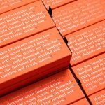
Hidden Characters by RE
Hidden Characters is the latest PR offering from international advertising agency network M&CSaatchi. It replaces/is an evolution of Bang PR, developed in response to the changing public relations landscape. With the advent of social media and the subsequent growth of non-traditional influencers and an increase in inauthentic product placement, Hidden Characters intends to make sure that their client’s reach is handled in an ethical and authentic...
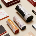
DOIY by Folch
DOIY is product design company creating playful objects that move between the useful and the more whimsical. These include items such as icepop socks, bicycle pizza slicer and unicorn scent. Much of this is firmly tongue-in-cheek but good quality, retailing in high-end and design-focused stores as well as larger chains. With the introduction of materials such as ceramics, woods, metal and porcelain across its new ranges,...
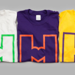
Helsinki City Museum by Werklig
Helsinki City Museum, through its collection of objects and images, provides visitors with historical insight into the everyday lives and personal experiences of the people of Helsinki. It is free to enter and features 2400 sqm of exhibitions and public spaces, a cafe, inner courtyard, areas to relax and conference rooms. To coincide with a move to a new space;...
Terri Timely by Bedow
Terri Timely is a Californian directing duo creating short films, music videos and commercials. Although they collaborate with a variety of clients; these include Mitsubishi, Amazon and Comcast, much of the duo’s work share a quirky and humorous visual style. This is expressed by their new brand identity, developed by Swedish graphic design studio Bedow, through a simple but playful visual style and animation...
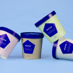
Mister by Brief
Mister crafts all natural, artisanal and seasonal ice cream from its location on Mainland Street, Vancouver, using a liquid nitrogen technique that rapidly freezes products to create less ice crystals and air compared to traditional ice creams. This gives Mister’s ice cream a richer, creamier and denser quality that does not require stabilisers or fillers. Mister worked with local graphic design studio Brief to develop a...
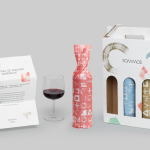
Sommos by Mucho
Summos is an online platform that gathers together and shares the knowledge of the six best sommeliers of the Netherlands and offers a seasonal subscription service that sends out a selection of some of the country’s best wines once every two months. Sommos worked with graphic design studio Mucho to develop name, brand identity and packaging. Based around the concept of group and innovation, and clearly informed...
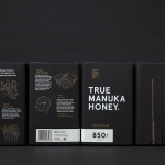
The True Honey Co. by Marx Design
The True Honey Company (TTHC) dedicates itself to the production of mānuka honey, a monofloral variety produced in Australia and New Zealand from the nectar of the mānuka tree. It has a unique colour and texture, and a high level of Dietary Methyglyoxal, an organic compound with antibacterial and antiviral properties. With a price range starting at 60.00AUD and rising to 230.00AUD per jar,...
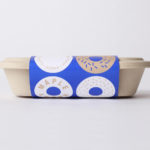
Happy Maple by Garbett
Happy Maple is a Adelaide-based bakery dedicated to producing small batch 100% vegan donuts, baked not fried, made from gluten, tree nut and peanut free recipes. Orders are by phone, e-mail or through their pop-up stores. There is no website, just a social media presence with lots of donut images, a personable approach to communication, and a cheerful brand identity created by...
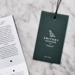
Smithey Ironware Company by Stitch
Smithey is an ironworks producing kitchenware from its location in Charleston, South Carolina. Smithey’s first product, a 10 inch skillet, features a smooth, non-stick cooking surface, created using a handcrafted method of finishing and polishing. This process was developed in response to the rough, coarse and sandpaper-like finish that proliferates the ironware market, which creates an uneven surface temperature, makes it...
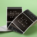
Hermoso Cariño by La Tortillería
Hermoso Cariño, a name taken from the title of a Mexican love song, is a gift shop with unique line of products. These are described as Mexican in the least expected way, leaning more towards the contemporary, but not forgetting tradition, and crafted by a new generation of designers. This is expressed throughout Hermoso Cariño’s brand identity, created by La Tortillería, through a mix of type,...
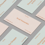
LeMise by DIA
LeMise is a Brooklyn based art and design advisory business, established by Andi Potamkin, described as being guided by the concept of mise-en-scene. LeMise considers the environment as a whole and works with its clients to bring together works of art and design, drawn from a vast network of designers and artists, to enhance space. New York graphic design studio DIA worked with Andi to develop...
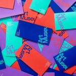
Art Museum by Underline Studio
Art Museum unites the Justina M. Barnicke Gallery and the University of Toronto Art Centre as one new institution dedicated to exhibition and education. It is one of the largest gallery spaces for the visual arts in Toronto and is housed within an iconic gothic-style building. The museum worked with Canadian graphic design studio Underline to develop a new visual identity system that...