Rolus by Re
Back in the early 00s – the era when arguably Hollyoaks was at its zenith, and bellybutton piercings their most bejeweled – Botox was gradually emerging from the hushed clinics of Harley Street and LA to become part of common parlance. As such, brands cottoned on to the word’s ‘eternal youth’ connotations: I distinctly remember a shampoo ad promising that...
TwelveLabs by Pentagram
Remember when the conversation around gradients was about making ‘bad’ design look ‘better’? When RGB colours were frowned upon because you couldn’t print them? Yeah, those ideas feel a bit outdated now. HP Indigo can now run fluorescents affordably, and business card mock-ups (in RGB) are more about selling than printing. Technology marches on, expectations and standards evolve, and everything...
Suupaa by A Friend of Mine
There isn’t a shortage of well-executed, interesting branding projects out there – ones that are joyful, witty, slick, or just perfectly fit a brief – which do their job perfectly. But 99% of the time, you can sort of see where they came from – the broader cultural spheres they’re playing into (nostalgia; fauxstalgia; irony, for instance) or the wider...
North Road by Manual
Independent content studio North Road was founded in 2022 to unite a portfolio of companies covering everything from scripted entertainment (‘Chernin Entertainment’) and non-scripted content (‘Kinetic Content’) to non-fiction productions (under ‘Words + Pictures’). Across these entities, North Road is one of the largest global suppliers of TV and film content, and is able to work on over 70 active...
Chester Zoo by How&How
I’d lazily assumed that, like jazz record sleeves and Dutch public transport, zoos were one of those sectors with a visual legacy that’s packed with game-changing brand design – the sort that fills the pages of graphic design histories, up there with the likes of Paul Rand’s ‘IBM’ and the FedEx arrow and Alan Fletcher’s gloriously clever ampersand trickery for...
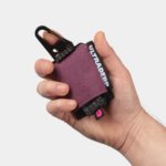
Ultraderp by Mucho
The name Ultraderp seeks to combine all things extreme (think ‘ultrafast’, or ‘ultra marathon’) with ‘derp’, which is, apparently, the face a dog makes when they don’t know what’s happening. The product that bears this name is an ultra-light, easily-packable dog leash that can be worn on the collar and deployed when needed, simply by pulling the tongue-like tab. This...
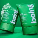
being by Zuru Edge
What does Gen Z really want? It’s the question at the heart of a thousand nigh-on identical think pieces; and at the fulcrum, it seems, of endless board meetings chaired by Gen Xers, and populated by ‘geriatric Millennials’, like me. My generation was simple. We wanted avocados, didn’t we? We wanted everything to be in millennial pink and to have...
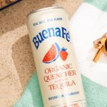
Buena Fé by Saint Urbain
Buena Fé is the first 100% organic tequila-based cocktail-in-a-can, and is made in Jalisco, Mexico, the ‘birthplace of tequila’, where the spirit was first distilled. The drink is made with 100% Blue Weber Blanco tequila, which means that all the alcohol in Buena Fé comes from the agave plant. Unlike your short Margarita, or shortish Paloma, these ready-to-drink cocktails are...

Tameko by DutchScot
Founded by Dominika Leveau and Chim Sonne-Schmidt in 2021, textile brand Tameko feels thoroughly ‘Scandi’ in aesthetics and ethos – it’s all clean lines, a singularly restrained stance on beauty. It’s form following function. Tameko embodies that very contemporary take on the luxury sensibility that never shouts about its status. It doesn’t need to: luxe quietly but confidently oozes from...
Hanbury by Base Design
Hanbury is an American architecture firm, founded in 1979 and based in Virginia. According to international agency Base Design, which recently delivered a rebrand for the practice, the last decade has witnessed a ‘transformative’ period of growth and diversification with the team increasing from 40 to 160 individuals, and expanding from one to eight office spaces. For Hanbury, which started...
Lunge by Porto Rocha
With trend-forecasting agency WGSN identifying ‘multi-species homes’ as one of the ‘top trends of 2024’, the global market for pet products is project to hit £28.75 billion by 2025 – and this excludes the food category. Even furniture design is increasingly influenced by the penchants of our four-legged friends. Catering to this pet-first design movement, Liberty London, Prada, Louis Vuitton...
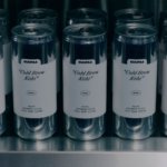
Matheson Food Company by Wedge
If nostalgia is a powerful force, arguably ‘fauxstalgia’ – that sense of longing and yearning for something that we never actually experienced – is even more so. Fauxstalgia isn’t the same as trend cycles – the baffling realisation that Gen Z is suddenly, unironically, into Nu Metal, for instance – it’s an internal sensation rather than an external observation. It’s...