The Best of BP&O — Packaging of 2015
Opinion by Richard Baird Posted 28 December 2015

2015’s package design highlights included O/O Brewing by Lundgren+Lindqvist, Round’s work for Loving Earth and Robot Food’s collaborations with Costèllo + Hellerstein and Naughty But Rice. However, there were five projects that stood out, and have made it into BP&O’s Best Of Series. This feature brings together the most interesting, unexpected or unusual projects published on the site during 2015 for another opportunity to be seen and shared. These balance a strong and appropriate concept with a compelling aesthetic that plays with image, colour, texture, layout, form, type and print finish.

Room Essentials by Collins, United States
Room Essentials is a line of modernist home furnishings created and sold by American retailer Target. The range covers over 2,000 products across 60 categories, and includes items such as blankets, lighting, chairs, tables and tableware.
While securing significant revenue for the retailer, the range has, over the last five years, experienced a downturn in sales generated by its Millennial demographic. With this in mind, and with the intention of recapturing the enthusiasm for and interest in the range, Target commissioned New York based Collins to reimagine Room Essential’s brand identity and packaging system.
See more of this project here


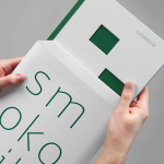
Springs’ Smokery by Distil, United Kingdom
Springs’ Smokery has been producing high quality smoked salmon for three generations from its location in South Downs, UK, using Sussex oak and a traditional dry-salting process which has remained unchanged for 50 years. Springs’ worked with graphic design studio Distil to develop a new visual identity and package design. Distil’s treatment is an exercise in aesthetic impact derived from colour and form contrast, and a conceptual and communicative simplicity that makes a connection with the traditional craft and process of smoking salmon but also draws on the themes of heritage and the sea.
See more of this project here

Second Hand Orchestra by Bedow, Sweden
Second Hand Orchestra is a collection of tracks recorded for a documentary that was unfortunately and abruptly cancelled. Rather than let the work fall by the wayside, band leader Karl-Jonas Winqvist has released these as a limited edition album of 300 LPs. These feature a visual identity and packaging design of custom typography, individually numbered and block foiled sleeves, and screen printed t-shirts created by Stockholm based graphic design studio Bedow and bound by the concept of repurposing.
See more of this project here

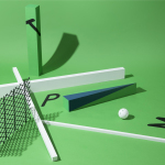
Vocation Brewery by Robot Food, United Kingdom
Vocation is a UK microbrewery, established and run by John Hickling, with a range of craft beers that have distinctive and punchy flavour profiles, and an identity, package design treatment and naming convention, developed by Leeds based graphic design studio Robot Food, that draws on their tropical, fruity, floral and hoppy characteristics, and the brewery’s fearless, daring and renegade attitude. The project also went on to include a limited edition Chocolate Stout for Christmas with a more festive twist.
Read more of this article here

The Bone Line by Inhouse, New Zealand
The Bone Line is a New Zealand winery with a name that references the K—T Boundary, a thin band that runs close to The Bone Line’s location in the Waipara Valley, and that marks the end of the Mesozoic Era and the extinction of the dinosaurs.
Auckland based graphic design studio Inhouse worked with the winery to establish a distinctive packaging and identity treatment. Like many good wine label solutions, Inhouse have taken its cues from the provenance of the wine. While conventional, this approach benefits from a significant regional prehistory that ties in well with the themes of age and vintage, and is effectively visualised through a contrast of type reduction and the detailed texture of fossil photography, and a black, white and copper colour palette.
Read more of this article here