BP&O Collections — Blue In Branding
Opinion by Richard Baird Posted 28 March 2017
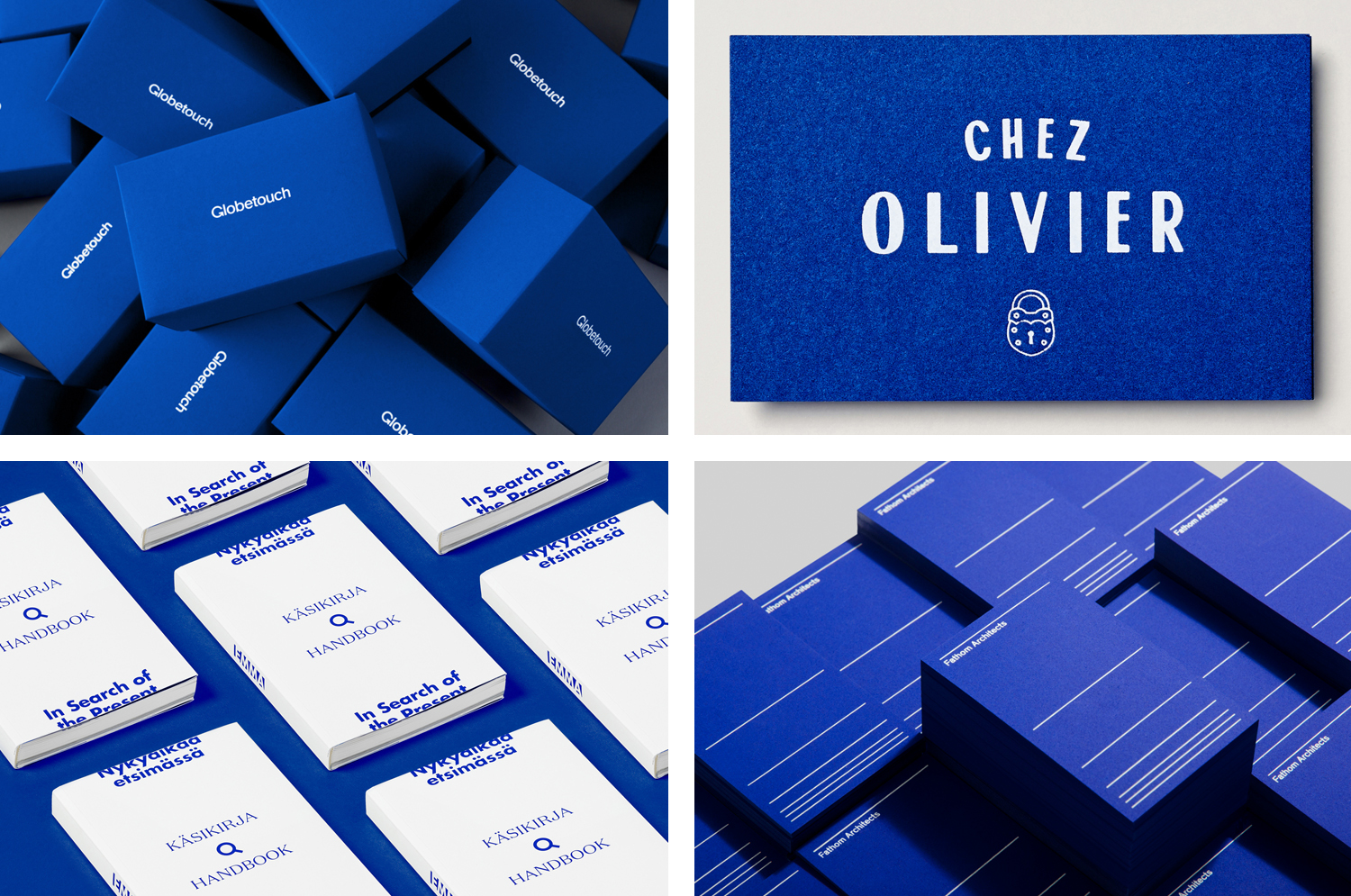
A collection of some of the very best brand identity and graphic design projects that effectively utilise blue, reviewed and published on BP&O. This post features work by Bunch, Swear Words and Werklig, and covers simple logo and stationery projects, and extends to broader brand identity programmes that include packaging and a variety of print communications. These play with large areas of blue, blue as highlight and contrast, and include four-colour blues, spot colours, dyed papers and boards. Be sure to click the images to read more about the project and the intentions of each design. Check out more from BP&O Collections here.
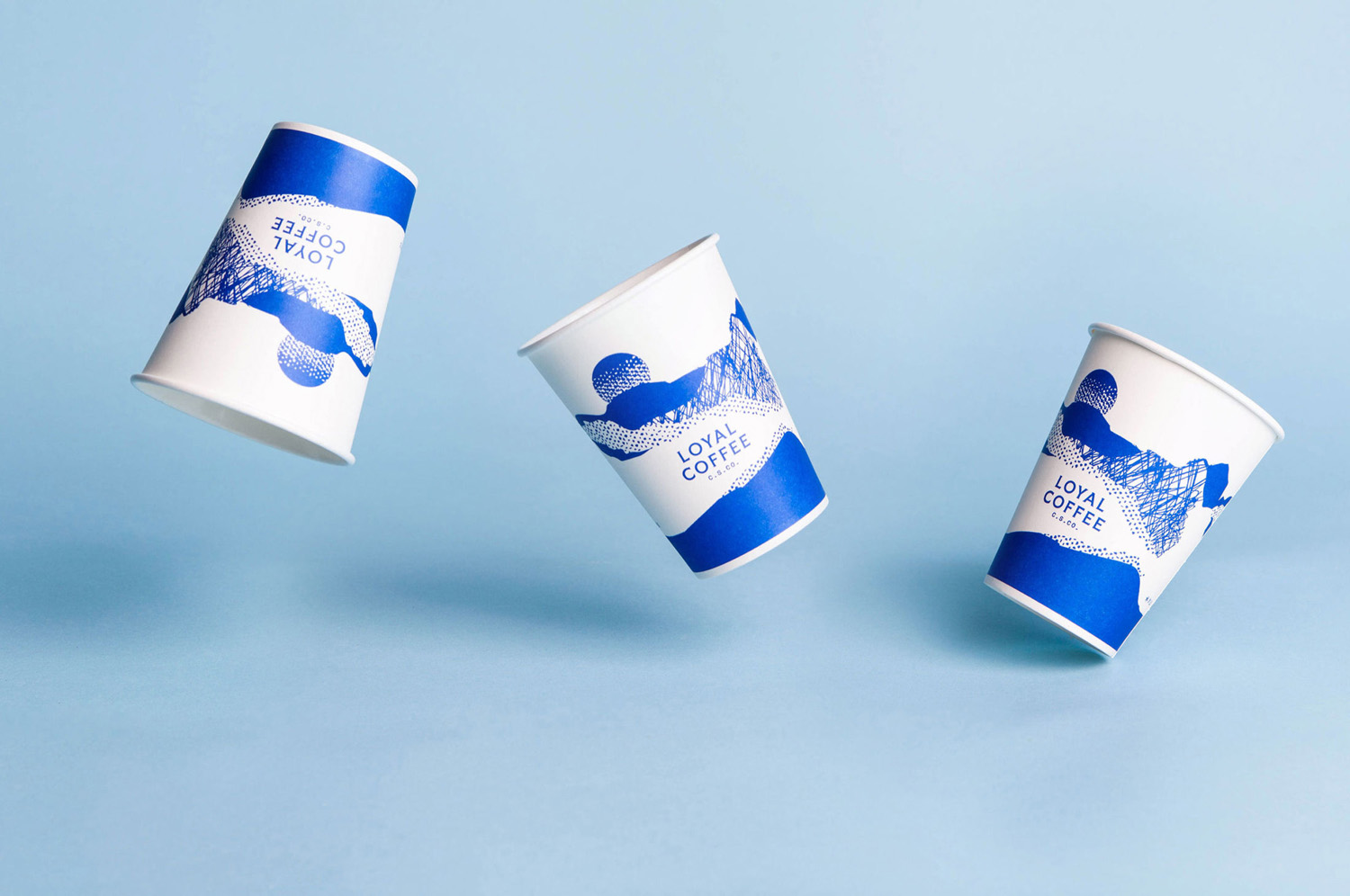
Loyal Coffee by Mast, United States
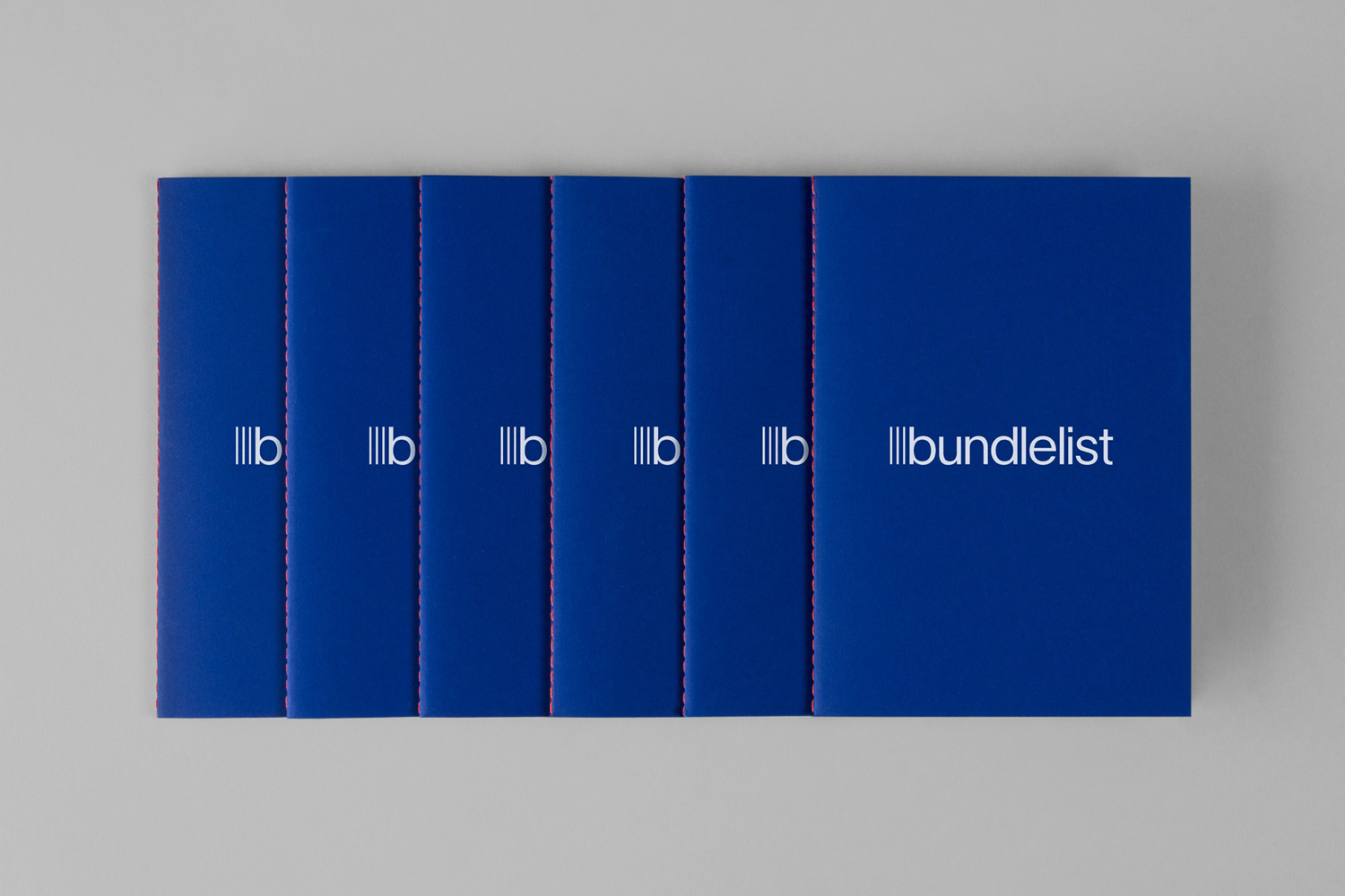
Bundlelist by Bunch, United Kingdom
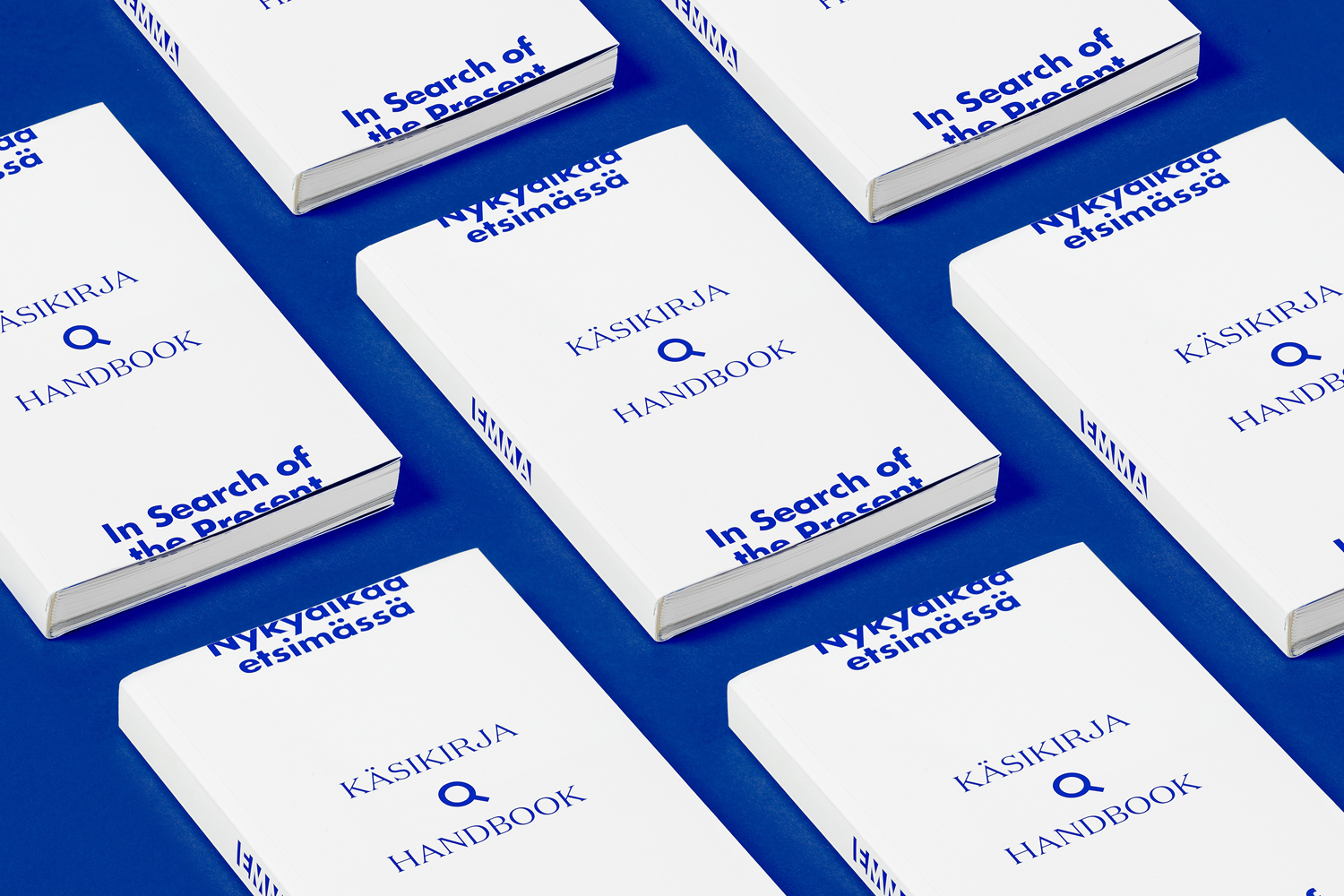
In Search Of The Present at EMMA by Werklig, Finland
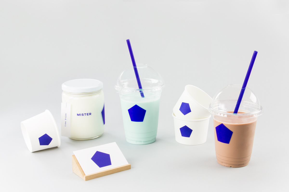
Mister by Brief, Canada
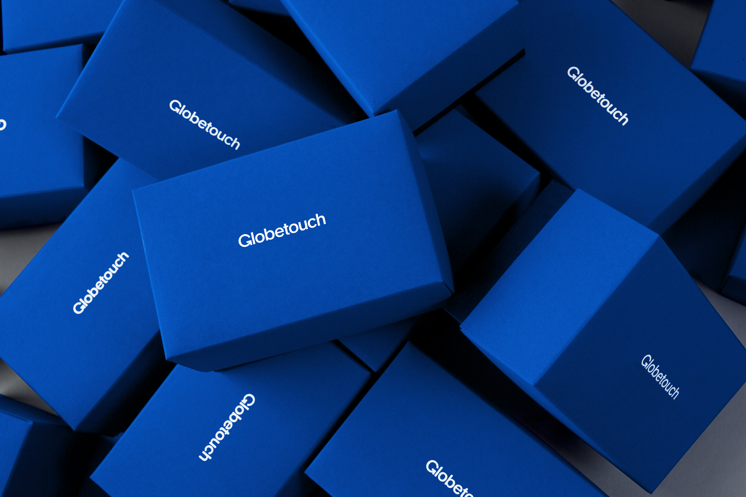
Globetouch by Bunch, United Kingdom
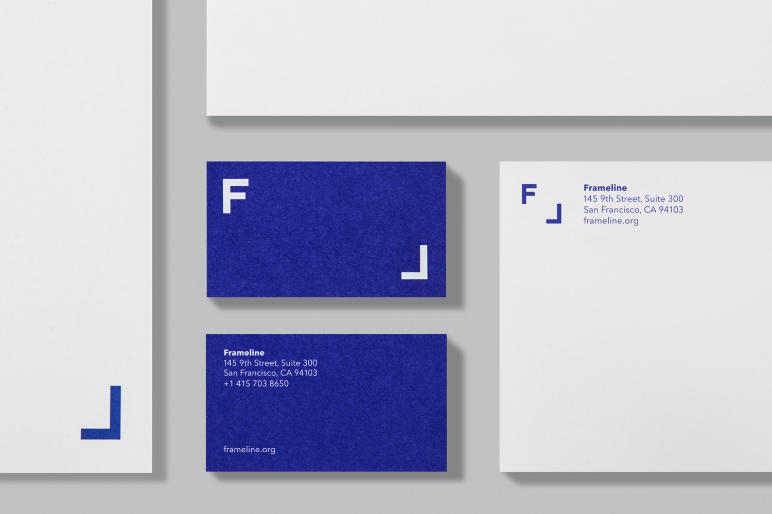
Frameline by Mucho, United States
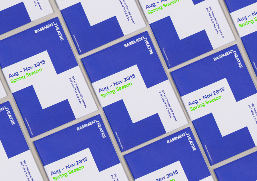
Basement Theatre by Studio Alexander, New Zealand
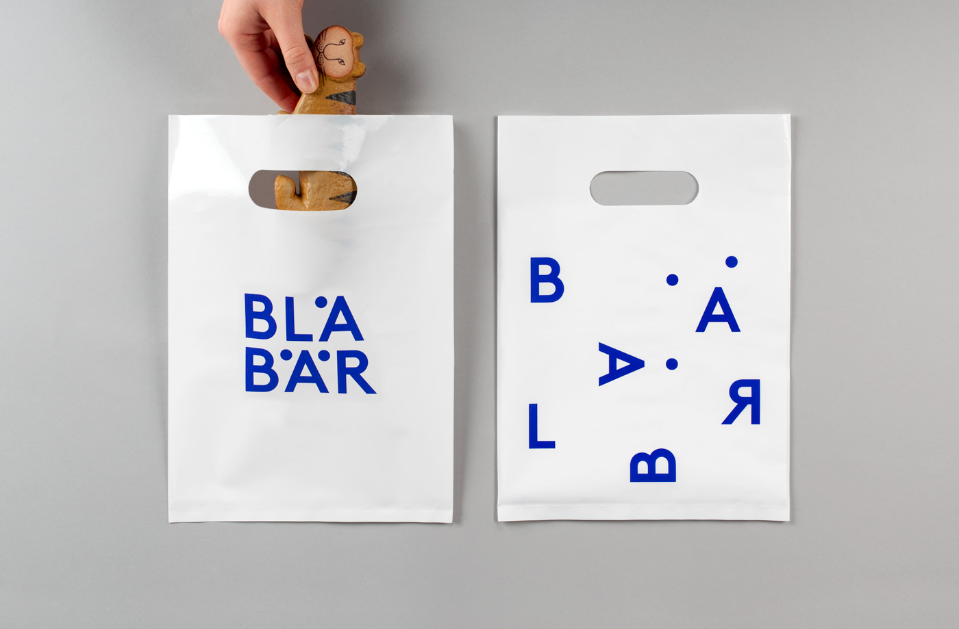
Blå Bär by BVD, Sweden
Haydn & Rollett by Richards Partners, New Zealand
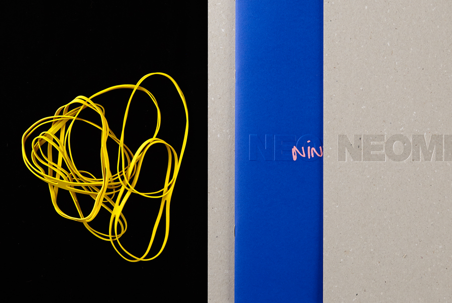
Neometro & Nine Smith Street by Studio Hi Ho, Australia
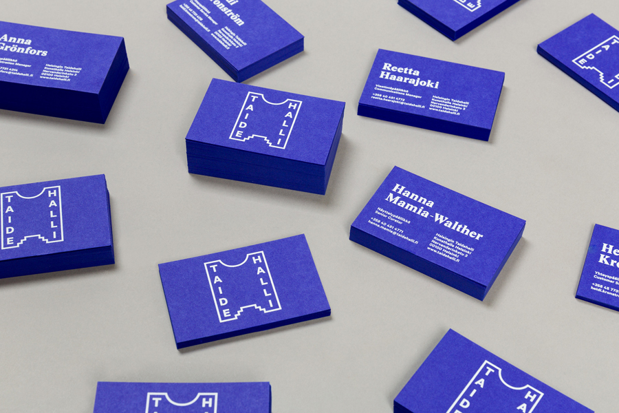
Taidehalli by Tsto, Finland
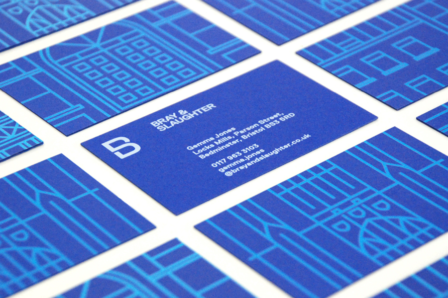
Bray & Slaughter by Mytton Williams, United Kingdom
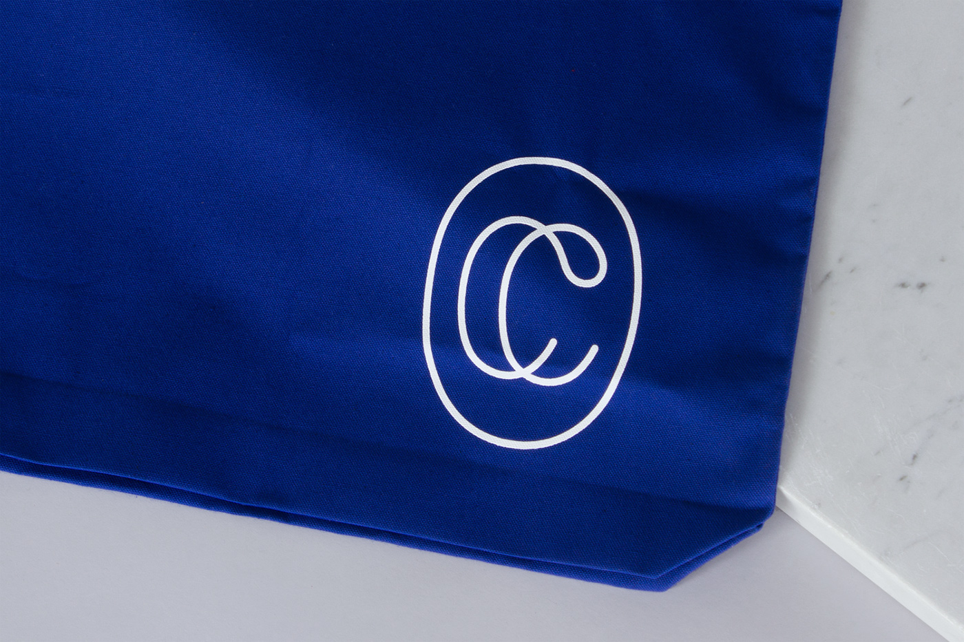
Collected Coffee by Fivethousand Fingers, Canada
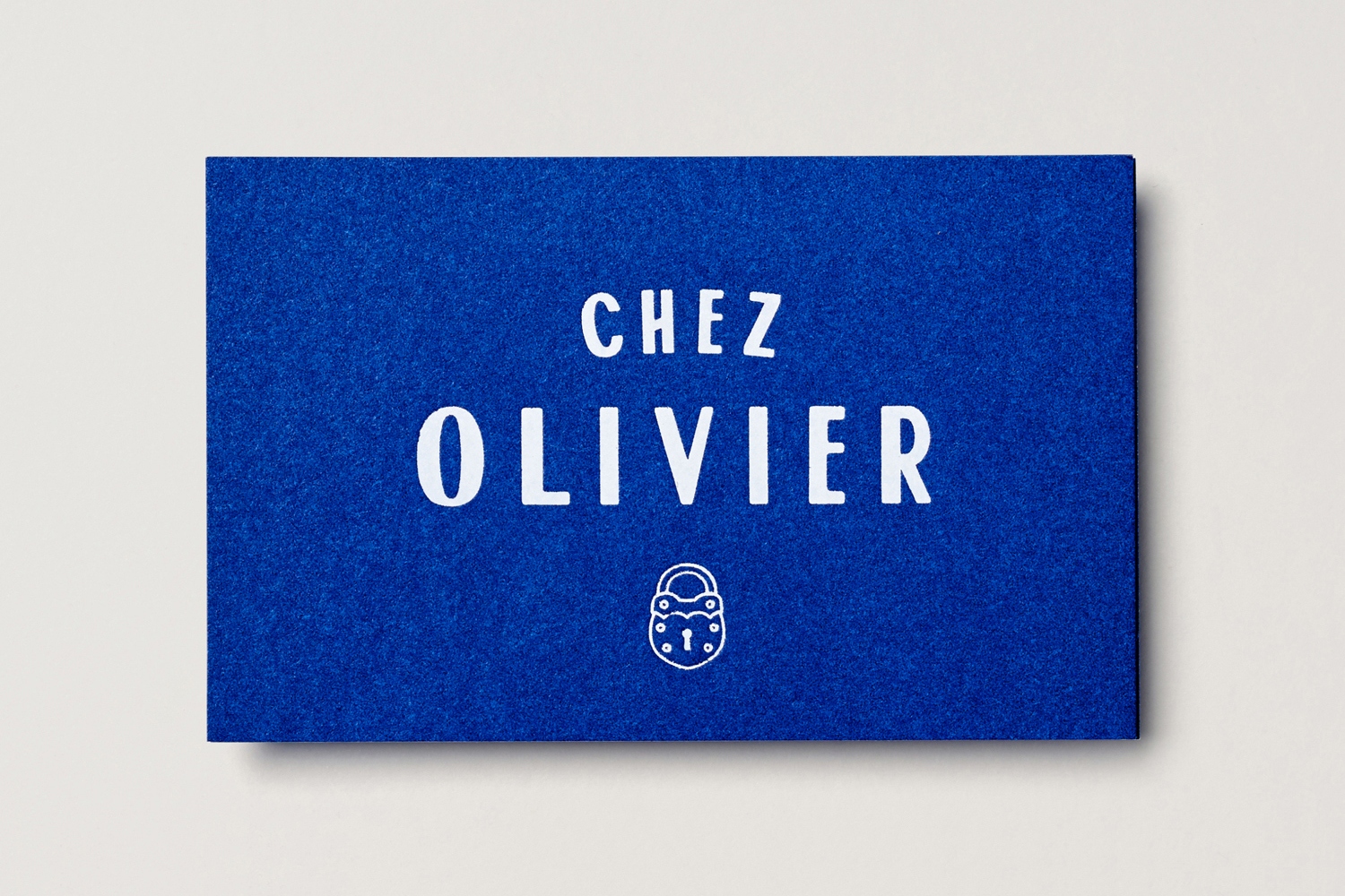
Chez Olivier by Swear Words, Australia
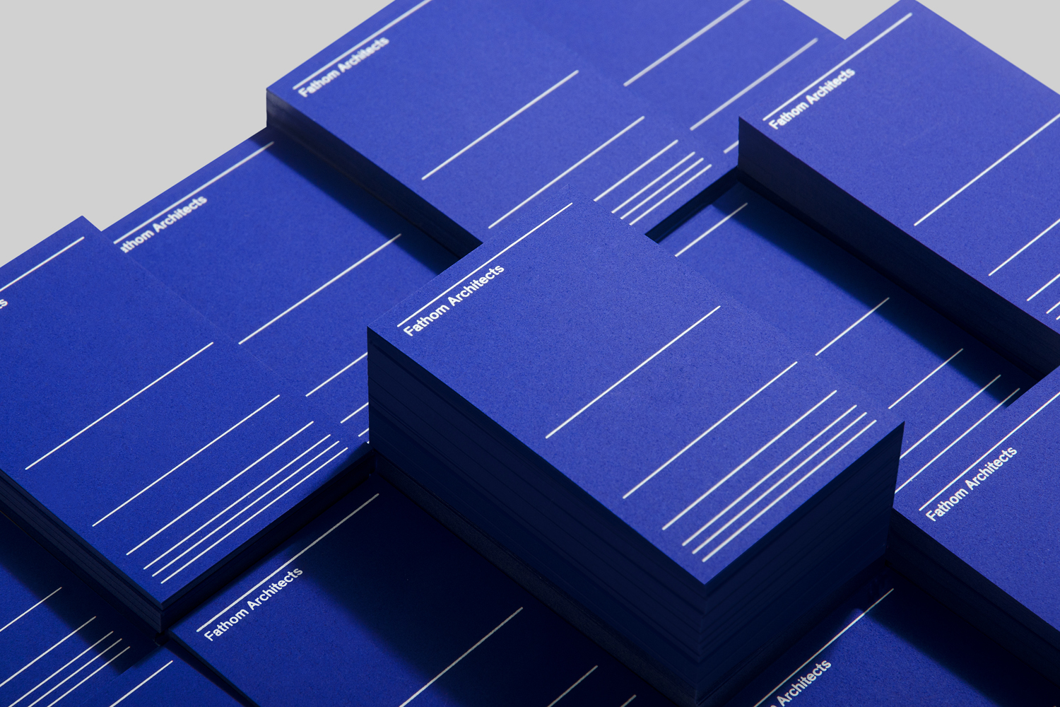
Fathom Architects by dn&co, United Kingdom
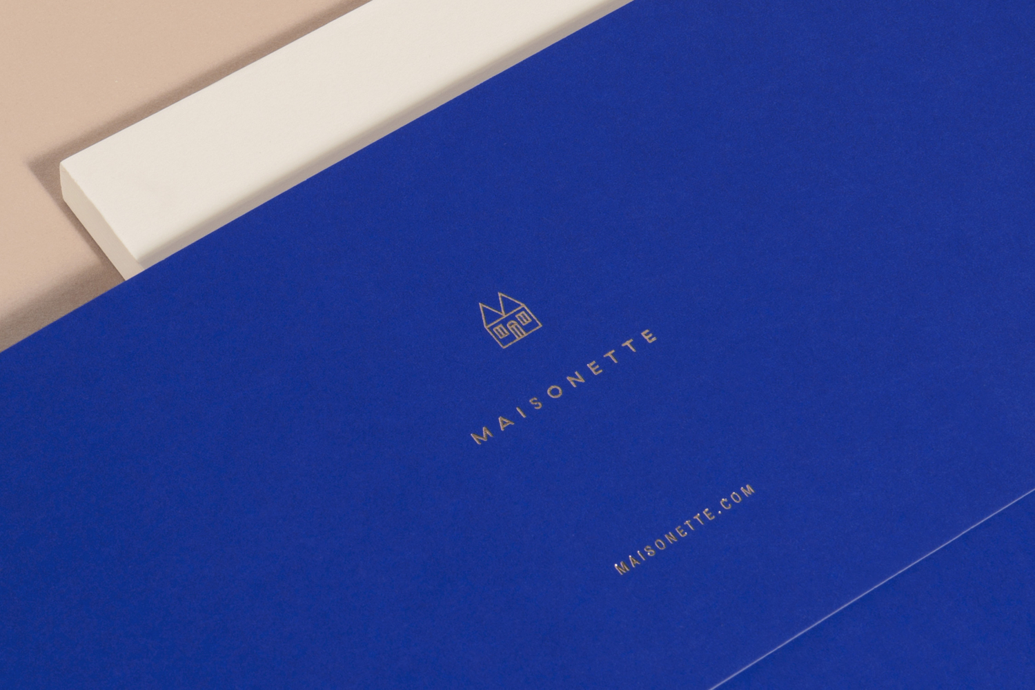
Maisonette by Lotta Nieminen Studio, United States
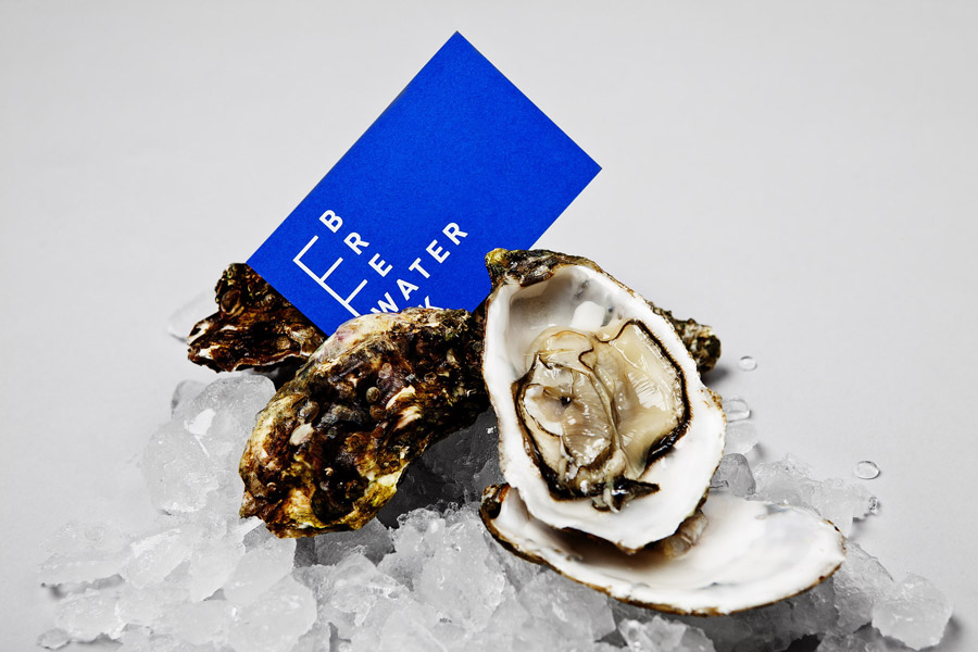
Breakwater by Lundgren+Lindqvist, Sweden
