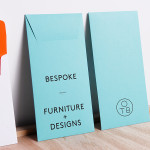
One To Be by Coast
One To Be is a Brussels based furniture design and manufacturing workshop that crafts custom wood pieces for residential refurbishments, bespoke kitchens, office and retail spaces, exhibitions, art installations and one-off pieces for private individuals. The workshop’s visual identity, a logo-centric solution executed across dyed uncoated paper choices by design agency Coast, is straightforward in its presentation of craft, functionality and...
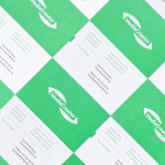
MediaCreator by Lundgren+Lindqvist
Media Creator is a Swedish print production and project management company that utilises a flexible web-based system that pairs a ‘intuitive computerized system’ and translation service, with ‘alert’ and ‘friendly’ staff to streamline their entire print process. Utilising a predominantly two-tone colour palette, san-serif typography and bright contemporary illustrative detail, MediaCreator’s new visual identity, which included a new logo, stationery set and...
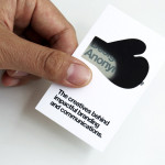
Designers Anonymous by Designers Anonymous
Designers Anonymous is London-based multidisciplinary design agency with global clients from a variety of sectors. The agency has appeared on BP&O on a number of occasions, with highlights including their packaging work for Zest and Patchett’s, and their identity work for Fuller’s hospitality brands The Parcel Yard, The Tokenhouse and Brewer St. Following the launch of their new website this...
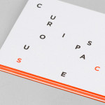
Curious Space by Mash Creative & May Ninth
Curious Space is a London-based scenographers—a specialist scene setter—that creates “unique and inspiring spaces for museums, galleries and more”. Their visual identity, developed by Mash Creative and May Ninth, ‘splits apart to create a physical space that intrigues whilst the type can sit either horizontally or vertically in numerous layouts within the dotted grid”, establishing a flexible and unusual yet structured...

Saxa by Graphical House
Saxa is an independent on-line dealer, publisher and commissioner of original and editioned works from international artists with differing perspectives and cultures, taking a curatorial and collaborative approach to make these available to collectors, galleries, institutions and the general public. Saxa’s visual identity, created by UK-based design agency Graphical House and inspired by crystalline structures, conveys the idea of buyer and artist networks through the coalescing and...
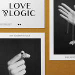
Sancy & Regent by OK-RM
Sancy & Regent is a UK-based online boutique retailer of limited edition jewellery created by young international designers. Their visual identity, developed by independent design studio OK-RM, combines classic type, proprietary quirk and subtle embellishment with tactile material choices and a hidden high quality print finish, to convey small-scale craft with consistent, curated quality....
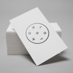
Longton by Longton
Longton is a Melbourne-based multidisciplinary design studio, established in 2012 by Michael Longton, that offers its clients holistic design solutions built on Michael’s past experience—under his previous agency And—with large, international businesses such Sony Music, Billabong, Stussy and Warner Music. The studio’s brand identity—an unusual, modernistic arrangement of neutral sans-serif characters, recurring circular forms and a single consistent line weight forming a logo—has a...
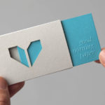
Minke by Atipo
Minke is a Spanish print production studio that favours ‘analogue splendour’ over mass manufacture, providing its clients with a variety of small-scale, mechanical and handcrafted processes. Their visual identity, developed by multidisciplinary design studio Atipo, reflects these services, processes and philosophy through a union of traditional and contemporary detail that exists across type, colour, material texture, print finish, pattern and die cut...
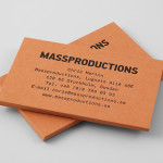
Massproductions by Britton Britton
Massproductions is a Stockholm-based furniture company – established in 2009 by designers Chris Martin and Magnus Elebäck – that develops ”high quality, tactile furniture in a modernist spirit’. The firm’s visual identity, developed by creative branding and communication agency Britton Britton, neatly mixes a structural, typographical authority with craft textures and confidently appropriates an upholstered colour palette of the past....
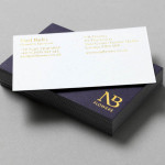
NB Flowers by Karoshi
NB Flowers is a florist – founded by Neil Birks and located at London’s New Covent Garden Market – that specialises in corporate and private events, delivering value through a combination of ‘beautiful flowers, creativity, and a personable service’. Multi-disciplinary design agency Karoshi were commissioned to ‘rebrand and reposition NB Flowers as one of London’s leading luxury event florists and capture the essence of the...
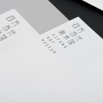
Sifang Art Museum by Foreign Policy
Sifang Art Museum is a gallery and creative space located in the Pukou region of Nanjing, China dedicated to art, architecture and international collaboration. Their visual identity, a bilingual logo-type set across a collateral of unusual trapezoidal cut detail and monochromatic colour palette—developed by Singapore-based creative and strategic design agency Foreign Policy—draws together the themes of architectural space, the dimensionality created by light and shadow,...
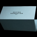
Delfina Foundation by Spin
“Delfina Foundation is an independent, non-profit foundation dedicated to facilitating artistic exchange and developing creative practice through residencies, partnerships and public programming, with a special focus on international collaborations with the greater Middle East & North Africa”. The foundation’s visual identity, developed by London-based design agency Spin, mixes a bold typographic solution and underline detail, a modern take on a...