Richard Baird
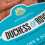
Duchess & Rover by Robot Food
The raw meat sector within the dog food industry continues to grow and innovate, reflecting owner’s increasing support and understanding that it can provide a fresh, natural and convenient way for their dogs to receive the nutrients they need. Recognising how unpleasant raw meat can be and looking to take advantage of the expanding market, design studio and now product development specialist Robot...
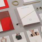
Mark Milton by ico Design
London-based design studio ico Design have recently completed their brand identity work for Mark Milton, a jeweller with a family heritage within the industry that dates back to 1947, and who carefully selects and retails a range of necklaces, earrings, bracelets and rings for women. Bound by the theme of curation, ico Design’s solution provides the Mark Milton brand with a high quality communicative breadth...
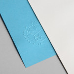
Papillon Blu by Sciencewerk
Papillon Blu is a privately owned spa and wellness centre located at the heart of Indonesia’s Surabaya City. Independent design studio Sciencewerk recently worked with the spa to develop a new brand identity, which included a logomark, logotype, print, environmental signage and website, based around the name blue butterfly....
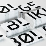
Bølgeblikk Arkitekter by Tank
In response to a change in leadership and the acquisition of new staff, Norwegian architectural firm Ottar commissioned Tromsø and Oslo-based design studio Tank to develop a new name and brand identity—which would go on to include a logo, stationery set and responsive website—that would better reflect the quality, professionalism and scale of the firm’s work within the health and education sector, whilst...
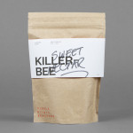
Single Origin Roasters by Maud
Single Origin is a Sydney-based coffee specialist with a roast works in Botany and a cafe in Surrey Hills. Single Origin approached Maud to create a brand identity solution—which included logo design, stationery and packaging—that would reflect the low-key nature of the brand, the founders’ desire to avoid any notion of commercialism and help them expand into new markets. In a ‘category rife...
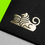
Anthem by Anagrama
Anthem will be a scouting and transfer business within the professional football market working predominantly across Spain, Switzerland and Mexico. Anthem will also be responsible for organising and promoting a variety of sporting events. Design agency Anagrama were recently commissioned to develop a new brand identity for the company—which included a logo, logotype and stationery set—that would communicate the prestige,...
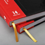
The Swedish History Museum by Bold
The Swedish History Museum is one of the country’s largest museums with a collection of over 10 million objects from a history that spans thousands of years. The museum also functions as a venue for lectures, concerts and a variety of activities. Stockholm-based design studio Bold were recently commissioned to develop a new brand identity for the museum that would...
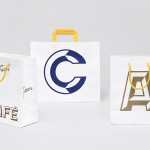
Fazer Café by Kokoro & Moi
Established in 1891 by Karl and Berta Fazer and located in Helsinki district of Kluuvikatu, Fazer began life as a French-Russian conditory that has grown to become one of Finland’s largest food companies, working within the bakery, confectionery, and work-place restaurant sectors. Summer 2013 saw the return of Fazer’s café chain to Helsinki with locations in the centre of the city and in the...
Finísima by Savvy
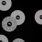
Finísima is the latest ale to emerge from the independent Mexican beer brewing category and is described as being for both those unaccustomed with the world of artisanal beer and the connoisseur. The ale’s packaging treatment, created by Mexican design studio Savvy, reflects its artisanal origin “without sacrificing the reach and reception of more commercial brands” by combining familiar craft aesthetics with...
The Coconut Collective by Marx Design
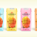
The Coconut Collective is a new Australian brand of organic, flavoured, coconut waters drawn from Sri Lanka’s king rather than green coconut, a first for the market. Soulfresh, the company behind the brand, describe the water from the king coconut as having a ‘cleaner taste profile’, one that should appeal to a broader consumer base. The Coconut Collective’s brand identity and...
Giant Owl Productions by Alphabetical
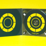
Giant Owl is a London-based independent production company that creates television programmes, commercials and short films for clients such as Channel 4 and Rimmel London. Design agency Alphabetical recently developed a new brand identity solution for Giant Owl—which included an animated logo, flat colour palette, glow-in-the-dark paper and bold illustrative detail—that leverages a simple observation to balance an expected technicality with a playful...
uBear by Hype Type Studio & Mash Creative
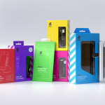
uBear is a high-end mobile phone, tablet and laptop accessories business located in Los Angeles, California. Their visual identity, developed by Hype Type Studio and Mash Creative, included a new logo, stationery set, packaging and responsive website. By utilising the bold graphic detail of diagonal stripes, sans-serif type, a bright and diverse colour palette, fine diagrammatic illustration, foils and varnishes and a simple bear...