
Guggenheim Helsinki NOW by Kokoro & Moi
NOW was a free exhibition presented by The Solomon R. Guggenheim Foundation that took place throughout May at Taidehalli in Helsinki. The exhibition unveiled the six shortlisted proposals for a Guggenheim museum in the capital, visualised, analysed and interpreted data drawn from the 1,715 projects submitted, and was also a chance to view the fifteen designs that received an honourable mention. The exhibition was extended to...
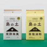
Organic Fertilizer of Awaji Island by UMA
島の土 / Island of Soil is an organic fertiliser created to help develop good quality soil and draw out and compliment the natural power of the land. The range is made using livestock feces and processed vegetable scraps from animals raised and produce grown on the Japanese island of Awaji. It comes in two varieties, a poultry manure and sawdust mix, and a rapeseed...
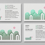
Ulju Mountain Film Festival by Studio fnt
UMFF is a film festival that takes place at the Ulju Arts Centre located in the South Korean city of Ulsan, and draws its name from the Ulju mountains to the west. Studio fnt worked with the film festival to develop a new visual identity treatment, which went on to include logotype, iconography, business cards, stationery, t-shirt design and signage, based around a contemporary...
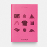
Zuzunaga by Folch
Zuzunaga is a homeware and fashion accessory business founded in ’07 by London and Barcelona based artist and designer Cristian Zuzunaga. Zuzunaga’s products, which include towels, tech covers, cushions, shawls, shoes and upholstery fabrics, are informed by contemporary living and seek to find a charm, warmth and humanity within the digital world. Products are characterised by lines, pixels, geometric abstractions and a...
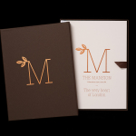
The Mansion on Marylebone Lane by Pentagram
The Mansion on Marylebone Lane will be a 22-unit high-quality residential development in Central London with lower ground, ground and seven upper floors, roof terraces and two basement levels. It will feature reflective glazed terracotta external cladding with a subtle variation in colour and shade to achieve an element of interest and complexity, while the reverse will be a white reflective glazed terracotta...

David Ryle by S-T
David Ryle is an internationally recognised and award-winning photographer with a studio in London. He has a portfolio of work that includes shots for The Sunday Times Magazine, JWT and Saatchi & Saatchi, and is represented across Europe and America by management agency The Peter Bailey Company. Drawing on his attention to detail and relentless pursuit of quality, design studio S-T developed...
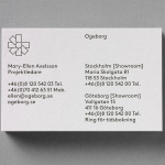
Ogeborg by Kurppa Hosk
Ogeborg is a Swedish, family-owned, manufacturer and supplier of high-quality carpet to the commercial sector, partnering with real estate owners, architects and interior designers since 1968. Stockholm based graphic design studio Kurppa Hosk worked with Ogeborg to develop a new strategy, visual identity treatment and website that would not only reflect some of the culture of the business but would help them...
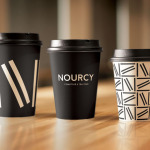
Nourcy by lg2boutique
Nourcy is a delicatessen that has been creating fresh, home-made and original products for thirty years from its location in Quebec City. While providing a contemporary dining environment Nourcy also offers catering services and lunch boxes to customers who have come to expect restaurant-quality at work and at home. In conjunction with a new menu of pastries, an expanded chocolate selection, exclusive gourmet delicacies and the development of a...
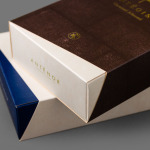
Antéoise by UMA
Antéoise is a creme dacquoise range from Anténor, a Japanese patisserie established in 1966 that creates French style cakes, cookies, tarts and variety of other confectionery. Antéoise’s brand identity and packaging treatment, developed by Osaka based graphic design studio UMA, draws on the range’s flagship positioning, high quality ingredients and the craft employed in its creation, the heritage and experience of Anténor, the streets of Kobe, and the...
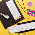
Tanoshii Ramen Bar by Mast
Ramen is a Japanese meat broth and wheat-noodle soup that originated in China and is now embraced internationally. While many enjoy instant versions, the best is said to be prepared over days and is the product, and some would say the art form, of a creative and experienced chef. These are the values of Tanoshii. As the first dedicated ramen bar...
Candlefish by Fuzzco
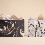
Candlefish is a Charleston, South Carolina, store that stocks a carefully curated collection of scented candles from an assortment of brands including Rewined and Produce, and also plays host to a variety of workshops. The store takes its name from the Eulachon, better known as the Candlefish. After drying, and due to its high oil content, the Candlefish burns much like a candle and...
Chavez by Föda
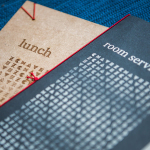
Chavez is a contemporary Mexican restaurant located within the Radisson hotel, Austin, Texas. The restaurant has a Southwestern menu created by chef Shawn Cirkiel and inspired by his memories of family road trips taken to the Mexican coast and the cuisine he experienced there. These memories also informed the development of a warmly lit, wood and fabric furnished interior design by Michael Hsu Office...