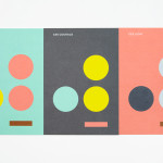
Coalition for Engaged Education by Blok
The Coalition for Engaged Education, formerly New Visions Foundation, is an LA based organisation, led by Dr Paul Cummins, that helps vulnerable children and young adults to realise their potential through an approach to education that respects and inspires them. CEE recently worked with design studio Blok to develop a new visual identity that would mark the organisation’s new national ambitions....

Collective by Hey
Collective is a new Istanbul based agency that is described loosely by Hey, the design studio behind its brand identity, as producing content, communication and design work. Its has an ideology, like the name suggests, based around a collaborative approach, developing projects with an extended network of people with a variety of skills. Hey recently created an visual identity treatment for...
Ridley by RE:
Ridley is a pioneer of digital architectural services and operates as a central hub from which builders, developers and architects can collaborate. Originally established, and continuing to operate as an architectural documentation specialist, Ridley, from its premises in Australia and the Philippines, has also grown to become a leader in Virtual Design Construction. This is a practice that involves attaching live...

Loot by Savvy
Loot is a surf and lifestyle store retailing distinctive products for a modern and global consumer and offers an alternative to the more commercial items from retailers typically found in its touristic location in the Mexican city of Zihuatanejo. Loot’s brand identity, designed by Savvy, draws its character and distinction from Zihuatanejo’s past as a hotspot for pirates, and visualised as...
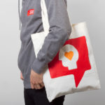
SSU by Snask
The Swedish Social Democratic Youth League, abbreviated to SSU, is a branch of the Swedish Social Democratic Party, associated with the Swedish Trade Union Confederation, and one of the largest youth leagues in the country with a membership of over 10,000. In response to an upcoming general election, which took place on September 14th, the SSU looked to readdress its visual identity which had...
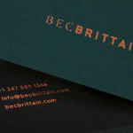
Bec Brittain by Lotta Nieminen
Bec Brittain is a New York based lighting and product designer who is driven by a “love for luxurious materials, intuitive forms and forward-thinking technology.” Working with her small team from a studio in Brooklyn, Bec Brittain creates products that explore and experiment with new production techniques and materials that push the boundaries of American-made centrepiece lighting design. Each piece is created and inspected by Bec and produced using a...
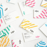
Biju Bubble Tea by ico
Biju is bubble tea brand and cafe located in London’s Soho district that looked to bring and translate a product and experience well-established in South East Asia to the UK in a way that would appeal to a modern discerning market. This was achieved by focusing on fresh, natural and high quality ingredients, a simple menu with an emphasis on taste, a focus on the social aspects...
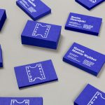
Taidehalli by Tsto
Taidehalli is an art gallery, also know as Helsinki Kunsthalle, with a significant 86-year history. It is set within the walls of a distinctive building created by Jarl Eklund and Hilding Ekelund, and during its lengthy residency has secured its place as a key space within Finland for the exhibition of contemporary artworks. Taidehalli’s new brand identity, recently redesigned by Helsinki and New York based design...
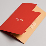
Skovin by Heydays
Skovin is Norwegian, high-end, solid wood floor specialist that combines ancient craftsmanship with modern technologies. By mixing a wood veneer business card and a traditional name drawn from the old word Skøyen, the area in Oslo where the company was founded, with geometric shapes and die cuts, panels of flat colour and sans-serif typography, Skovin’s identity, designed by Heydays, intends to...
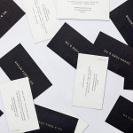
Shaun Ford & Co. by Savvy
Shaun Ford & Co. is a Canadian bespoke furniture an interiors business that creates tailored environments for the sophisticated, style conscious consumer, and whose work revolves around a timeless approach to space. Each piece of furniture is designed with careful consideration given to the years that it will have to coexist within a particular environment and with the intention that each acquires further...
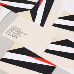
Studio Aves by Build
Studio Aves is a soon to launch UK design practice that will specialise in typeface and typographic design. Its visual identity, based around a high contrast colour palette drawn from the markings of British birds — a reflection of the name and inspired by blue tits, goldfinches, magpies, robins plus many more — was recently created by Build. The identity runs...
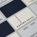
Aspira Urval by BVD
Aspira Urval is a banking, finance and insurance recruitment specialist with offices in the Swedish city of Stockholm. Its new brand identity, designed by BVD, draws its inspiration from the name and the themes of ‘elevated ambitions’ and ‘reaching new heights’. These are visualised as a generously spaced, uppercase, sans-serif logotype with an adaptive ascender that changes depending on its context. It is...