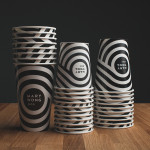
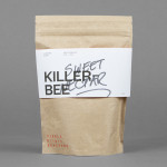
Mary Wong by Fork
Mary Wong is a fast-food chain, with locations throughout the Russian city of Rostov-on-Don, that prepares Chinese noodles with both Asian and American influences. Mary Wong’s brand identity, a combination of bilingual typography, logotype, black noodle boxes with bright spot coloured stickers, t-shirts, environmental design and signage developed by Moscow based studio Fork, was inspired by Tokyo and New York nightscapes and...
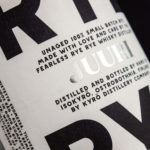
Kyrö Distillery Company by Werklig
Kyrö is a Finnish distillery, housed in a former dairy in the region of Isokyrö, that will yield a high quality 100% rye whisky in 2017 for national and international markets and currently batch produces a root variety for cocktails. Design studio Werklig was hired by the distillery to create their brand identity, which went on to include a logotype and custom typeface,...
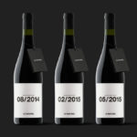
Le Naturel by Moruba
Le Naturel is an all-natural wine created without the use of sulphites by Spanish producer Vintae. Vintae describes itself as an innovative, young and dynamic enterprise, representing the avant-garde and revolutionising different aspects of the wine-growing industry. The wine’s packaging, developed by Moruba, embraces an unusual and distinctive change in communicative priorities, discarding the perceived high qualities of foil and tactile papers, verbose narrative, the...
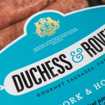
Duchess & Rover by Robot Food
The raw meat sector within the dog food industry continues to grow and innovate, reflecting owner’s increasing support and understanding that it can provide a fresh, natural and convenient way for their dogs to receive the nutrients they need. Recognising how unpleasant raw meat can be and looking to take advantage of the expanding market, design studio and now product development specialist Robot...
Single Origin Roasters by Maud
Single Origin is a Sydney-based coffee specialist with a roast works in Botany and a cafe in Surrey Hills. Single Origin approached Maud to create a brand identity solution—which included logo design, stationery and packaging—that would reflect the low-key nature of the brand, the founders’ desire to avoid any notion of commercialism and help them expand into new markets. In a ‘category rife...
Finísima by Savvy
Finísima is the latest ale to emerge from the independent Mexican beer brewing category and is described as being for both those unaccustomed with the world of artisanal beer and the connoisseur. The ale’s packaging treatment, created by Mexican design studio Savvy, reflects its artisanal origin “without sacrificing the reach and reception of more commercial brands” by combining familiar craft aesthetics with...
The Coconut Collective by Marx Design
The Coconut Collective is a new Australian brand of organic, flavoured, coconut waters drawn from Sri Lanka’s king rather than green coconut, a first for the market. Soulfresh, the company behind the brand, describe the water from the king coconut as having a ‘cleaner taste profile’, one that should appeal to a broader consumer base. The Coconut Collective’s brand identity and...
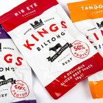
Kings Biltong by Robot Food
Capitalising on the increasing demand for healthy protein-rich snacks and sports supplements Kings Biltong, a business established by three former England rugby professionals, have launched a three flavour, cured and sliced, grass-fed British-beef range that offers athletes an “alternative to chalky protein bars and other supplement snacks that miss the mark in terms of both taste and quality perceptions.” Designed...

Olive & Sesame Oil by Lo Siento
Design agency Lo Siento have recently completed their packaging design work for Spanish olive oil producer Olis Bargalló‘s new Olive & Sesame variety. Lo Siento’s use of condensed sans-serif typography, stacked vertically, and printed with a single black ink makes great use of the tall tin and its warm gold colour. Typography, structural choice and straightforward language share a similar commercial...
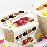
Cuckoo Muesli by B&B Studio
Cuckoo is a ‘modern’ wheat-free bircher muesli range that blends oats, yoghurt and fruit. Individual flavours include ‘Choco Sour Cherry with a smooth layer of Madagascan Vanilla’, Mango & Coconut with a tropical twist of Lime and Ginger’ and ‘Elderflower & Cranberry with a Blueberry & Blackcurrant compote’. London-based design agency B&B Studio, inspired by Swiss graphic posters, developed a new...
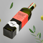
Olaf Olive Oil by Anagrama
Olaf is a Mexican cold-pressed extra-virgin olive oil produced by Olivarera Italo-Mexicana – a Mexican Italian collaboration – intended for healthy, home-cooked, family meals and makes up one-third of Olivarera ‘s olive oil range, which also includes Valentto and Olive Gold. Anagrama, the design agency behind Olaf’s new visual identity, print materials and packaging, describe their approach as taking “typical Italian visual clichés...
F. Whitlock & Sons by Marx
F. Whitlock & Sons is a New Zealand based producer of pickles and sauces with a heritage that dates back to 1877, a heritage that over the last century had disappeared from the packaging. Design studio Marx, in collaboration with running with scissors, sort to bring back and celebrate this with a mix of copywriting wit and illustrative authenticity based around Fred Whitlock’s love of...