Lookbooks by Studio Lowrie
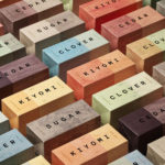
Lookbooks is an online bookstore that specialises in fun and quirky publications of the past. Recent acquisitions include Old Bohemian and Moravian Jewish Cemeteries by Petr Ehl, Arno Parik & Jiri Fiedler, 1991 and 101 Cake Design by Mary Ford, 1987. There is a cultural value to many of these, reflecting a time and particular niche interest, and how these...
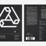
LogoArchive Issue 5
The technical limitations of the mid-century—the need for a steady hand and a precise mind for mechanical reproduction—demanded that an exceptional level of care and creativity be given over to shape and space, association and perception. These considerations created a rich corporate and consumer form language and range of graphic techniques. These have been partly marginalised, usurped by modern print...
LogoArchive Issue 4
The first issue of LogoArchive was conceived, designed and sent to the printers within a day. It was inspired by a panel discussion that took place the day before at Somerset House as part of the exhibition Print! Tearing It Up. Following a successful launches of the first, second, third and Extra Issue, LogoArchive returns with its fourth release. This is...

LogoArchive ExtraSpecial Issue – Canada Modern (Signed)
Following its third release, LogoArchive mixed things up with an Extra Issue in collaboration with Canada Modern. Designed and edited by Blair Thomson, and documenting the forms and colour of Canada’s modernist symbols, this issue was distinguished from the series by its Colorplan Bright Red and full-colour gatefold Chrolomux insert dedicated to the work of Gottschalk+Ash for outdoor advertising company Claude Neon....
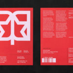
LogoArchive Extra Issue – Canada Modern
The first issue of LogoArchive was conceived, designed and sent to the printers within a day. It was inspired by a panel discussion that took place the day before at Somerset House as part of the exhibition Print! Tearing It Up. Following the successful launch of three issues, LogoArchive returns with a very special Extra Issue in collaboration with Canada Modern,...
The Architect’s Bookshop by Garbett
The Architect’s Bookshop is a new design-focused retailer, located in Sydney’s Surrey Hills, devoted to the books of architecture and interior design, landscaping and urban development. The space was conceptualised as being more than a bookshop but a place to take time out to browse, a chance to engage with the material and form of the books, and as a place...
WeWork by Gretel
Founded in 2010 and headquartered in New York, WeWork began as a workspace provider and has grown to offer a broader infrastructure of community management and support, event programming and virtual network management for small and large businesses, entrepreneurs and freelancers. With significant and rapid growth WeWork worked with Gretel to align its visual identity with its purpose. “Framework”, a graphic route that...
TGC x Stenerhag by Carl Nas Associates
Tangent GC began as an organic garment and shoe care company developing products that intended to ensure longevity and entered the organic skincare market in 2016. Designed by Essen International TGC’s graphic identity, by way of a simple typographical expression, established a visual system of informational immediacy through the absence of superfluous stylistic detail and colour. This divided content and drew a...
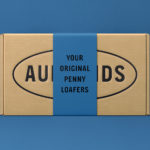
Aurlands by Heydays
Aurlands is the oldest running workshop for handcrafted shoes in Norway. It was founded in 1907 by shoemaker Nils G. Tveranger who, following time in America training as a shoemaker, went on to create the world’s first Penny Loafer in 1926. This, subsequently, became an enduring unisex fashion icon across Europe and America. Aurlands continues to build on this legacy,...
Varnom Ross by Bibliothèque
Varnom Ross is a London-based specialist recruitment agency carefully pairing property professionals with private and public sector clients operating throughout the UK. Their specialism emerges from a single-minded focus on searching for and discovering the perfect synergy between individual character and collective corporate culture, professional skill set and task. This is achieved through personal conversation rather than the impersonal algorithmic governance...
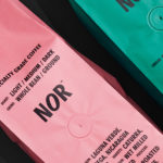
NOR Specialties by Re-public
NOR Specialities supports the development of plantation farmers and helps sustain local communities across Colombia, Guatemala, Nicaragua and Bolivia by way of its range of chocolate, cocoa nibs, roasted coffee beans and cold brew coffee products. NOR trades directly with family farms and producers of its raw ingredients, working with them to develop transparent and sustainable practices. Danish design studio Re-public worked with...
LogoArchive Issue 3
The first issue of LogoArchive in print was conceived, designed and sent to the printers (for quotation) within a day. It was inspired by a panel discussion that took place the day before at Somerset House as part of the exhibition Print! Tearing It Up. Following a successful launch of the first and second issues, LogoArchive returns with its third release...