Gustini by Koto
Like many a geriatric millennial, a lot of my childhood was joyfully spent in front of the telly absorbing cultural pillars like Zig and Zag, Stoppit and Tidyup, and, of course, Wales’ finest export after Charlotte Church, Fireman Sam. Alongside the titular Sam, the show starred icons including ‘Naughty’ Norman Price (fun fact – my dad once mended the boiler...
Be Equitable by For The People
There are many kinds of rebrand. There are rebrands that tread lightly, reverently refining and polishing what is already there, like archaeologists delicately exhuming sunken lucre so that it can once again gleam (National Portrait Gallery). Then there are rebrands that are a little more decisive in their handling of the raw materials—imagine our similetic Time Team creatively re-assembling the...
Plume by Human After All
Plume is a Denver-based telehealth service (or ‘virtual-clinic’) tailored specifically to the needs of the trans community across the US, offering a range of services including prescriptions for oestrogen or testosterone. This is a hostile political landscape to step into, but Plume is doing it with bright and bold panache, courtesy of a fresh rebrand from London-based studio Human After...
Hometree by How&How
It’s all well and good for a design agency to make some wild, boundary-pushing, all-singing all-dancing work for things like Gen Z healthcare products; or ‘top shelf’ spirits; or craft beer. But most client projects aren’t going to be the sort of thing that merits bright orange and typography that dances around the boundaries of legibility. And arguably, it’s those...
Expensify by The Collected Works
According to The Collected Works, one of the main reasons its recent client Expensify was looking to rebrand was to remedy a perceived mismatch between the ‘wacky’ vibe of the brand’s marketing and ads (namely its 2019 Superbowl commercial), and its core visual identity. Which begs the question – how far does a brand identity itself have to mimic or...
Beams by Only Studio
The Beams is ‘an expansive new venue and event space on the Royal Docks in the heart of East London’ (that’s as long as you prefer your cartography loosely impressionist). Manchester-based Only Studio was tasked with branding the former Tate & Lyle sugar factory. The award-winning agency has previous form in the field of London industrial-eyesores-turned-cultural-juggernauts: it was also responsible...
Natural History Museum by Pentagram & Nomad
If you grew up in the UK, the Natural History Museum is likely synonymous with two things: the massive blue whale suspended from the ceiling, or the equally large diplodocus skeleton. For many British kids, the museum is a childhood staple – either from school trips, or days out with parents who, rather savvily, combine a widespread fascination among youngsters...
Unmind by Ragged Edge
In recent years, employers have been rushing to offer an increasingly elaborate range of workplace perks, from the WeWork style beer on tap approach to sleep pods (begging the question, if you have to sleep at work, is this really a perk at all?) to Ben & Jerry’s rather busman’s holiday-ish promise that employees can take home three pints of...
Wype by Among Equals
London-based creative agency Among Equals recently worked with ‘below-the-waist wellness company’ Wype on its brand identity and art direction, aiming to help the company build a new brand that would set it up for its next phase of growth. Wype is a gel that was designed to ‘turn any toilet paper into an eco-friendly wet wipe, all at the squeeze...
Stereoscope by Olssøn Barbieri
Oslo-based multi-disciplinary design studio Olssøn Barbieri has created the brand identity for Los Angeles-based speciality coffee roastery Stereoscope, working across its packaging design and printed materials with a typography-led approach that celebrates tactility. According to Olssøn Barbieri, Stereoscope is underpinned by a philosophy that sees coffee as a living organism rather than a commodity, and which takes its responsibility to...
TWELV. by Seachange
Maybe the recent explosion in astrology is thanks to a more secular society; or a post-Covid sense of generalised uncertainty that’s left us grasping for answers. Perhaps it’s the rise of Instagram/TikTok influencers; or maybe it’s just because its foundations lie in astronomical reality that’s been harnessed by civilisations stretching back tens of thousands of years. Whatever it is, where...
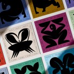
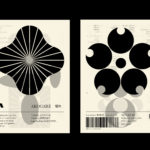
LogoArchive Ukraine
In 2020 LogoArchive started to roll out a research programme, inviting international designers to use the platform to share the works of their countries, with a special interest in those who have been previously under-represented. This included nations in the Middle East, East Asia and Eastern Europe. Since then, the LogoArchive Instagram accounts have continually surprised and delighted. One of...
Everybird by Marx Design
Few products have successfully integrated ethical, sustainable and environmental concerns with a product than coffee. It’s hard to imagine a time when the conditions of cultivation (both human and environmental) were not equal to flavour and – if we’re getting technical – whether the roast is blended or single origin. With its smaller volumes, the speciality coffee market has challenged...
Pursue Hard Seltzer by OlssønBarbieri
New products, new markets and new consumer groups generate new aesthetics – or, at least, you would hope so. Too often, style migrates from one category to another, or the identity of a sub-culture (visually speaking), is exploited in a commercial context. This is where ‘authenticity’ emerges, to support genuine origin credentials, or to mask the appropriation with narrative context....
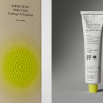
Soft Services by Decade
Skin is the human body’s largest organ while skincare is the fastest growing segment of the beauty industry. Yet with all their promises of ‘dewy’, ‘glowing’ and ‘blemish free’, most products on the market, are focused on the face. Direct-to-consumer business Soft Services creates skincare products for specific body skin problems, such as acne, ingrown hairs, stretch marks and fungal...
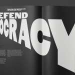
Forward Majority by Order
The balance of power in the US isn’t decided in Washington. It’s decided in state capitols where Republicans have gained overwhelming control, asserting systematic bias on voting rights and election processes. Through policies of suppression and gerrymandering, certain priorities and populations are often neglected in election results. Forward Majority is a political action committee on a mission to accelerate Democratic...
Metamorphoses by A Practice For Everyday Life
Metamorphoses is a contemporary art gallery that curates unique pieces by makers who turn one thing into another. It takes a special interest in works that are inspired by the past while displaying keen attention to present issues. These pieces, selected by the gallery, are often drawn from a body of work by artists who reflect on aspects of cultural...
LogoArchive – Akogare 憧れ by Hugh Miller
LogoArchive returns with its fourth collaborative Extra Issue and first bi-lingual release, documenting the forms of Japanese logo design. Through the distinctive smaller format of the bound booklet LogoArchive seeks to surprise and delight with each new issue, introducing new collaborators to offer unexpected interpretations of the ubiquitous logo book. For this Extra Issue, Hugh Miller orchestrates graphic impact and...
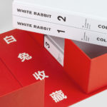
White Rabbit Collection by Toko
The White Rabbit Collection is a contemporary arts publication showcasing the work of 99 artists drawn from the White Rabbit, a contemporary art museum, gallery and archive in Sydney. The museum has become one of the world’s most significant collections of Chinese contemporary art, with over 2000 works from 700 artists. Through this new publication, designed by Australia design studio Toko...
Hair Solutions by Paul Belford Ltd.
Hair Solutions is an enhancer, made from botanical concentrates, that can be added to any brand of shampoo, personalising it to meet 66 different haircare scenarios through a combination of formulations directed at 6 categories (normal, dry, wavy, flaky and colour-treated and fine) and 11 concerns (brittle, dry, oily, thin, wavy or colour-treated, split-ends, frizz, low-shine or volume issues and curl definition)....
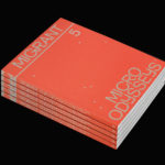
Migrant Journal No.5 by Offshore Studio
Migrant Journal is a six-part exploration of migration in all its forms. It covers, as you might expect, the current and pressing political and socio-cultural implications of the mass migration of people, yet also delves deeper into the more abstract movement of ideas, power and information around the globe. Migrant Journal, in its breadth but a continuity of theme, intends...
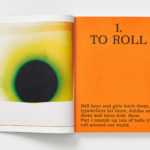
MacGuffin Magazine. No.6
MacGuffin is a biannual design, art and crafts magazine that commissions stories on, around or jumping off from ordinary things, uncovering personal and curious relationships with the objects that surround us. Issues 1 to 5 explored The Bed, The Window, The Robe, The Sink and The Cabinet. The Ball, MacGuffin Magazine No.6 Autumn/Winter 2018, the one BP&O has its hands-on,...
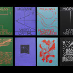
Migrant Journal by Offshore Studio
Migrant Journal is a six-part exploration of migration in all its forms. Indeed, it covers the very current and pressing political and socio-cultural implications of the migration of people fleeing from persecution, seeking better economic opportunities or under pressure from shifting environmental conditions, yet it also touches upon the more abstract movement of objects and ideas around the globe. Migrant...

Critical Mass by Foreign Policy
Critical Mass is a biannual magazine that explores a brand’s ripple effect across the globe, from patterns in consumer spending to environmental implications. It intends to showcase, in its curation, commissioning and design, how a brand’s living legacies extend beyond mere aesthetics and profit margins in the face of fast-moving and ever-changing global consumerism. Issue 1 explores the lines blurred between...