
BP&O Voices
Paul Belford on Ads:
British Rail poster
A guest article from Paul Belford on Hedger Mitchel Stark’s poster for British Rail (1984). BP&O Voices presents the opinions of industry experts on a wide range of topics....
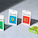
Tipple Topper by Marx Design
The pandemic catalysed the at-home market for a whole host of products. Paired with social isolation, it’s no wonder that one of the markets to benefit would be alcohol. Just like coffee, dried flowers and cleaning products, alcohol was packed down into letterbox-sized parcels and sent through the post. Mail-order cocktails have been a somewhat surprising development. The drama, theatre...
Eames Institute by Manual
American industrial designers Ray and Charles Eames fundamentally believed that good design should be available to everybody. It’s ironic, therefore, that today – in part due to institutional bodies, galleries, collectors and capitalism – their work has been elevated far beyond the reach of the common person. Design that was supposed to be accessible has become a symbol of taste,...
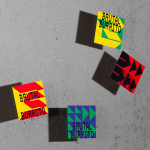
Brutal Burrito by Tres Tipos Gráficos
In 1984, the death of the wrestler Rodolfo Guzmán Huerta – commonly known as El Santo – sent shockwaves through Mexico. Over the course of five decades and 15,000 matches, the legendary fighter had captivated audiences, helping to fuel the growth of Lucha Libre around the world. Through his appearances in film, comic books and cartoons, he established himself as...
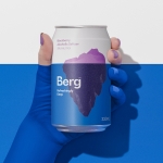
Berg by Marx Design
Marx Design worked with drinks company Lion to develop a brand identity for Berg, an alcoholic / hard seltzer free from artificial colours and preservatives aimed at “discerning drinkers who’ve been yearning for a more refined alternative.” Berg is available in three flavours, Berg Watermelon, Berg Lemon & Yuzu and berg Blackberry. While delivering a clarity and crispness of flavour, Berg is...
Ebb Dunedin by Maud
Design-savvy duo and father and son team Dylan and Frank worked alongside Gary Todd Architecture and interior design team INDYK Architects to develop Ebb, a contemporary boutique hotel located at the heart of Dunedin, a city on the South Island of New Zealand. Ebb is uniquely situated at the edge of the reclaimed Otago Harbour–a place where Polynesian travellers would...
Petit Planet by Studio fnt
The Hyundai is one of the three major department stores in South Korea, with its 15 branches across the regions of Seoul, Yeongnam and Hoseo accruing more than $6 billion in annual sales. Petit Planet is the Hyundai’s new specialised children’s division, presenting premium brands in an environment designed to stimulate young imaginations. This post includes Extended Insights for BP&O...
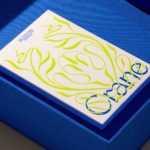
Crane by Collins
In 1775 Crane paper was used to print the first money for the American colonies, and by 1801 the company was the primary paper producer for local and regional banks. Later that century, equipped with an arsenal of innovative techniques from Europe, Crane won a contract with the Bureau of Engraving and Printing and became the supplier for the US...
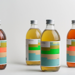
Swee Kombucha by Bedow
Although its recent rise to popularity has been rapid, running a quick search on ‘kombucha’ reveals that until the 21st century it had seen little category growth since its creation, more than 2000 years ago. For the uninitiated, kombucha is a fermented, non-alcoholic sweetened tea containing vitamins, amino acids and nutrients. This mix of familiarity (as a tea), its sweetness...
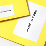
Marc Jacobs by Triboro
Fashion designer Marc Jacobs heads his own eponymous fashion brand, as well as diffusion lines The Marc Jacobs and Heaven by Marc Jacobs. He was also creative director at Louis Vuitton from 1997 to 2014, where he created the company’s first ready-to-wear clothing line. In his own words, Jacobs’ work is ‘a little preppy, a little grungy, a little couture’, and this...

Yes You Can by Marx Design
Yes You Can is a non-alcoholic ready-to-drink range developed by former Olympic athlete Tyler Martin. It exists in the growing direct-to-consumer space alongside more traditional channels of distribution that includes major liquor retailers across Australia. Yes You Can launched with three products aimed at a young ‘social “seltzer” crowd’ looking for healthy and sophisticated alternatives to other ready-to-drink products. Helping...
The Art Gallery of New South Wales by Mucho
The Art Gallery of New South Wales, founded in 1872 as the New South Wales Academy of Art, suffered from a fragmented brand architecture. Addressing this through a rationalised and simplified system, and reinforcing the master brand across all Gallery collateral became a central part of developing of a new brand identity which would support a repositioning strategy that moved...