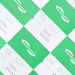
MediaCreator by Lundgren+Lindqvist
Media Creator is a Swedish print production and project management company that utilises a flexible web-based system that pairs a ‘intuitive computerized system’ and translation service, with ‘alert’ and ‘friendly’ staff to streamline their entire print process. Utilising a predominantly two-tone colour palette, san-serif typography and bright contemporary illustrative detail, MediaCreator’s new visual identity, which included a new logo, stationery set and...
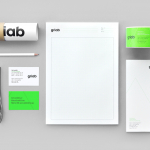
Griab by Kollor
Griab is a Swedish engineering firm, founded in 1957 and located in Helsingborg, Sweden, that specialises in delivering a holistic design and build service that includes land planning, wastewater management, architecture and construction. Developed by multidisciplinary design agency Kollor, Griab’s visual identity, “inspired by the the straight lines and shapes commonly seen in architecture” and created to help reinforce the firm’s environmental...
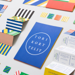
Torikorttelit by Kokoro & Moi
Torikorttelit is the old town district of Finland’s capital Helsinki. Its new visual identity, designed by Kokoro & Moi and based around bright colours, simple geometric patterns, a stacked typographic serif logo framed by a circle and paired with a modernist inspired secondary typeface neatly reflects the historic setting at the heart of a modern metropolis....
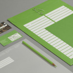
Storyline Studios by Work In Progress
As well as providing space, Storyline, Norway’s largest film studio, offers a wide range of services which include, but are not limited to, set building, lighting, VFX, audio and video post production as well as costume and equipment rental. Developed by Work In Progress, Storyline’s visual identity brings together the classic flourish of a script, the humanist qualities of hand drawn detail, a sense...
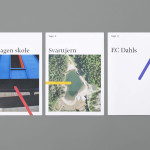
Tegn_3 by Neue
Tegn_3 is a Norwegian, multidisciplinary, architecture design studio that, through inclusive methods, process-oriented and competent project management, deliver holistic solutions that encompass the fields of architecture, planning and landscape, to large clients across Scandinavia. Their visual identity, developed by Neue, draws together the themes of technical knowledge, structure, connections, collaboration and creativity through neutral typography, a modular and expanding geometric...
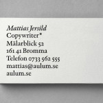
Mattias Jersild by BVD
Of all BVD’s recent projects, which includes their packaging for 7-Eleven – a blog favourite this and last week -, it is their work for Swedish copywriter Mattias Jersild that really stood out for me. It is an incredibly simple but wonderfully laid out, spaced and restrained solution that introduces variety through an interesting mix of lowercase, sentence case and uppercase typography set...

7-Eleven Sandwiches, Wraps and Salads by BVD
Stockholm based graphic design Studio BVD have created the packaging for Sweden’s 7-Eleven sandwich, wrap and salad range. The studio’s treatment combines the stacked sans-serif characters of Klim Type Foundry’s Calibre with bright spot colours, and enhances these with a rich, earthy brown background....
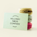
Helsinki Food Company designed by Werklig
The Helsinki Food Company provides design and production services – including consultation, styling, photography and recipe development – to regional broadcast, print and event sectors. Created by visual communications agency Werklig, their visual identity – an economical single colour print treatment of a logo-type constructed from a single consistent line weight and culinary-related letter-forms across a variety of tactile and dyed craft substrates – sets...

Mikkeller + Bedow Seasonal Beers by Bedow
Mikkeller + Bedow is a limited edition beer with a four seasons theme created by Danish brewery Mikkeller with packaging created by Stockholm-based graphic and product design studio Bedow....

Crosskey by Kurppa Hosk
Crosskey is a Finnish company that develops and maintains systems and solutions for the Nordic banking sector and capital markets, making it ‘easier and more profitable for its customers to operate their banks’. Based around the idea “Banking Power!” design agency Kurppa Hosk developed a visual identity solution, which mixes a simple corporate typeface, iconic mark and an economical colour...
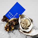
Breakwater by Lundgren+Lindqvist
Breakwater is a Swedish logistics company that services the marine cargo sector. Their visual identity and stationery, created by Gothemburg-based studio Lundgren+Lindqvist, brings together the themes of open sea, systems and cargo through the vertical and horizontal intersection of a geometric sans serif, simple grid-based layout, plenty of space and a vivid blue and icy white colour palette....
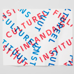
The Finnish Cultural Institute by Kokoro & Moi
The Finnish Cultural Institute for the Benelux (Fins Cultureel Instituut, Institut Culturel Finlandais) is a non-profit organisation that promotes Finnish arts and culture to the Benelux countries of the Netherlands, France and Belgium, with the intention of fostering collaborative opportunities for artists and organisations within the fields of music, literature, design, cinema and the performing and visual arts. The institute’s visual identity,...