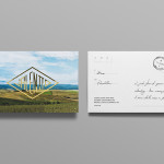
Valentto Olive Oil by Anagrama
Valentto is a Mexican cold-pressed virgin olive oil produced by Olivarera Italo-Mexicana – a Mexican Italian collaboration – created for commercial kitchen and restaurant use. Multidisciplinary design agency Anagrama recently developed a new brand identity and packaging solution for Valentto that juxtaposes the natural detail of Italian landscapes alongside the industrial utility of a square tin structural choice, described by Anagrama as being...
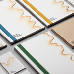
Jeremy Maxwell Wintrebert by Hey
Jeremy Maxwell Wintrebert is a glassware designer and manufacturer currently working in France with a free hand glass blowing philosophy mastered while traveling internationally across the US and Europe. Spanish design agency Hey recently developed a new visual identity solution for Jeremy that captures the heat, craft and art of glass blowing through a smart combination of colour and laser...
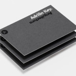
Adrián Key by Face
Adrián Key is a San Pedro based architecture firm and architect working with the rich and famous from “one of the most exclusive corners of northern Mexico”. Design agency Face Creative developed a new visual identity for the firm with a “clean, simple aesthetic with bold and modern touches, an icon that cleverly encases the name of the brand in its design, and...
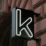
Kontoret by Werklig
Created by consultant Ray Lindberg with the intention of setting new standards for flexible work environments, Kontoret provides low-cost office space by the hour, with wireless internet, printers and coffee, to freelancers, chief executives, local businesses and international travellers in the centre of Helsinki. Inspired by the “essence and basic needs of office work and the aesthetics of the classic office...
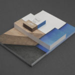
Cocktails & Bitters by Bureau Collective
Cocktails & Bitter is the identity of professional Swiss bartender Philipp Grob whose service is described by Bureau Collective, the design agency behind his new visual identity, as a “special and individual bar experience” “for gourmets, connoisseurs and explorers.”...
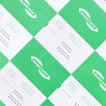
MediaCreator by Lundgren+Lindqvist
Media Creator is a Swedish print production and project management company that utilises a flexible web-based system that pairs a ‘intuitive computerized system’ and translation service, with ‘alert’ and ‘friendly’ staff to streamline their entire print process. Utilising a predominantly two-tone colour palette, san-serif typography and bright contemporary illustrative detail, MediaCreator’s new visual identity, which included a new logo, stationery set and...
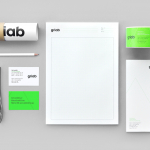
Griab by Kollor
Griab is a Swedish engineering firm, founded in 1957 and located in Helsingborg, Sweden, that specialises in delivering a holistic design and build service that includes land planning, wastewater management, architecture and construction. Developed by multidisciplinary design agency Kollor, Griab’s visual identity, “inspired by the the straight lines and shapes commonly seen in architecture” and created to help reinforce the firm’s environmental...
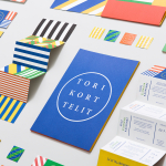
Torikorttelit by Kokoro & Moi
Torikorttelit is the old town district of Finland’s capital Helsinki. Its new visual identity, designed by Kokoro & Moi and based around bright colours, simple geometric patterns, a stacked typographic serif logo framed by a circle and paired with a modernist inspired secondary typeface neatly reflects the historic setting at the heart of a modern metropolis....
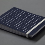
Bedre Kommunikasjon by Work In Progress
Bedre Kommunikasjon is a oslo-based consulting firm, run by communication specialist Nils M. Apeland, that offers personal, professional and independent advice to business, drawn from 20 years of analysis, strategy, promotion, media relations and crisis management experience. Multidisciplinary design agency Work In Progress recently worked with Nils to develop a new visual identity solution which included a logo, business card and stationery design...
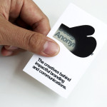
Designers Anonymous by Designers Anonymous
Designers Anonymous is London-based multidisciplinary design agency with global clients from a variety of sectors. The agency has appeared on BP&O on a number of occasions, with highlights including their packaging work for Zest and Patchett’s, and their identity work for Fuller’s hospitality brands The Parcel Yard, The Tokenhouse and Brewer St. Following the launch of their new website this...
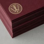
Willow Tree by Bunch
Willow Tree, one of London’s leading business consultancies, worked with graphic design studio Bunch to develop a new but traditional-looking visual identity with an attention to detail. Based around a WT monogram, created by typographer Spencer Charles, utilised as a mix of embosses, carved in seals and simulated watermark, and using purple cloth, black leather, cream paper and handmade coffee pottery, Bunch’s solution embraces a...
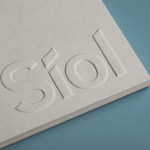
Síol Studio designed by Mucho
San Francisco-based architecture studio Síol recently commissioned multidisciplinary design agency Mucho to develop a new visual identity solution that would embody “their philosophy of conceptual, clean architecture for both interior and exterior design.” Based around a customised sans-serif logotype executed as a blind deboss, the identity conveys the familiar architectural themes of light and shadow formed within three-dimensional space and a practical, corporate efficiency....