Sigma by Stockholm Design Lab
You could argue that there’s a fair few similarities in terms of Japan and Sweden’s approach to design, and the aesthetics of life more generally. Both are known often for a specific kind of minimalism – a tastefulness that eschews fluff, luxuriates in crisp whites and keeps its edges, everything in its right place, rules and order and form following...
Klangwelt Toggenburg by Studio Marcus Kraft
Klangwelt Toggenburg (which translates as ‘sound world Toggenburg’) is a cultural organisation that manages to marry a devotion to the experience and exploration of (you guessed it) sound, with breathtakingly gorgeous (as far as I can tell from Google Images, anyway) mountainous natural landscapes of the Swiss Alps, and some serious architectural chops to boot. Klangwelt Toggenburg began life more...
BRiMM by Harriman Steel
Combining an online shop, journal, and collective, BRiMM describes itself as a platform for ‘planet-positive living’, drawing together some big ideas and ruthlessly sustainable brands. Based between London and Stockholm, it was founded last year by James Haycock, who’s billed as, ‘an exited founder, angel investor, and the vision behind’ it all. The fact the whole thing looks so great...
Siuru by Bond
Estonia’s Siuru plays with important questions, subverting and, at the same time, fulfilling expectations. Is it an art museum? A library? A cinema? Or a cultural institution? For a Bond (Veikkausliiga, Saaristo, Cable Factory) the design studio in charge of developing a brand identity for Siuru, this raised the concern, how do you brand something that seeks not to be characterised...
Ding by Wildish & Co.
When I left the UK and landed in the Czech Republic – my home between 2010 and 2018 – I found a notable difference in advertising and branding between the two countries. Specifically, I saw an abundance of brand mascots. Now, of course, mascots were also used in the UK and have a global historical precedent, but I was struck...
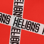
Helions by Pentagram
HELIONS… now that sounds impressive. Something to do with helium atoms and stellar fusion, the force that powers stars? Or perhaps it’s invoking Helios, the Greek god of the sun, blazing his chariot across the sky? Nope – it’s actually a tribute to Helions Bumpstead in Essex, a beneficiary of the British gift for naming that also gave us Pratt’s...

Fuku by Red Antler
Fuku (no sniggering at the back please) is a ‘fine brining establishment’ – i.e. some sort of eatery, you can safely assume – specialising in a specific type of chicken ‘sando’, or in normal language, ‘sandwich’. According to Red Antler, the Brooklyn based design agency behind Fuku’s branding, ‘the Fuku sando first hit the scene as a secret menu item...
ROM by Leo Burnett
Okay, let’s get it out of the way… yes, there are elements of Pentagram’s 2018 Library of Congress in Leo Burnett’s work for the Royal Ontario Museum (ROM). In both projects, type is a frame for images of archive material. Is it BP&O’s responsibility to acknowledge similarities in all the work we publish, tracking a typology back to the start...
Saaristo by Bond
‘Saaristo’ is the generic term for ‘archipelago’ in Finnish, but – to the outside world – it’s sufficiently distinctive to refer to the entire region in Western Finland, which now makes up a new tourism brand. This brand intends to generate more interest in (and visitors to) the world’s largest archipelago: a collection of 40,000 islands. This scale makes it...
North Road by Manual
Independent content studio North Road was founded in 2022 to unite a portfolio of companies covering everything from scripted entertainment (‘Chernin Entertainment’) and non-scripted content (‘Kinetic Content’) to non-fiction productions (under ‘Words + Pictures’). Across these entities, North Road is one of the largest global suppliers of TV and film content, and is able to work on over 70 active...
Chester Zoo by How&How
I’d lazily assumed that, like jazz record sleeves and Dutch public transport, zoos were one of those sectors with a visual legacy that’s packed with game-changing brand design – the sort that fills the pages of graphic design histories, up there with the likes of Paul Rand’s ‘IBM’ and the FedEx arrow and Alan Fletcher’s gloriously clever ampersand trickery for...

Hello Klean by Two Times Elliott
Beauty is, of course, in the eye of the beholder, but there’s no denying that objectively, its branding and identity design has undergone some huge changes over the past decade or so. Gone are the days of faux-luxurious designs that were all about swathes of abstract silk; women coiffured to within an inch of their life; a microscopic lens on...