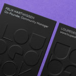
Loupedeck by Bond
Loupedeck is a Finnish startup and photo editing console designed to make the process of image manipulation faster in Adobe Lightroom for both Windows and Mac users. It is described as being an intuitive replacement for keyboard and mouse, is mapped exactly to Lightroom to encourage creative spontaneity and experimentation, and suited to beginners and professionals alike. To help establish and...
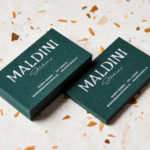
Maldini Studios by Jens Nilsson
Maldini Studios is a Stockholm-based interior design and carpentry studio made up of project manager and carpenter Rasmus Moberg, interior designer Elina Johansson and carpenter Theo Klyvar. The studio’s work often uses precise lines and geometric forms to elevate the irregular detail and texture of natural materials. There are moments of utilitarian and ornamental juxtaposition, times at which this feels subtle and transitional,...

14 Islands by Bedow
14 Islands is a Swedish digital development studio that focuses on the design and build of distinctive and creative user experiences for companies such as Google, Adidas and Plume. Although its products are diverse, and include websites, apps and web-based games, these are linked by the studio’s commitment to balancing good design principles and technical performance with natural and playful...
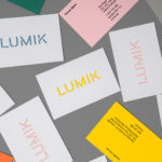
Lumik by Hey
Lumik is a Spanish lighting design and manufacture company, and partnership between the traditional metalworking company of Francesc and Ferran Martí, and interior designer and art director Frank Domínguez. Together they have 65 years of experience, and have built a catalogue of products with simple forms, moments of colour, elements of play and the industrial. These move between those that are...
Maisonette by Lotta Nieminen Studio
Maisonette is an American online retailer of luxury children’s brands, founded by former Vogue co-workers Sylvana Durrett and Luisana Mendoza Roccia. The retailer carries a carefully selected yet extensive catalogue of clothing, homeware, gifts and accessories that mixes local up-and-coming brands with those that are well-established and international. Maisonette’s visual identity, designed by New York based Lotta Nieminen Studio, intends to balance and juxtapose a...

Deptford X by IYA Studio
Deptford X is an arts festival that takes place over ten days across a number of public sites and spaces throughout the district of Deptford, south-east London, with the intention of engaging audiences in active and unexpected ways. This year’s festival, the 18th, builds on a new curatorial approach which was first trialled in 2016. To coincide with and mark this...
Loyal Coffee by Mast
Loyal Coffee is a barista-owned and operated specialty coffee shop located in Colorado Springs. It features a high ceiling, exposed beams and concrete surfaces, natural material detail such as tree trunk stools, and crafted finishes that include a mosaic floor, carved wood panel and what looks like a ghost sign. Drawing on this, the surrounding landscape, and the loyal bond that...
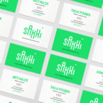
Sakki by Bond
Sakki is Finland’s national union of vocational students. It is made up of 15-20 year olds from a variety of nations, and offers support, tackles student issues, and engages in activism. Scandinavian graphic design studio Bond worked with the union to design and develop a mobile-first experience, and a visual identity made up of tilt-responsive iconography, a bright, simple and modern colour...
Kosmopolis by Hey
Kosmopolis is a five day literature festival that takes place in Barcelona every two years, but also has a programme of ongoing events in between. The festival, since 2002, has been organized by the exhibition and arts centre Centre de Cultura Contemporània de Barcelona, and intends to promote literature in its many different forms. It does this through a series of talks and...
Paulig Kulma by Bond
Paulig Kulma is distinctive space, located in the heart of Helsinki, developed by Paulig, the leading coffee brand in the Nordics. It combines a coffee shop, roastery and barista institute, and intends to appeal to a broad customer group, and accommodate a variety use cases throughout the day. Paulig Kulma serves multiple functions. From the inviting and flexible space of the coffee shop, to...
Well Coffee by Bond
Well Coffee is a new vegetarian café in the centre of the Finnish capital of Helsinki. It has a distinctive interior of steel frames and wood surfaces, exposed concrete walls, drilled and CNC cut panels of circles, large menu board, marine lamps and potted plants. These blend the current and utilitarian with the more welcoming. Scandinavian graphic design studio Bond worked with the...
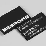
Bespoke by DIA
Bespoke is a New York-based boutique digital retouching company working within the fashion industry and moving into its tenth year of business. With a desire to appeal to an increasingly more commercial clientele while not undermining their roots Bespoke commissioned graphic design studio DIA to develop a new brand identity. With a strong favour for contrast; in colour, proportion and type, DIA establish a bold visual expression...