GUT by &Walsh
Guts aren’t exactly glamorous. And the connotations of the word ‘gut’ are multifarious: there’s the gory (‘blood and guts’); the Germanic ‘good’; the straightforwardly corporeal; or for those with an interest in newer psychological findings, it’s a wondrous ‘second brain’. Ad agency folk, however, have long taken the word ‘guts’ far outside of the bodily. For many of them, ‘guts’...
National Portrait Gallery by Edit Brand Studio
In June 2023, a giant of British cultural life awoke from a three year slumber. The return of the National Portrait Gallery evokes a joy that is made all the keener when one recalls the troubled time in which it closed its doors: March 2020, as the COVID-19 pandemic took hold and public life evaporated in the announcement of that...
Florentia Village by DNCO
On first hearing, ‘Florentia Village’ is a ridiculous name for a warehouse complex in South Tottenham, as if Hyacinth Bouquet had somehow risen from the grave and gained a seat on the borough council in order to render floridly Italianate a grimy chunk of East London. However, the name does in fact arise from an organic nomenclatural etymology: indicating ‘flourishing’ or...
ZVYK by .Oddity Studio
Most people agree that demarcations like ‘millennial’, ‘Gen Z’ and ‘Gen X’ are redundant – little more than age brackets created for the convenience of marketing teams which have become shorthand for a series of traits we’re expected to believe somehow define an entire generation. It’s curious, then, that for every diatribe against such groupings there’s at least ten more...
Future Observatory by SPIN Studio
SPIN Studio continues its working relationship with the Design Museum (after branding its Waste Age exhibition in 2021 and Wim Crouwel’s first UK retrospective in 2011) by putting its inimitable spin (this won’t happen again, I promise) on Future Observatory, the museum’s ‘national research programme for the green transition’. Perhaps more so than any other studio working today, SPIN has...
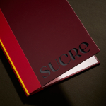
Sucre by DutchScot
It’s always satisfying to see smart, bold new identity designs for a household name brand, often by one of the big name studios: things like the still-hyped 2021 JKR Burger King rebrand; Collins’ Girl Scouts revamp in 2022; Springetts’ fresh look for Ryvita that same year, which makes the much-maligned crispbread seem a lot more palatable. And while such projects...
Cohere by Pentagram
From Wes Anderson to ‘accepting the job’ and distinctly dystopian new romantic relationship models; in recent years, it’s felt like you can’t move for chat about AI – its weirdest uses, its hilarious shortcomings, and a hell of a lot of scare-mongering about it stealing our jobs. The platform that’s dominated much of the conversation is ChatGPT, an AI chatbot...
Time by For The People
‘The story of the internet is the story of life’. Understood in this way, rebranding Malaysia’s challenger internet service provider Time presented the appropriately existentially titled For the People with a daunting task. As legislation in Malaysia shifted, requiring companies like Time to share their infrastructure with other ISPs, competition has grown. As such, Time needed to evolve its brand. What is...
Fork & Good by Mother Design
There’s nothing more human than food says Nyati Gupta, CEO and Co-founder Fork & Good. However, the first place people in more temperate regions will feel the effect of climate change will be on their plate. ‘To be able to eat your favourite dishes without the environmental impact, that would be the dream’. Although vegetarianism and veganism have made it to...
Tembo by Perky Bros
When I first caught Perky Bros’ latest project I misread it as ‘Tempo’, the speed at which music is played. Timing is everything, or so it is said. For real estate company Tembo this notion takes the form of patience; the time to grow gently and judiciously. Property development, momentarily paused during the pandemic, seems to have recovered and is again...
Jupiter by Triboro
Triboro worked on its first restaurant branding project over a decade ago, at a time when the folklore was that if you were a restaurant serving traditional food the visual language should evoke the region and time period of the cuisine. This was intuitive and, as Triboro founder David Heasty recounts, led to some well-crafted and beautiful results but often leaned...
Big C Charters by Mucho
Big C Charters is a premier charter service located in the San Francisco Bay Area, offering hands-on fishing trips and excursions. The company gets its name from Christian Cavanaugh, captain, founder and former professional basketball player. With a growing fanbase and fleet, Mucho was commissioned to create a new logo, colour palette and custom typeface for the brand, as well...