
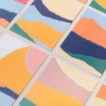
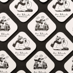
Printed by Somerset by Leo Burnett
Somerset is described as being Canada’s top printer, known for its precision, attention to detail and ability to pull off complex jobs. Alongside reproduction services, Somerset, a family-run business, also provides extensive print finishing services. Inspired by this, the stacked paper of the press, and with the intention of engaging a new generation of designers, Toronto based studio Leo Burnett developed a new brand identity...

Roster Bar & Restaurant by Bond
Roster is a bar and restaurant on the corner of Pohjoisesplanadi and Unioninkatu in the Tori Quarters of Helsinki. It features an impressive interior made up of custom furniture with a vintage twist, raw and refined materials and hand-picked design objects. Although sophisticated in its design, Roster is a casual rather than formal dinning experience. The eclectic but cohesive style that proliferates interior, its high-quality food...
Sardine by Here Design
Sardine is a restaurant, located on London’s Micawber Street, with a simple menu of rustic, Southern French and Mediterranean-inspired dishes cooked over a wood fire. It features an interior design of bent wood chairs, open kitchen, steel and light wood table tops and a brand identity created by Here Design. This adds a touch of a mediterranean colour to interior through menus and tile detail, while also linking other assets such...
Faust by Snøhetta
Faust is a high-end shoemaker with its first signature store located in Oslo’s Barcode area. The shop is a small but impressive space consisting of five concrete niches and large carved wooden doors. Faust worked with Scandinavian studio Snøhetta to create both interior and brand identity. This was based around the The legend of Faust from the Renaissance, its basis for many literary, artistic, cinematic and musical...
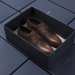
Sauvage by Triboro
Sauvage is a Brooklyn-based cafe and cocktail bar from Joshua Boissy and Krystof Zizka, the duo behind Maison Premiere. It is described as being reflective of the staple establishments of New York and Paris, and has a menu of French-accented American dishes. This is also reflected throughout its interior design, a mix of mosaic flooring, brass rimmed circular tables, bent wood furniture,...
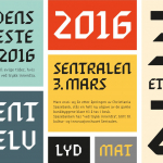
Sentralen by Metric Design
The former building of Norway’s first savings bank, which began as a social initiative to serve the working class people of Oslo, now houses Sentralen, a mixed-use cultural centre. Sentralen continues in the traditions of the bank, functioning as a hub for innovators concerned with and looking to address present day societal issues. The centre houses over 350 tenants working...
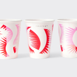
Moi Helsinki by Bond
Moi Helsinki welcomes visitors to the Finnish city of Helsinki, and offers a place to relax after a long journey, with an extensive menu of beers and snacks from its location in the arrivals lobby at Helsinki-Vantaa Airport. The bar features an interior design of light wood and bright neon signage, alongside dark walls, furniture and tiles. Where there are...
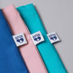
BIFAN 2016 by Studio fnt
Bucheon International Fantastic Film Festival (BIFAN) is an eleven day event that takes place each year in a number of locations throughout the South Korean city of Bucheon, a satellite city of Seoul. It celebrates world cinema; specifically those dealing with the themes of love, fantasy and adventure, plays host to international, Asian and national premieres, and includes, alongside the...

ArtRabbit by Bond
ArtRabbit is a global platform for the promotion, discovery and appreciation of contemporary art, connecting thousands of art spaces, exhibitions and events to artists, art professionals, collectors, students and anyone interested in art. Bond’s London-based studio worked with the team at ArtRabbit to create a new wordmark and brand language that could be used both in print and online....
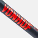
VonHof Cycles by Franklyn
VonHof crafts bicycles in small batches by hand for mountain, road and cyclocross categories from its location in Hoboken, New Jersey. Keeping true to the process of crafting bikes, one that produces a range that is uniquely poised, handsome and of exceptional quality, New York graphic design studio Franklyn took a boutique approach to VonHof’s brand identity. This included wordmark and a...
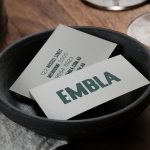
Embla by A Friend Of Mine
Embla is a new wine bar and restaurant located in Melbourne’s inner city, created by Christian McCabe, the man behind The Town Mouse. It has an interior of wood surfaces, exposed floor beams and brick walls, warm low hanging lighting and a large frameless glass front. Embla’s brand identity, designed by local graphic design studio A Friend Of Mine and based around a...

Prism by Matchstic
Prism is a new thermally fused laminate brand from Arauco—a global manufacturer of sustainable wood products—created to appeal to the art and design market currently dominated by well-known brands. Arauco worked with American graphic design studio Matchstic to develop a brand identity for Prism that would communicate the value of a product often perceived as low-value within a market that often favours reclaimed woods and...