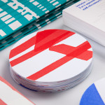
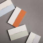
Rendez-vous des Créateurs by Marks
Rendez-vous des créateurs 2014 was an event that took place in September at experimental meeting, performance and exhibit space Flux Laboratory in the Swiss town of Carouge. The exhibition was an opportunity for those servicing the graphic design chain to show off finishes, materials and techniques under the title “onomatopoeia of printing”. Participants included silk screen printer Atelier Fuerm, binder Bubu, hot stamper...

Here East by dn&co.
Here East is a 1.2 million sq ft commercial space developed by Delancey and housed within the former Olympic Press and Broadcast Centre near Hackney Wick in East London. Here East is described as an ecosystem looking to attract businesses from the design, technology and modern manufacturing sectors who are looking to scale, and those of scale looking to behave more creatively....
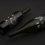
The Bone Line by Inhouse
The Bone Line is a New Zealand winery with a name that references the K—T Boundary, a thin band that runs close to The Bone Line’s location in the Waipara Valley, and that marks the end of the Mesozoic Era and the extinction of the dinosaurs. Auckland based graphic design studio Inhouse worked with the winery to establish a distinctive packaging and identity treatment. Like...
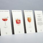
Merchants of Beverage by Manual
Merchants of Beverage is an online service that aims to make buying and gifting luxury items easy. Products include wines, spirits and Champagne’s, as well as hand-blown crystal stemware and professional barware. Each item has been handpicked and curated by a team of experts and sourced from a variety of international artisans. The service’s new brand identity, which included monogram, logotype,...
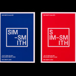
Sim Smith Gallery by Spin
Sim Smith is contemporary art gallery that specialises in the representation of emerging British artists. The gallery, having established relationships with curators and collectors, complements its exhibitions with artistic projects developed in collaboration with design studios, arts and cultural festivals, as well as charities, national institutions and global retail brands. The gallery’s brand identity, designed by Spin, takes the open white...
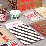
DF / Mexico by BuroCreative
DF / Mexico is the latest restaurant concept from the creators of Mexican market food experience Wahaca. Located on London’s Hanbury St. the restaurant combines an informal diner-style setting with Mexican fast-food and modern American influences. Its brand identity, a broad combination of print, signage, environmental graphics and website design by BuroCreative, is built around a simple mix of condensed type,...
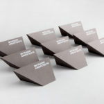
Mitsuori Architects by Hunt &Co.
Mitsuori Architects is an architectural design studio that creates high quality structures and spaces that merge aesthetic beauty with careful planning and thoughtful detailing. Their large scale project experience is combined with the flexibility of a smaller practice allowing them to provide big clients with a personalised service. Mitsuori’s visual identity, designed by Melbourne based Hunt & Co. and informed by a name that translates from Japanese as...
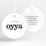
Oyya by Skinn
Oyya is an ice bar located in the Belgium city of Bruges that retails a variety of frozen yoghurts, yoghurt drinks, waffles and 28 ice creams — the most in the city. Its brand identity, which included logotype, print, signage, uniforms and interior design created by local studio Skinn, while largely logo-centric and having a strict consistency across stickers, tubs,...
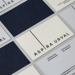
Aspira Urval by BVD
Aspira Urval is a banking, finance and insurance recruitment specialist with offices in the Swedish city of Stockholm. Its new brand identity, designed by BVD, draws its inspiration from the name and the themes of ‘elevated ambitions’ and ‘reaching new heights’. These are visualised as a generously spaced, uppercase, sans-serif logotype with an adaptive ascender that changes depending on its context. It is...

Neometro & Nine Smith Street by Studio Hi Ho
Nine Smith Street is the latest residential property project from Neometro, a company that describes itself as having a reputation as Melbourne’s most design-focused development group and recognised as one of the first holistic design and construction businesses in Australia. Neometro are dedicated to creating architectural buildings that are beautiful, functional and timeless, and have a sense of place and belonging. Neometro’s brand...
Tamarindo by La Tortillería
Tamarindo is a kitchen and bar with an international menu due to open in October 2014. Located in Ourense, Spain, Tamarindo was created as a refreshing alternative for local walkers who are used to traditional bars and restaurants, and is described as a place with two distinct moods and spaces, the casa cocina or house/kitchen, a place for coffee and...
Mauritshuis by Studio Dumbar
Mauritshuis is an art museum and state-owned building constructed in the 17th century and located in The Hague. The building is described as being a fine example of Dutch Classicist architecture. It was formerly the residence of count John Maurice of Nassau and has been home to the Royal Picture Gallery since 1822. Today, it houses a plethora of Golden...