The Best of BP&O — Business Cards No.6
Opinion by Richard Baird Posted 10 December 2014
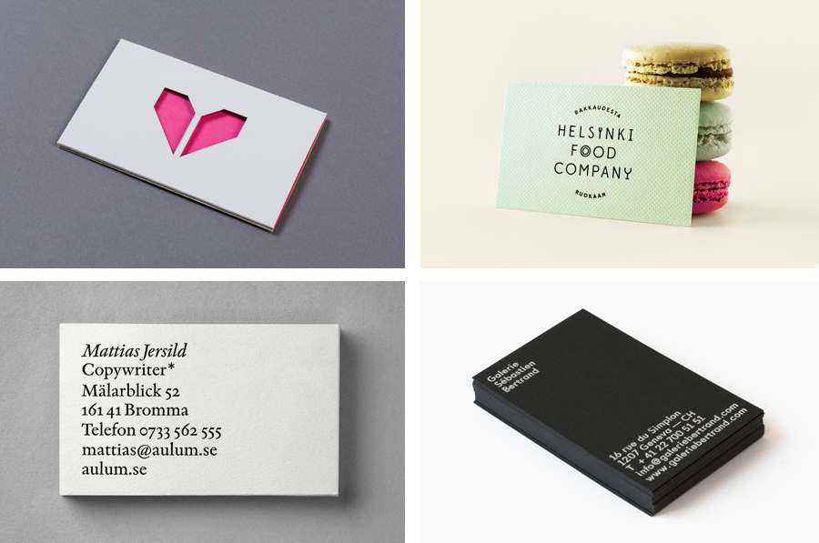
The sixth collection of business cards reviewed and published on BP&O. Between them, these highlight how colour, type, form and texture contrast, delivered through a combination of graphic design, material choice and print finish, contribute to a distinctive and communicative brand identity. As with earlier sets, this selection includes uncoated and coated boards, papers from Colorplan and Arjowiggins, edge painted detail, surface embosses and foils. Featured studios include Karoshi, BVD, Werklig and Atipo.
This post was published as a quick way to browse through BP&O’s content and gain access to older but equally interesting projects through different themes, in this case business cards, and expands upon previous posts under the category The Best of BP&O. This series can be subscribed to here.
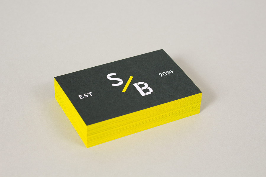
The Stow Brothers designed by Build
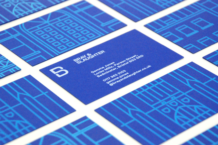
Bray & Slaughter designed by Mytton Williams
Iannilli designed by Savvy
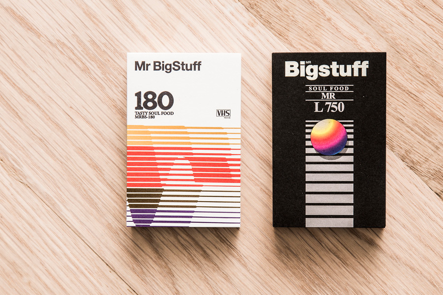
Mr Big Stuff designed by Can I Play
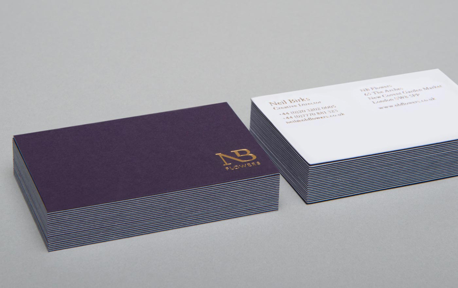
NB Flowers designed by Karoshi
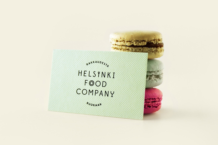
Helsinki Food Company designed by Werklig
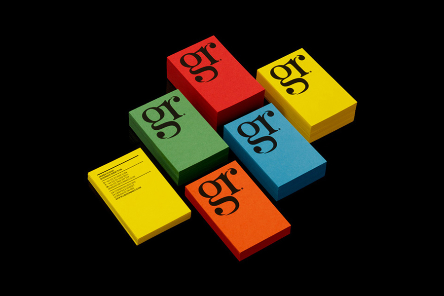
GR Communications designed by Ascend
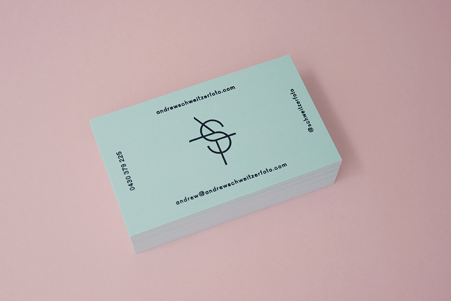
Andrew Schweitzer designed by Studio Constantine
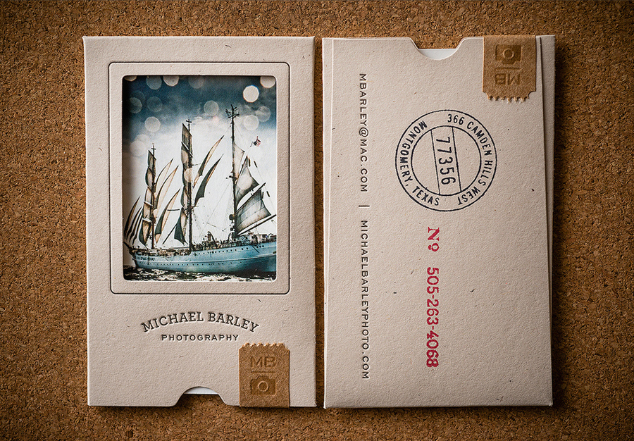
Michael Barley Photography designed by 3advertising
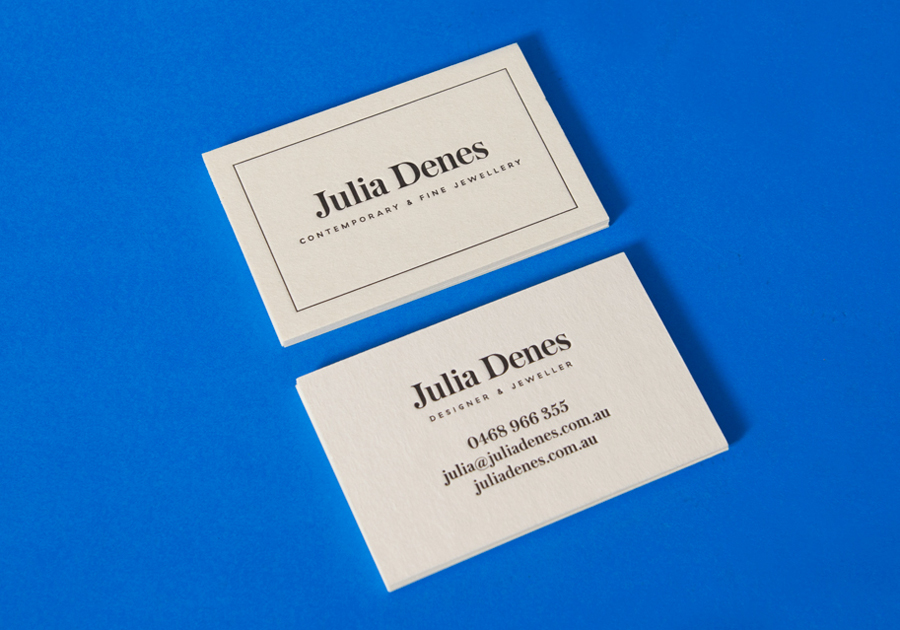
Julia Denes designed by Sammut
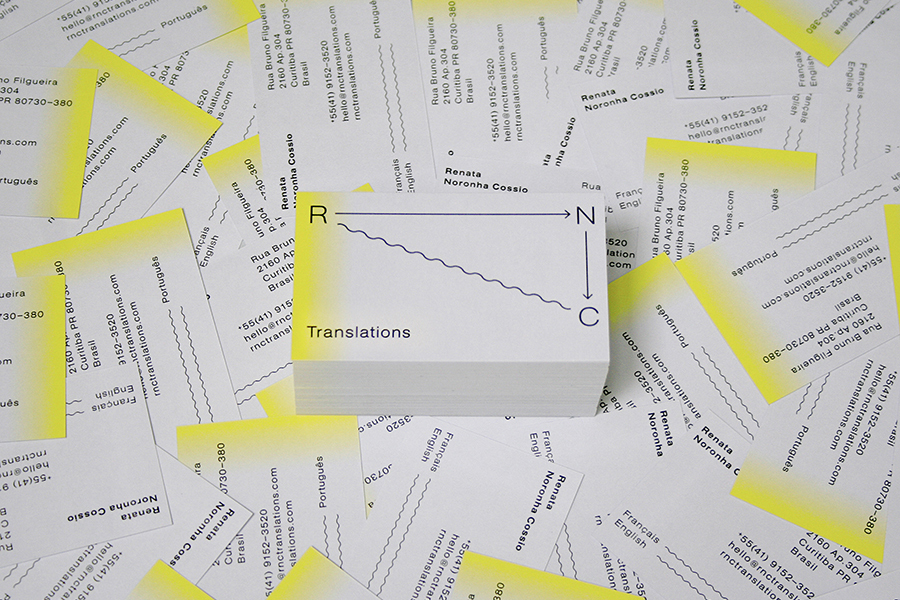
RNC Translations designed by Studio Constantine
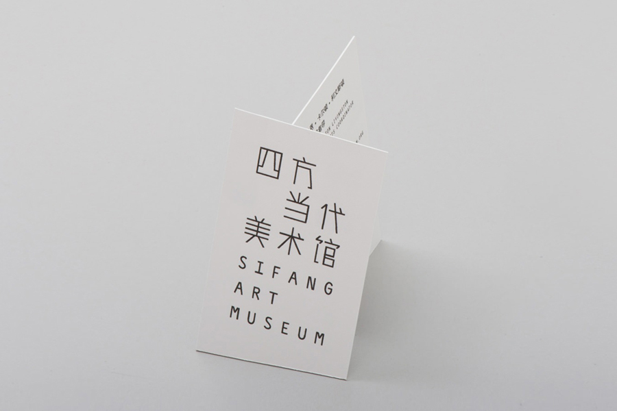
Sifang Art Museum designed by Foreign Policy
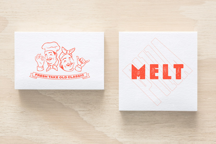
Melt designed by Can I Play
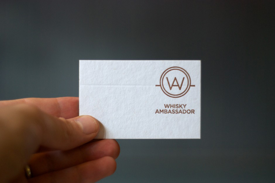
Whisky Ambassador designed by O Street
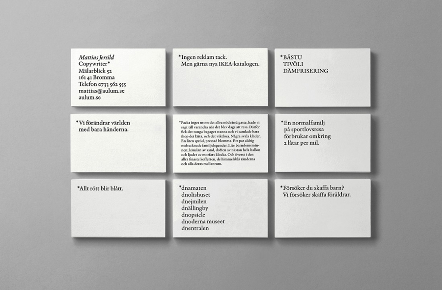
Matthias Jersild designed by BVD
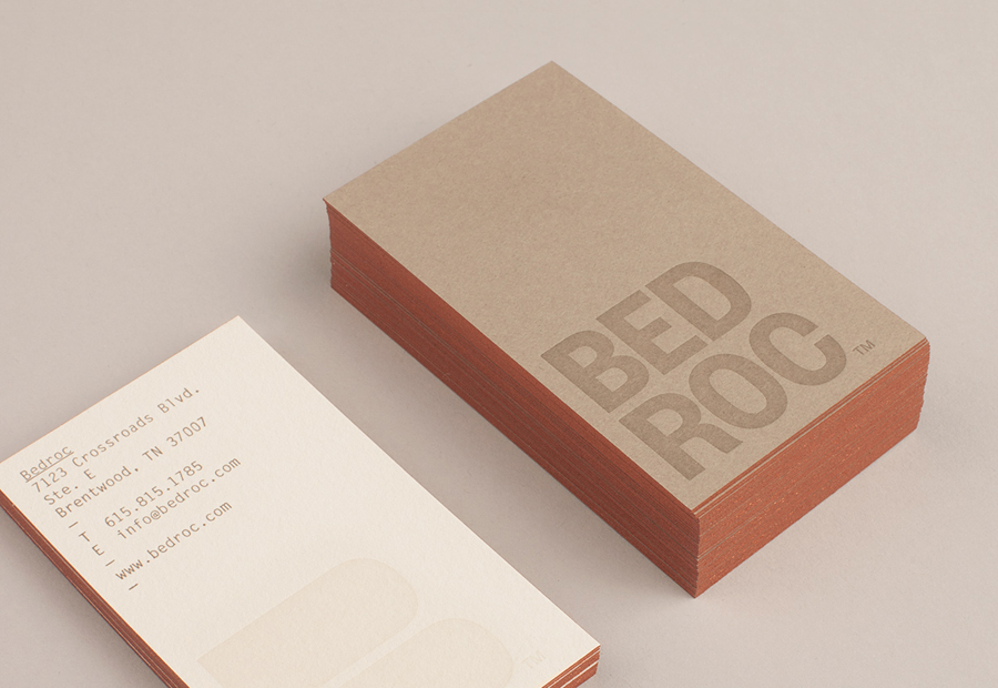
Bed Roc designed by Perky Bros
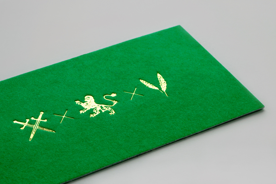
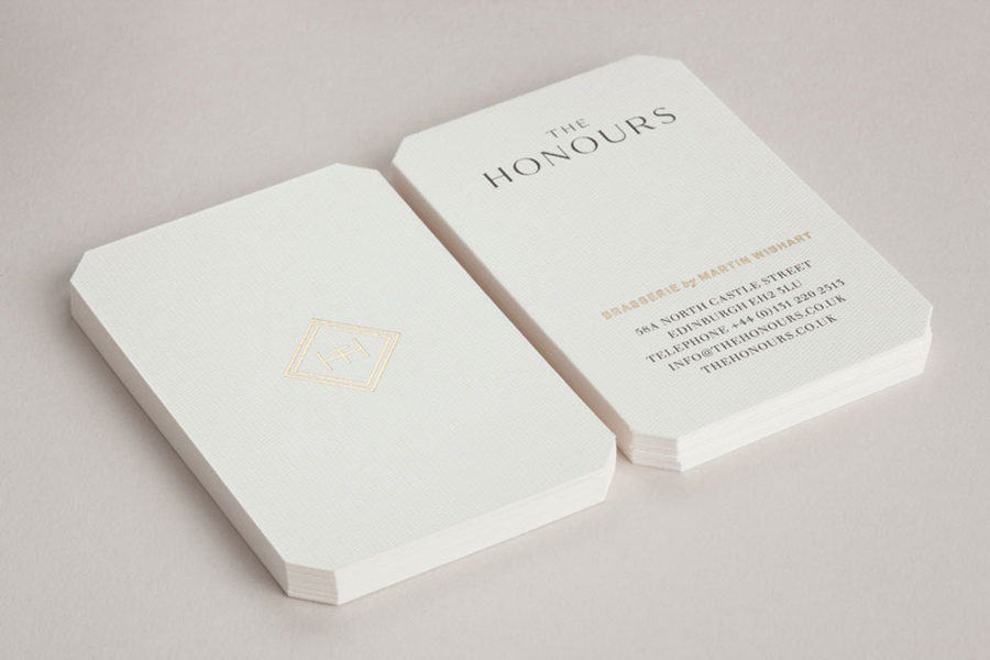
The Honours designed by Touch
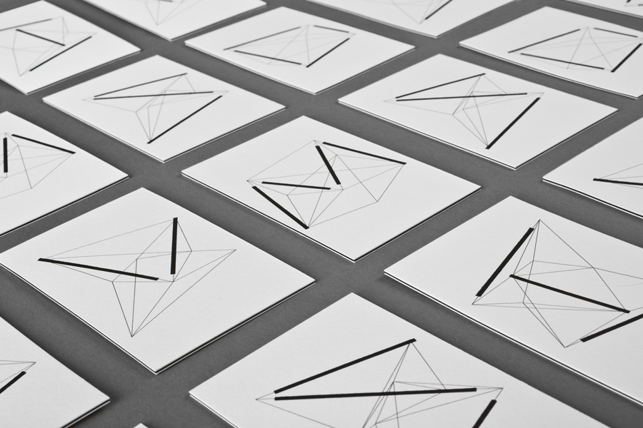
Nosive Strukture designed by Bunch
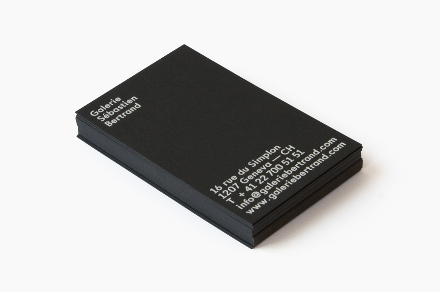
Sébastien Bertrand Gallery designed by Neo Neo
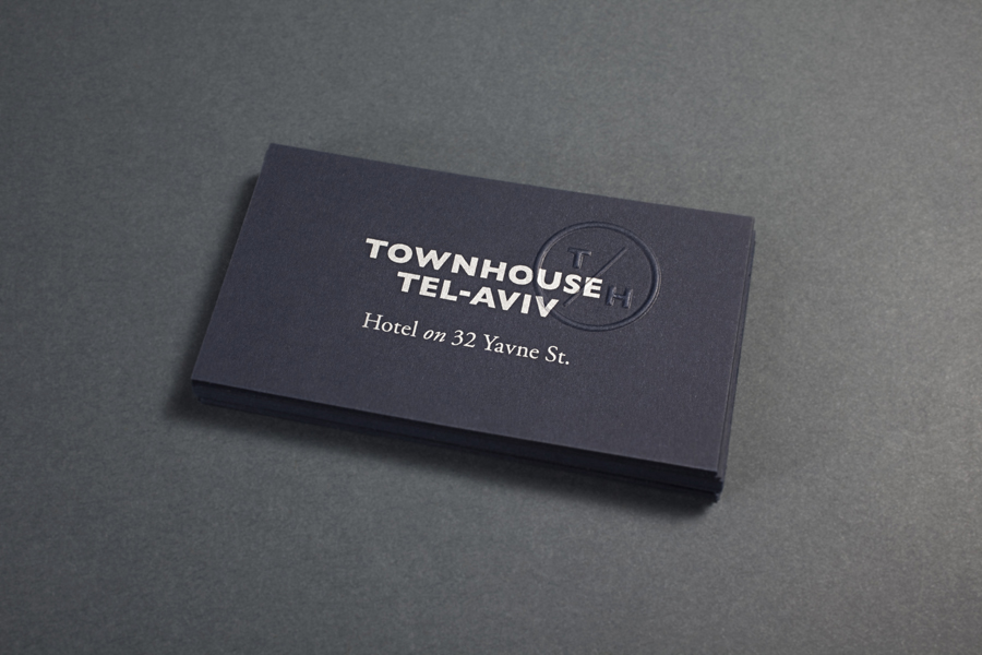
Townhouse designed Koniak
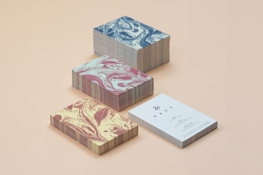
Pact designed by Acre
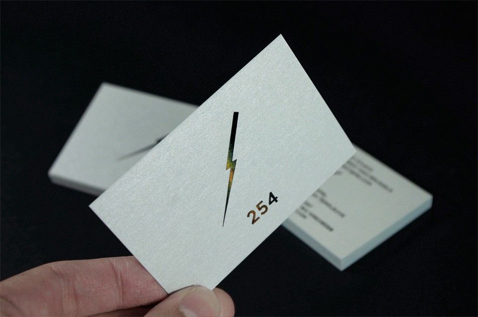
254 Forest designed by Codefrisko
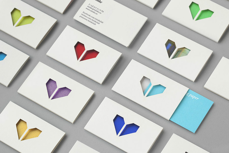
Minke designed by Atipo
