The Best of BP&O — October 2015
Opinion by Richard Baird Posted 3 November 2015
October’s highlights included SocioDesign’s work for Twice Fashion, Mucho’s brand identity for Tina Frey Designs, Marx Design’s brand identity and packaging for Bruce Juice, and Park by Glasfurd & Walker. However, there were five projects that stood out, and have made it into BP&O’s Best Of Series. This feature brings together the most interesting, unexpected or unusual projects published on the site each month for another opportunity to be seen and shared. These typically balance a strong concept with a compelling aesthetic that appropriately play with colour, texture, layout, form, type and print finish.

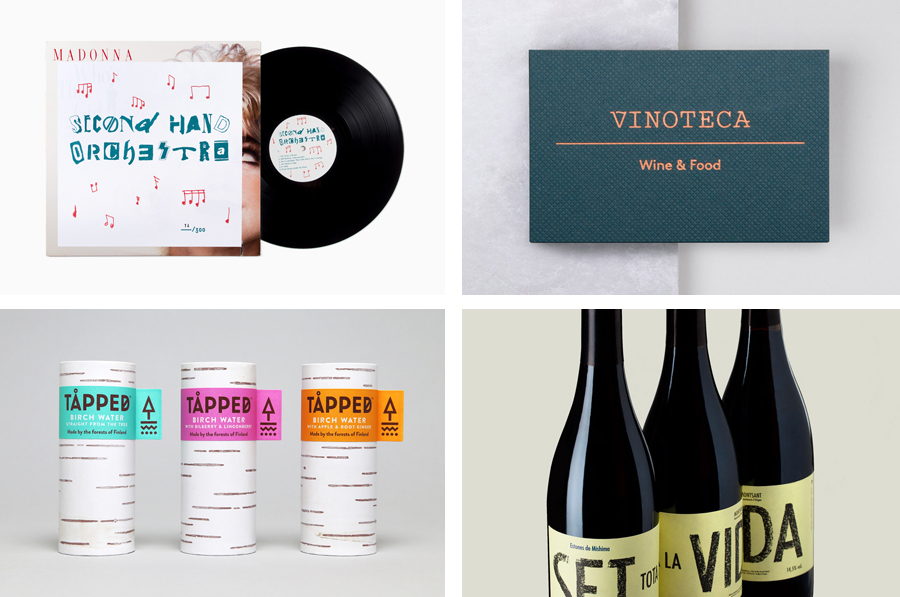
Second Hand Orchestra by Bedow, Sweden
Second Hand Orchestra is a collection of tracks recorded for a documentary that was unfortunately and abruptly cancelled. Rather than let the work fall by the wayside, band leader Karl-Jonas Winqvist has released these as a limited edition album of 300 LPs. These feature a visual identity and packaging design of custom typography, individually numbered and block foiled sleeves, and screen printed t-shirts created by Stockholm based graphic design studio Bedow and bound by the concept of repurposing.
See more of this project here


Estones de Mishima by Folch, Spain
Vins de Mas Sersal is a Spanish wine producer, founded by winemaker Salvi Moliner and sommelier Sergi Montalà in 2008. Inspired by the lyrics of Qui n’ha Begut from the album Set Tota La Vida (Thirsty The Whole Life) by singer, songwriter and friend of Salvi and Sergi, David Carabén of the indie band Mishima, the winery created a special edition release of its Estones.
Estones de Mishima is a blend of Grenache, Syrah and Carignan grapes grown in the lands of Catalonia and aged seven months. The bottle features a distinctive label by Barcelona based graphic design studio Folch that takes its cues from Mishima’s Set Tota La Vida album cover, also designed by Folch. The result is described by the studio as a unique and synergic combination, and the Spanish wine industry’s first co-branded venture.
See more of this project here

Vinoteca by dn&co, United Kingdom
Vinoteca is a group of London based restaurants, founded by business partners and friends Brett Woonton and Charlie Young, that were inspired by the wine bars of Spain and Italy. Aside from the restaurant experience, and as a testament to the quality of their wine list, these restaurants also operate as local wine retailers.
dn&co. were commissioned to refresh and formalise Vinoteca’s brand identity. With an emphasis on balance and clarity, and a desire to convey Vinoteca’s welcoming and easily digestible take on the complex world of wine, dn&co., in opposition to the simplicity and clinicality often favoured by similarly positioned restaurants, embraces material colour and texture, typographic reduction and flourish, space and rich photography. This extends across menus, wine lists and labels, business cards and website.
See more of this project here

Tapped Birch Water by Horse, United Kingdom
Tapped is an organic birch water, drawn straight from trees growing in Finland, and available in Bilberry & Lingonberry, Apple & Root Ginger and unflavoured varieties in the UK from Whole Foods Market, Planet Organic and online.
Birch water is a traditional spring time drink and medicinal ingredient in Finland, tapped from birch trees which filter ground water up through their roots and trunk acquiring minerals, vitamins and manganese, an antioxidant, in the process.
Tapped worked with UK based graphic design studio Horse to develop a brand identity and package design that would communicate the Nordic and birch tree origin of the water, distinguish it from other waters, be compelling to a market unfamiliar with the product and also be environmentally conscientious.
Read more of this article here

Goldsmith’s by Spy, United Kingdom
Goldsmiths is a world-renowned public research university founded in 1891 and located in south-east London. It provides a diverse programme of study, but specialises in creativity, and covers the arts, design, humanities, and social sciences.
Goldsmiths’ heritage, which was reflected in its previous identity in a familiar and conventional manner, makes way for a far more current visual expression created by British graphic design studio Spy. This included an unassuming sans-serif logotype, a bold and expressive typographical system based around the font family Druk, a revised tone of voice and bright spot colour alongside those that are described as subdued. This unites a variety of print communication including, but not limited to, posters, postcards and welcome packs.
Read more of this article here