The Best of BP&O — January 2019
Opinion by Richard Baird Posted 31 January 2019
Five projects that stood out in January and have made it into BP&O’s Best Of Series. Between them, these typically balance a strong singular concept or an appropriate confluence of ideas with a compelling visual character and clear communicative intention that appropriately play with form, colour, type and layout, as well as material, texture, image and print finish.
BP&O, in this end of month review, tries to recognise both the smart use of small budgets—those that channel spending into the most appropriate assets—and those projects with a broad and holistic quality, establishing a continuity (conceptual and/or visual) across multiple touch points. Many of the projects share a concise aesthetic expression, yet there is nuance and strategic weight to these, so do click through and read more about each of these. Alongside reviews BP&O introduced a new text series, the first of which Collation & Curation, experiments with two interwoven narratives; the delineation between the practice of collation and curation in design publishing and how the new metrics of the net impose themselves on today’s design work.
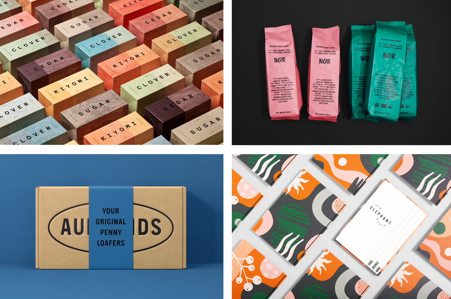
Old Elephant House by Studio South
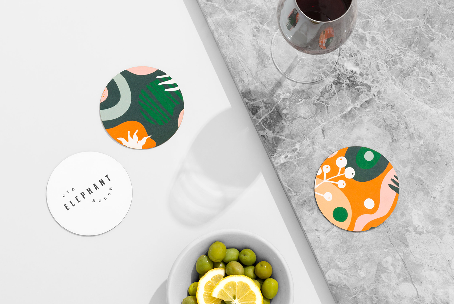
Old Elephant House is a new brasserie and courtyard bar in the former elephant enclosure at Auckland Zoo. It offers an à la carte menu and set three-course meals made up of light and elegant dishes. It is a building that is distinct in its proportions and location, with tall doors and windows from which to hear the distant calling siamang gibbons. Taking cues from the animals of the zoo and their jungle habitats, and with a mind towards a relaxed environment for family and friends, Studio South developed an illustrative collage of exotic motifs, cropped across menus and costers, and transitioning into a space designed by Izzard by way of hand-painted murals.
See more of this project here

Aurlands by Heydays

Aurlands is the oldest running workshop for handcrafted shoes in Norway. It was founded in 1907 by shoemaker Nils G. Tveranger who, following time in America training as a shoemaker, went on to create the world’s first Penny Loafer in 1926. This, subsequently, became an enduring unisex fashion icon across Europe and America.
Aurlands continues to build on this legacy, crafting high-quality and sustainable shoes, and maintaining classics, alongside The Penny Loafer, such as the Norwegian welt and Norwegian split toe, names that refer to the way leather meets in their construction. Although distinct, each shoe shares the same attention to detail, the craft of their build and care given to both functionality and longevity.
The Aurlands brand is an enduring story of a Norwegian influence on the international shoemaking community. This story continues in their rebranding, created by Scandinavian design studio Heydays. This sees the introduction of a new wordmark and container, a bespoke typeface–Aurlands Display designed by Ellmer Stefan, lifestyle photography from Lasse Fløde, package design and soon to launch website.
See more of this project here
NOR Specialties by Re-public

NOR Specialities supports the development of plantation farmers and helps sustain local communities across Colombia, Guatemala, Nicaragua and Bolivia by way of its range of chocolate, cocoa nibs, roasted coffee beans and cold brew coffee products. NOR trades directly with family farms and producers of its raw ingredients, working with them to develop transparent and sustainable practices.
Danish design studio Re-public worked with NOR to launch the brand into the highly competitive Western market, delivering creative direction and visual identity. This included packaging for coffee beans, chocolate bars and cold brew coffee cans. These are linked by a visual language based around the typographic simplicity, communicative immediacy and character of Agipo and its typesetting, paired with a material language drawn from the vessels and sacks of export.
See more of this project here
A’18 by Pentagram

AIA Conference on Architecture is an annual three-day event that explores what is new and now in architecture and design. In 2018 this took place between June 21st and 23rd at Manhattan’s Javits Center, a pioneering modernist space frame structure designed by architect James Ingo Freed. The event is made up of workshops, seminars and city tours across the five boroughs of New York City as well keynotes from those working within the fields of both architecture and design who spoke of their approaches to making a difference to cities across the globe.
Pentagram partner Natasha Jen and team developed the visual identity for A’18, building on the graphic identity developed for AIA, also designed by Pentagram. This captures the vibrancy and life of the city, and the idiosyncrasies of its diverse neighbourhoods. This linked the welcome desk with takeaway assets that included tote bags, Metro Cards and city map.
See more of this project here
TGC x Stenerhag by Carl Nas Associates

Tangent GC began as an organic garment and shoe care company developing products that intended to ensure longevity and entered the organic skincare market in 2016. Designed by Essen International TGC’s graphic identity, by way of a simple typographical expression, established a visual system of informational immediacy through the absence of superfluous stylistic detail and colour. This divided content and drew a distinction from the arrangement and orientation of Akkurat Mono.
As Tangent GC ventured into the organic personal skincare market they worked with London based Carl Nas Associates to build out the visual language through launch campaigns and in the design of TGC’s perfumed organic hand creams. An exposed aluminium tube introduced a new form and material language and developed the theme of contrasts in campaign work and collaboration with airbrush artist Syd Brak.
Collaboration and contrast remain central themes as the TGC story continues with the release of four new fragrances added to their organic soap range. To celebrate this, Carl Nas Associates worked with Swedish artist Åsa Stenerhag to create a limited edition of 100 hand painted boxes. These will be sold through selected retailers around the world beginning in February 2019.
See more of this project here