HUB Residential by DNCO
Opinion by Richard Baird Posted 1 December 2022
Property development continues to boom in London. It’s difficult to see how any of this is really benefitting those most in need, or whether housing is even being designed to be resided in at this point, acting as a ‘store of value’ for those much wealthier individuals. Recently developed areas appear like ghost towns at night. Having just moved, and experienced first-hand the shock of having to bid on rentals (yep, that’s a thing now), the crisis feels very real. Worse still, is knowing that there are many who are in tougher situations.
HUB, as explained by DNCO, the design studio behind its new visual identity, is a developer with a difference, one creating living places where people come first. This is, rather unfortunately, seen as somewhat of progressive stance today when it should, quite frankly, be the norm. Back to Hub. Having developed the business from single buildings in London, Hub has expanded into complex multi-phase locations throughout the UK, and now with a stronger focus on the much needed build-to-rent sector.
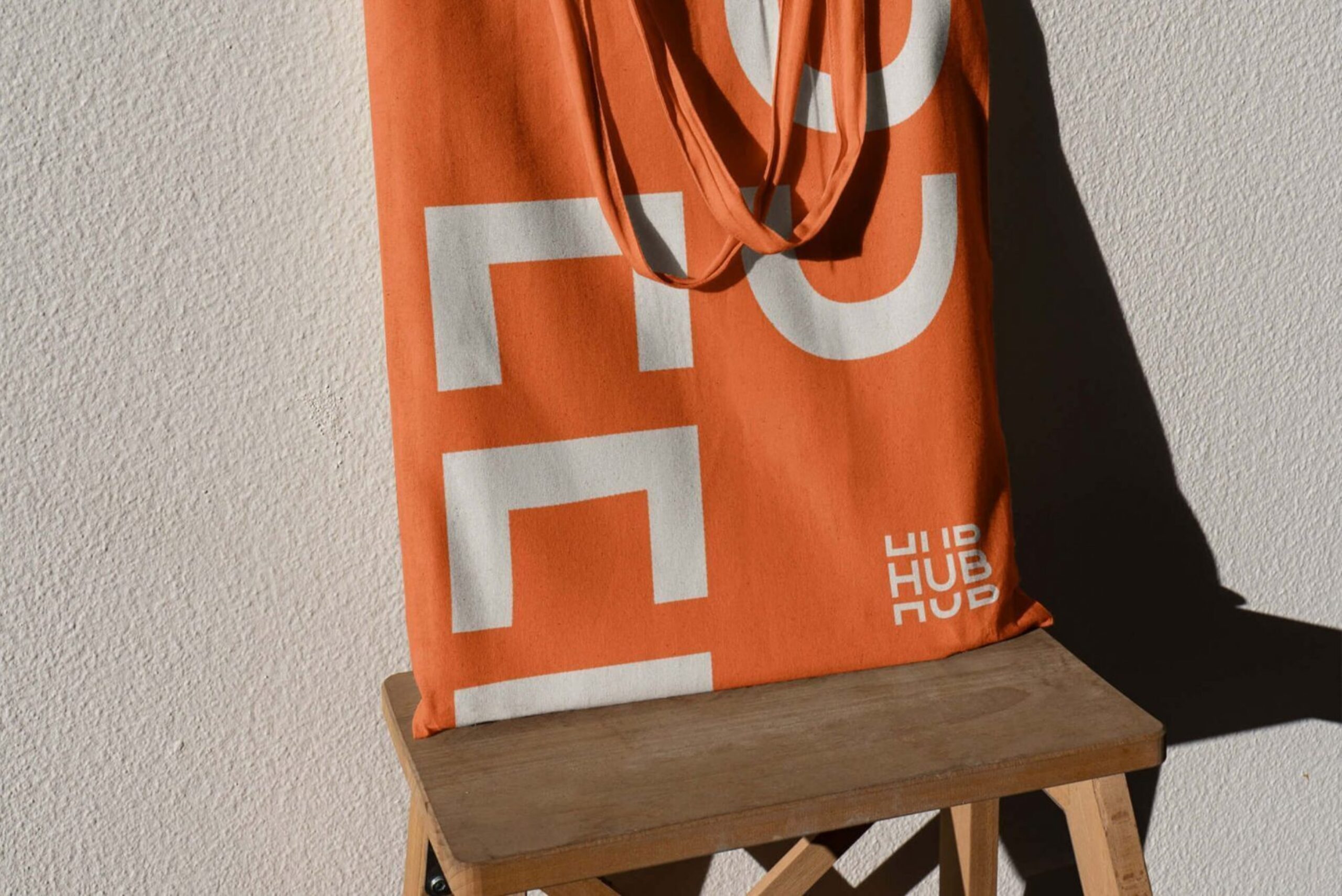
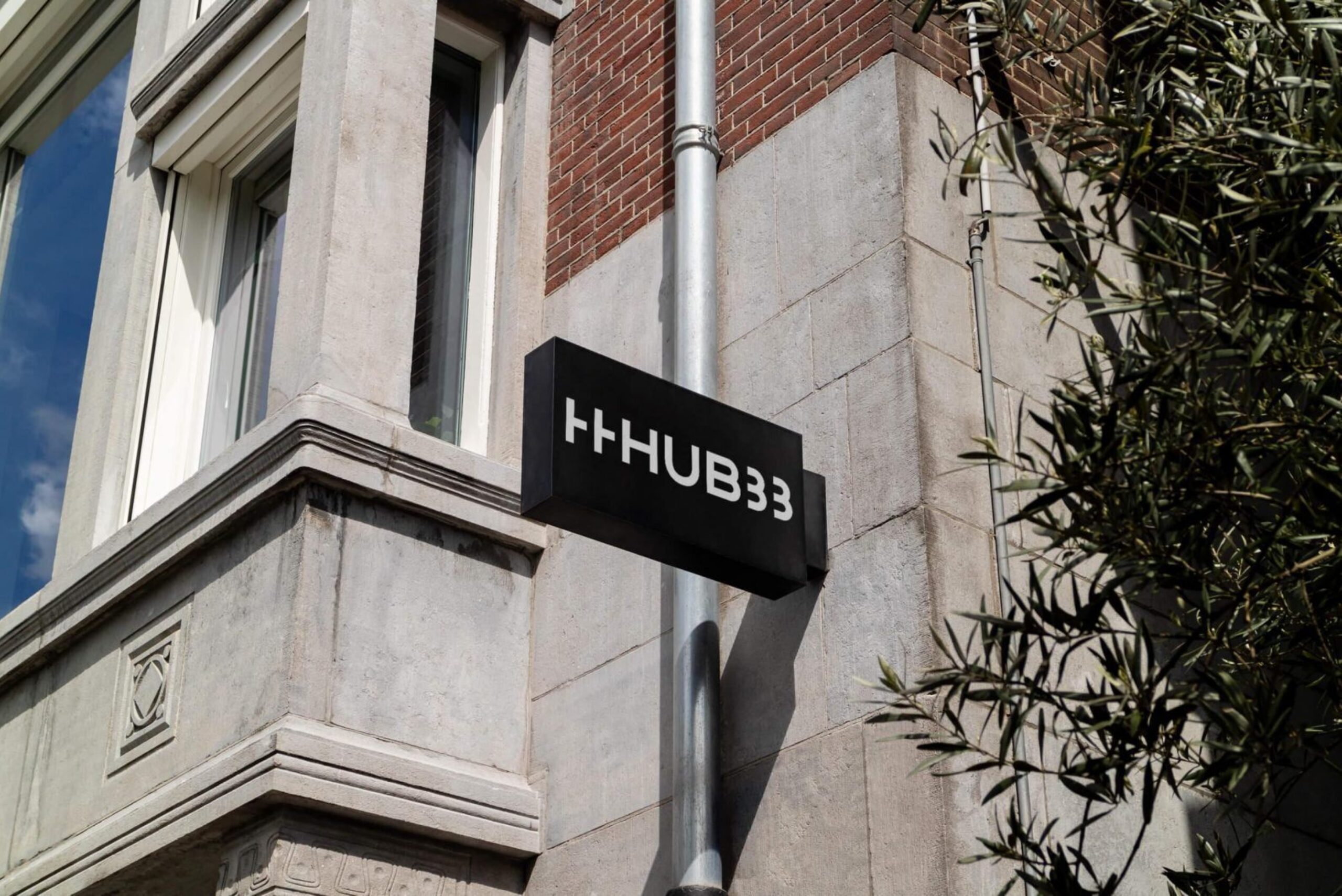
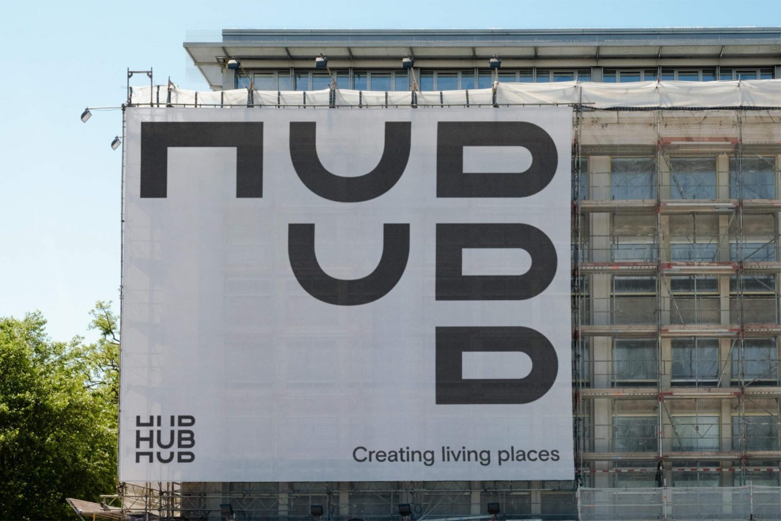
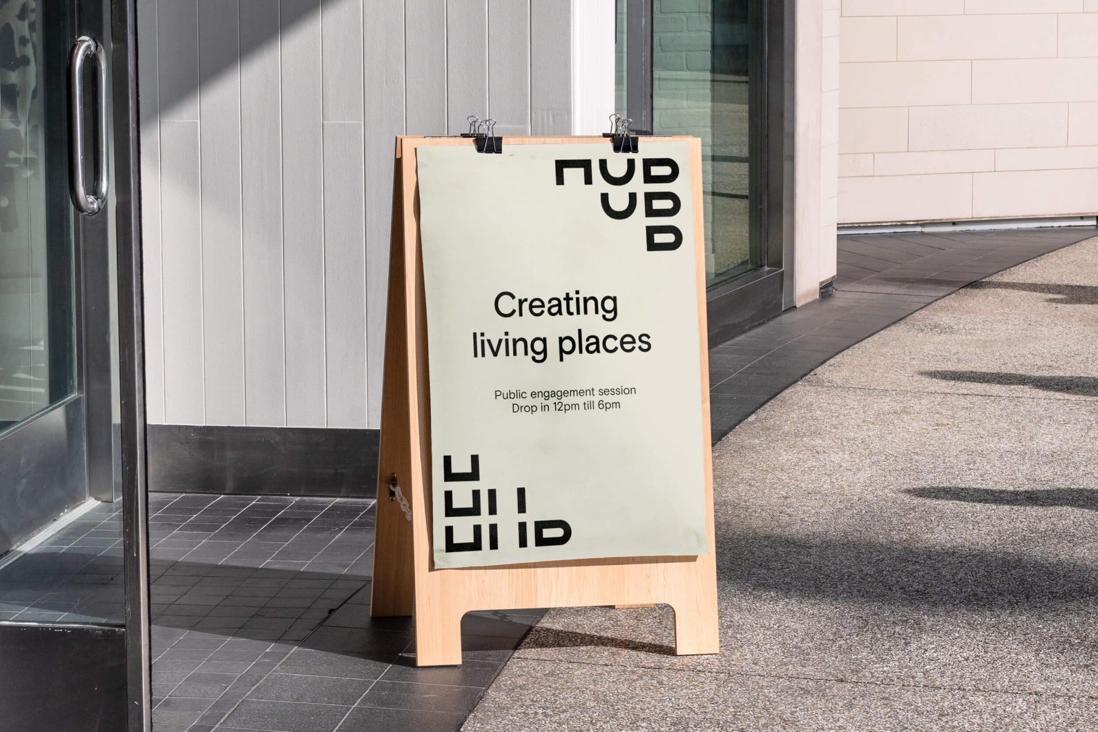
The repositioning of Hub precipitated the need for a new visual identity, one that would better express its new vision, and more specifically, the company’s ‘energy’ ‘nimble approach’ and ‘commitment to creating distinctive places’. A dynamic, animated and reconfigurable logotype met those needs; building, framing, expanding and contracting to link static elements such as signage, brochure, tote bag and business cards, and come to life on screen.
This post includes Extended Insights for BP&O Plus members.
Find out more and sign-up here.
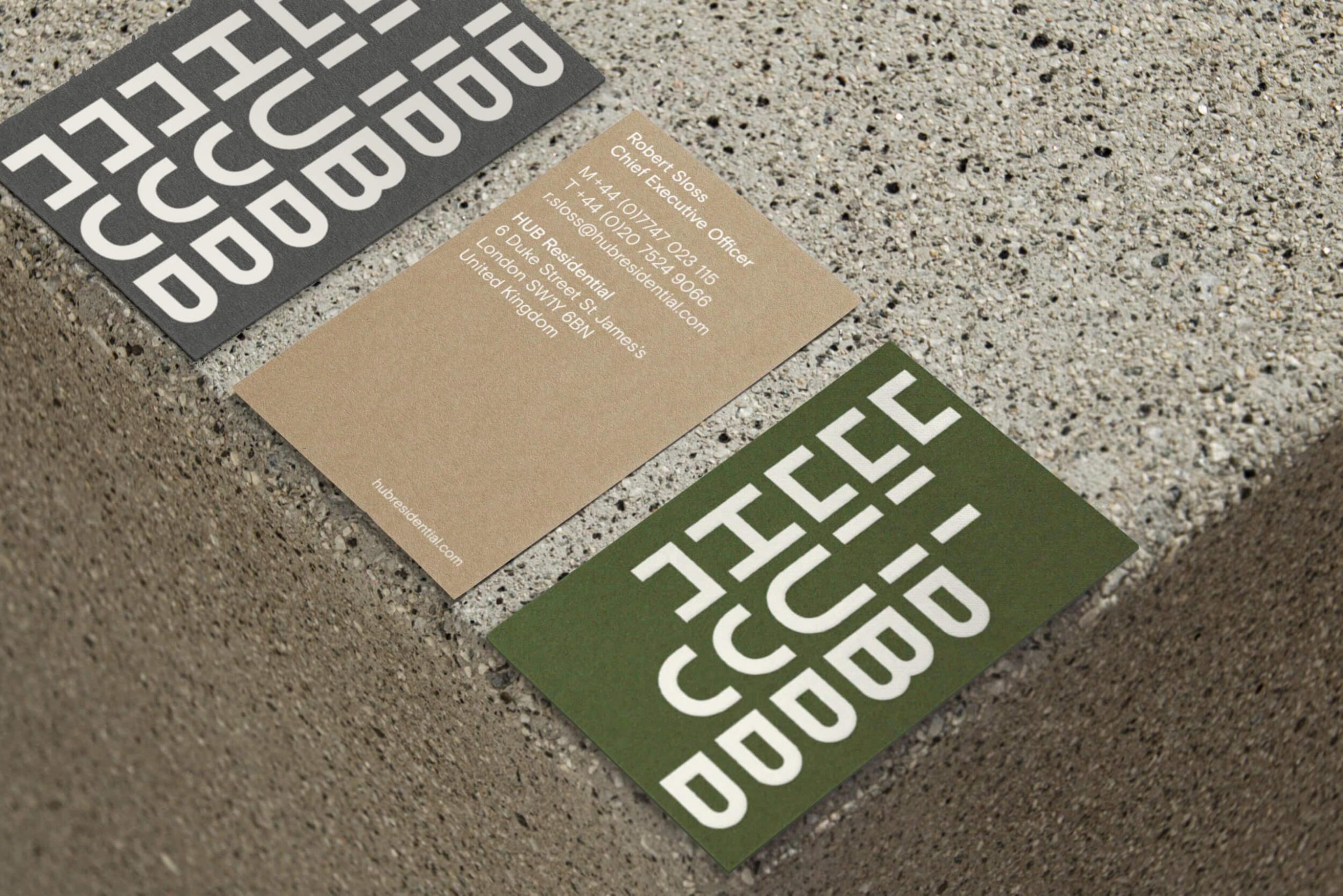
The Hub visual identity takes its cues from the company’s experimental spirit, and somewhat from the visual language of the Swiss International Style, or perhaps more from the hypnotic modernist work of Canadian designer Burton Kramer. The resonating and radiant typographic treatment neatly finds a synergistic relationship between construction and community through its repetition up and outwards.
DNCO have managed to extract a bunch of variable visual gestures from just three letters, building it out into a visual identity, functioning as either as a focal point or framing device. Where it deviates from the Swiss Style is in its use of a warmer more natural colour palette of leaf, sand and concrete, far less austere. The impression is certainly more along the lines of liveable and inviting.
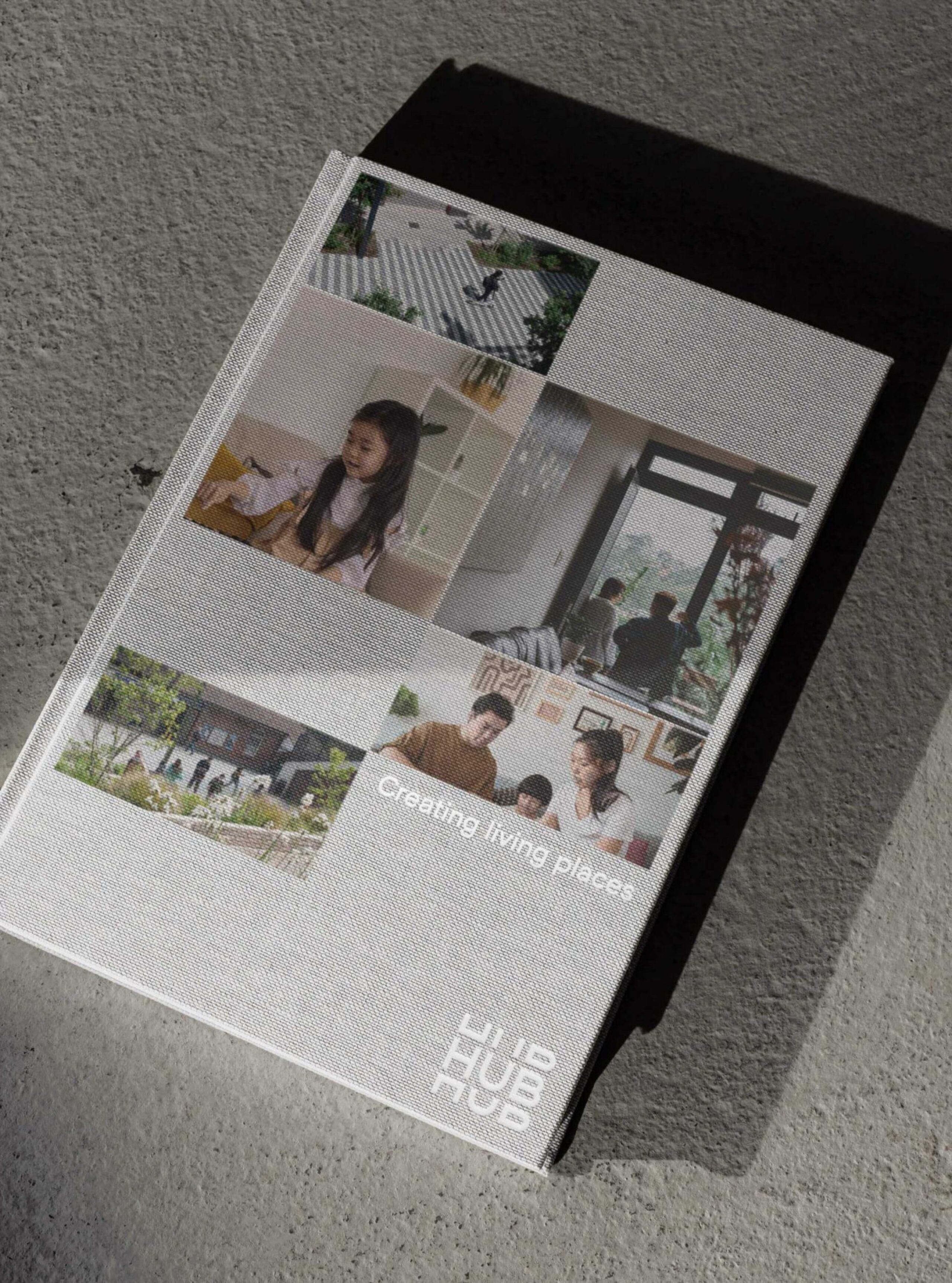
The work is fundamentally about the growth of the business (Hub), the growth of people, families and communities, and while it does introduce the familiar and familial thematic photography across the brochure cover, the idea/themes are suggested or inferred by the graphic work helps distinguish the developer from the glossy, tokenistic renders that feel quite far removed from reality. I’ve lived in a new build for the last year and there’s a naivety/cynicism at play with communication, suggesting that these facilitate community and family life but I quickly came to feel part of the capitalistic machinations. Perhaps Hub can do better.
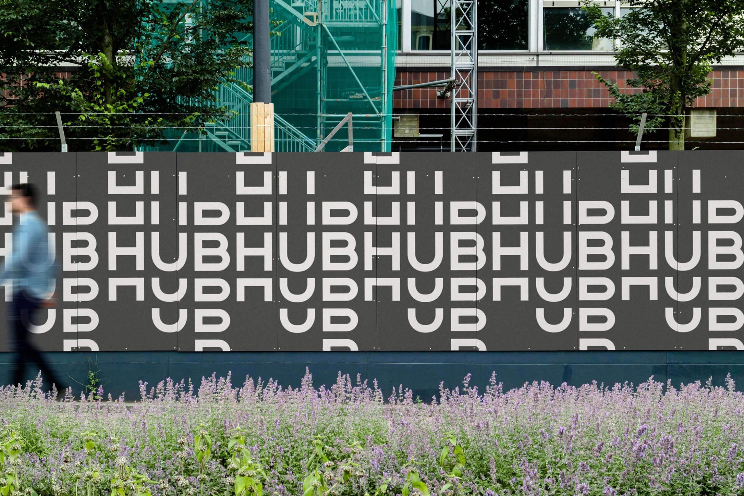
We gave HUB a unifying purpose — ‘we believe that progressive development is vital to creating living places’. The world needs trusted developers like HUB to bring bold ideas to life, and take the inspiring action humanity needs right now. DNCO recognise the challenges of today’s housing market, beset in the UK by crisis, and have set out four essential principles. “First, HUB builds relationships before buildings. Then, they seek progress by delivering maximum social impact. And no matter how complex a project gets, they believe in the power of great design. Finally, they foster trust by creating long-lasting value for all. Because progress is real action, never empty promises.” Idealistic, perhaps, but certainly honourable.”We build relationships before buildings”. It’s a great start, and the Hub visual language certainly captures some of this, connections and impact obviously in the use of radiating patterns. The rest will have to come through in action and material outcomes.
