Richard Baird
BP&O Voices
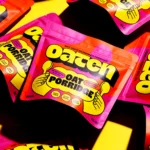
Packaging:
Oat Standing
A guest article written by packaging expert Lisa Cain. BP&O Voices presents the opinions of industry experts on a wide range of topics....

BP&O Voices
Jobs:
Mid-weight Designer, Pentagram, London
Pentagram partners Luke Powell and Jody Hudson-Powell are looking for a Mid-weight brand and systems designer to join them in the London studio....
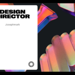
BP&O Voices
Jobs:
Design Director, Josephmark, Brisbane
Josephmark is looking for a Design Director to join their Brisbane studio. This is remote-friendly opportunity at a digital studio that designs, builds, and launches brands, products, and companies that shape the future....

BP&O Voices
Jobs:
Senior Designer, Moniker, San Francisco
Moniker is looking for a Senior Designer 100% focused on visual identity work: concepting and designing brand systems that can scale across complex organisations, digital products, and real-world environments. This role is hands-on, highly collaborative, and ideal for someone who is as comfortable defining a core visual idea as they are building out the details of a system so it...
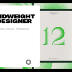
BP&O Voices
Jobs:
Midweight Designer, Base, Melbourne
Base Melbourne is looking for a Mid-Weight Designer, a concept-led thinker who lives and breathes brand but can stretch into digital, motion and/or campaign work, then land it with craft and clarity....
BP&O Voices
Jobs:
Portal
Introducing Portal, a platform that I’m building to connect studios with talent using the networks of BP&O, LogoArchive and BrandArchive....
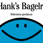
Hank’s Bagelry by Studio Ongarato
Sometimes, a brand identity can be deeply strategic, have a rich heritage or an involving narrative. Other times, it can be simply eye catching and cool. Suites of custom designed icons, art directed photography, tone of voice, motion behaviours, programmatic graphic elements and bespoke in-house content generating tools…. not every brand needs these. They’re colours to paint with. I call...
Muse Group by Collins
Muse Group exists as a collection of digital products covering all aspects of the creative process in music. This reviewer is familiar with Audacity and has used it in the past, but other platforms include Ultimate Guitar, MuseClass, MuseScore, and MuseHub. These tools are used by a range of professional musicians, budding amateurs, and everyone in between, working across all...
Sigma by Stockholm Design Lab
You could argue that there’s a fair few similarities in terms of Japan and Sweden’s approach to design, and the aesthetics of life more generally. Both are known often for a specific kind of minimalism – a tastefulness that eschews fluff, luxuriates in crisp whites and keeps its edges, everything in its right place, rules and order and form following...
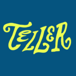
Teller by Werklig
The social and cultural activity of sharing stories has been, and continues to be, an essential part of human experience. Storytelling contributes to the cohesion of, and sometimes control over, individuals and groups, preserving and passing on knowledge, and instilling moral values. Many of us live by the values and knowledge established over thousands of years through stories. With improvisation...
Something a Wittl different
Hi! It’s Rich here, you’ll have to forgive me, this is a rare one-off message to the studio owners (and soon-to-launch studios) that follow BP&O. I wanted to introduce you to something that I’ve been working on over the last year, something that I think you might find useful. My co-founder Christian and I found a gap in the market...
Siuru by Bond
Estonia’s Siuru plays with important questions, subverting and, at the same time, fulfilling expectations. Is it an art museum? A library? A cinema? Or a cultural institution? For a Bond (Veikkausliiga, Saaristo, Cable Factory) the design studio in charge of developing a brand identity for Siuru, this raised the concern, how do you brand something that seeks not to be characterised...