Richard Baird

andSons Chocolatiers by Base Design
andSons is a second generation chocolatier and retailer run by Marc and Phil Covitz, two brothers who learned everything there is to know about fine chocolate from their mother. Seeking to offer something new to the world of artisanal chocolate, driven forward by Top 10 Pastry Chef Kriss Harvey who joins the brothers, andSons thrashes out a liminal space between...
Rare Harvest by Marx Design
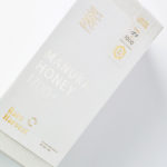
The True Honey Company (TTHC) dedicates itself to the production of mānuka honey, a monofloral variety produced in Australia and New Zealand from the nectar of the mānuka tree. It has a unique colour and texture and a high level of dietary Methyglyoxal, an organic compound with antibacterial and antiviral properties. With a price range starting at 60.00AUD and rising to 230.00AUD per jar,...

Salbini by Studio Brave
Salbini, formerly Fesal, is an online retailer of premium European furniture and appliances based in southern Italy and shipping internationally. It deals in both one-off purchases and tailoring for large commercial projects, offering both local and global brands. Fesal comissioned Studio Brave to rename and refresh its brand and overhaul its online store. While the project features revisions to type...
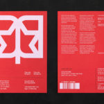
LogoArchive Extra Issue – Canada Modern
The first issue of LogoArchive was conceived, designed and sent to the printers within a day. It was inspired by a panel discussion that took place the day before at Somerset House as part of the exhibition Print! Tearing It Up. Following the successful launch of three issues, LogoArchive returns with a very special Extra Issue in collaboration with Canada Modern,...
The Golden Hour by Triboro
The Golden Hour is an outdoor seasonal restaurant located in New York’s The High Line Hotel. It is a place to experience the softening of sunlight with unobstructed views of the Chelsea skyline. The restaurant intends to draw to mind the casual elegance of a coastal soirée rather than the rushing of pre-dinner drinks. The restaurant space is described as being...

360ME, Montgomery+Evelyn by Studio Makgill
360ME is the first range of “life-ready” “Mood Nutrition” from Montgomery+Evelyn a new direct-to-consumer nutritional supplement company. Each of the four products focus on an individual and singular benefit with each capsule providing exactly what the body needs without having to purchase multiple products. M+E intends to bring a new level of quality and clarity of communication to a complicated nutrition market....
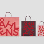
Åhléns by Happy FB
Åhléns began in 1899 as a small mail-order business. Aside from it being one of the oldest it has also grown to become one of the largest retail chains in Sweden. By carefully collating a variety of items across brands and price categories, the retailer maintains its relevance today, understanding and responding to the many ways in which its customers...
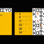
Kaiyo by Pentagram
Kaiyo, formerly Furnishare, is an online platform for the reselling and buying of used furniture, currently available in New York City and New Jersey, but with the intention to expand this internationally. Kaiyo picks up, inspects, cleans, photographs and uploads furniture to its online catalogue, easing the difficulties of selling secondhand online. It is part of a growing up-cycling movement,...

StrangeLove Lo-Cal Soda by Marx Design
StrangeLove is an Australian soft drinks brand that began with a four flavour range of energy drinks. Although mass-produced, each of these was created with the intention of evoking a taste of the homemade through carefully sourced and high-quality organic ingredients. The range was developed in response to energy drink brands who StrangeLove believed had failed to live up to their...

The Architect’s Bookshop by Garbett
The Architect’s Bookshop is a new design-focused retailer, located in Sydney’s Surrey Hills, devoted to the books of architecture and interior design, landscaping and urban development. The space was conceptualised as being more than a bookshop but a place to take time out to browse, a chance to engage with the material and form of the books, and as a place...
WeWork by Gretel
Founded in 2010 and headquartered in New York, WeWork began as a workspace provider and has grown to offer a broader infrastructure of community management and support, event programming and virtual network management for small and large businesses, entrepreneurs and freelancers. With significant and rapid growth WeWork worked with Gretel to align its visual identity with its purpose. “Framework”, a graphic route that...

TGC x Stenerhag by Carl Nas Associates
Tangent GC began as an organic garment and shoe care company developing products that intended to ensure longevity and entered the organic skincare market in 2016. Designed by Essen International TGC’s graphic identity, by way of a simple typographical expression, established a visual system of informational immediacy through the absence of superfluous stylistic detail and colour. This divided content and drew a...