Richard Baird
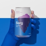
Berg by Marx Design
Marx Design worked with drinks company Lion to develop a brand identity for Berg, an alcoholic / hard seltzer free from artificial colours and preservatives aimed at “discerning drinkers who’ve been yearning for a more refined alternative.” Berg is available in three flavours, Berg Watermelon, Berg Lemon & Yuzu and berg Blackberry. While delivering a clarity and crispness of flavour, Berg is...
Ebb Dunedin by Maud
Design-savvy duo and father and son team Dylan and Frank worked alongside Gary Todd Architecture and interior design team INDYK Architects to develop Ebb, a contemporary boutique hotel located at the heart of Dunedin, a city on the South Island of New Zealand. Ebb is uniquely situated at the edge of the reclaimed Otago Harbour–a place where Polynesian travellers would...
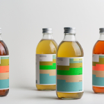
Swee Kombucha by Bedow
Although its recent rise to popularity has been rapid, running a quick search on ‘kombucha’ reveals that until the 21st century it had seen little category growth since its creation, more than 2000 years ago. For the uninitiated, kombucha is a fermented, non-alcoholic sweetened tea containing vitamins, amino acids and nutrients. This mix of familiarity (as a tea), its sweetness...
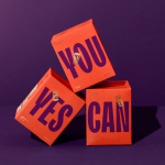
Yes You Can by Marx Design
Yes You Can is a non-alcoholic ready-to-drink range developed by former Olympic athlete Tyler Martin. It exists in the growing direct-to-consumer space alongside more traditional channels of distribution that includes major liquor retailers across Australia. Yes You Can launched with three products aimed at a young ‘social “seltzer” crowd’ looking for healthy and sophisticated alternatives to other ready-to-drink products. Helping...
The Art Gallery of New South Wales by Mucho
The Art Gallery of New South Wales, founded in 1872 as the New South Wales Academy of Art, suffered from a fragmented brand architecture. Addressing this through a rationalised and simplified system, and reinforcing the master brand across all Gallery collateral became a central part of developing of a new brand identity which would support a repositioning strategy that moved...
Autex Acoustics by Marx Design
With manufacturing and sales teams throughout Australia, UK and the USA, Autex has grown to become the market leader in interior acoustic products in New Zealand, and the go to choice for leading architects aspiring to reduce the amount of atmospheric noise within cutting-edge residential and commercial spaces. Their products are innovative, produced in a variety of forms and colours,...
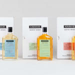
Kininvie by Here Design
The Kininvie distillery was established in 1990 as a third home for William Grant & Sons – it was initially built to relieve pressure on stock at neighbouring sites in Dufftown. Kininvie Works is a more recent development, created as an innovation arm to develop new recipes and processes. As such it is liberated from the rules and regulations that...
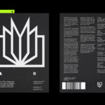
Metamorphoses by A Practice For Everyday Life
Metamorphoses is a contemporary art gallery that curates unique pieces by makers who turn one thing into another. It takes a special interest in works that are inspired by the past while displaying keen attention to present issues. These pieces, selected by the gallery, are often drawn from a body of work by artists who reflect on aspects of cultural...
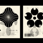
LogoArchive – Akogare 憧れ by Hugh Miller
LogoArchive returns with its fourth collaborative Extra Issue and first bi-lingual release, documenting the forms of Japanese logo design. Through the distinctive smaller format of the bound booklet LogoArchive seeks to surprise and delight with each new issue, introducing new collaborators to offer unexpected interpretations of the ubiquitous logo book. For this Extra Issue, Hugh Miller orchestrates graphic impact and...
OMA NY Monograph by Studio Lin
The Office for Metropolitan Architecture (OMA) is an international architectural practice operating within the traditional boundaries of architecture and urbanism. It was founded in 1975 in Rotterdam by architects Rem Koolhaas and Elia Zenghelis and alongside Madelon Vriesendorp and Zoe Zenghelis. OMA now has seven offices. This year saw the launch of OMA New York’s self-published monograph, designed by Studio Lin, that takes a look...
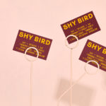
Shy Bird by Perky Bros
Shy Bird is a all-day café, rotisserie and bar in Cambridge, Massachusetts. Its core mission is to elevate chicken, and the experience of eating chicken into the realms of the exceptional through gastronomic know-how, a beautiful interior and a visual identity designed by American studio Perky Bros. Drawing their inspiration from the red junglefowl, the “original chicken” and descendant of the domestic chicken, and...
LogoArchive Issue 8
Inspired by a panel discussion that took place at London’s Somerset House in 2018 as part of the exhibition Print! the first issue of LogoArchive was conceived, designed and sent to print the following day. Channeling the independent spirit of niche publishing the LogoArchive zine series seeks to surprise and delight within the context and practice of mid-century logo archival...