Richard Baird
Sing King by Nomad
I’m going to break with a decade of convention and jump right in. I love this. I was sold as soon as I saw the logo, it’s in the BP&O Gallery. It’s rare you see this kind of logo today. It’s mostly, and understandably, logotypes that prevail today. Those that are striped down to function well on multiple devices. Blanding?...
Baseline by Garbett
‘There’s better ways to build’ is Baseline’s opening gambit on its landing page. And Surrey Hills-based Garbett worked with the government and commercial builder to bring this and its core values of simplicity, precision, clarity and transparency to life. ‘Every successful build needs the right foundation’. This notion is expressed through a single unit that expands and grows into a dynamic system of blocks, not quite...
Skateyogi by Order
The skateboarding learning curve is really defined by the individual. There are lessons (passed down or shared online), but much of it is practice (and patience). Further, and perhaps more importantly, skateboarding is expressive, it’s fused with personal style. Timeless tricks are given an individual twist that keep it evolving and competitive. Iconic skateboarding brands have grown out of the...
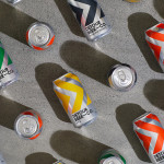
Detour Beer Co. by Weave
Craft beer has become a hugely competitive market to enter. It seems a rather obvious thing to write, but it’s quite something to have been part of the generation that saw its rise. It’s also provided a lot of great imagery for design blogs, and moved freely between both brand building and just plain visual delight. To see large fridges within...
NN North Sea Jazz Festival by Studio Dumbar/DEPT
After seeing Collins’ work for the San Francisco Symphony – a pioneering typographic and digital experiment with Swiss foundry Dinamo – I thought it would be some time before I’d be surprised by another visual identity in the music space. Sure, there’s an abundance of styles and artists to be inspired by within an art that has evolved in tandem...
Everybird by Marx Design
Few products have successfully integrated ethical, sustainable and environmental concerns with a product than coffee. It’s hard to imagine a time when the conditions of cultivation (both human and environmental) were not equal to flavour and – if we’re getting technical – whether the roast is blended or single origin. With its smaller volumes, the speciality coffee market has challenged...
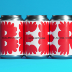
Pursue Hard Seltzer by OlssønBarbieri
New products, new markets and new consumer groups generate new aesthetics – or, at least, you would hope so. Too often, style migrates from one category to another, or the identity of a sub-culture (visually speaking), is exploited in a commercial context. This is where ‘authenticity’ emerges, to support genuine origin credentials, or to mask the appropriation with narrative context....
Mama Mexa by Seachange
Tacos are a Mexican staple, consisting of a small hand-sized corn or wheat-based tortilla topped with a range of fillings. They make for perfect on-the-go food, packed full of flavour. This combination of convenience (quick to make or eat) and tastiness has seen the traditional dish rise in popularity as an ideal product to package and sell in many markets....
Sitko Pizza Co. by Werklig
Pizza making is a lot like brand identity design. It has many potential configurations: it can be generic or wildly individual, but fundamentally, it’s systematic, a framework of organised elements. It is a base that holds a variety of communicative assets and techniques (the toppings, if you will). Appeal is determined by how well this is orchestrated, and how well...
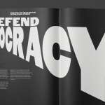
Forward Majority by Order
The balance of power in the US isn’t decided in Washington. It’s decided in state capitols where Republicans have gained overwhelming control, asserting systematic bias on voting rights and election processes. Through policies of suppression and gerrymandering, certain priorities and populations are often neglected in election results. Forward Majority is a political action committee on a mission to accelerate Democratic...
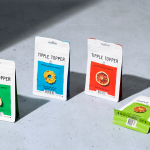
Tipple Topper by Marx Design
The pandemic catalysed the at-home market for a whole host of products. Paired with social isolation, it’s no wonder that one of the markets to benefit would be alcohol. Just like coffee, dried flowers and cleaning products, alcohol was packed down into letterbox-sized parcels and sent through the post. Mail-order cocktails have been a somewhat surprising development. The drama, theatre...
Eames Institute by Manual
American industrial designers Ray and Charles Eames fundamentally believed that good design should be available to everybody. It’s ironic, therefore, that today – in part due to institutional bodies, galleries, collectors and capitalism – their work has been elevated far beyond the reach of the common person. Design that was supposed to be accessible has become a symbol of taste,...