Richard Baird
Lookbooks by Studio Lowrie
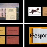
Lookbooks is an online bookstore that specialises in fun and quirky publications of the past. Recent acquisitions include Old Bohemian and Moravian Jewish Cemeteries by Petr Ehl, Arno Parik & Jiri Fiedler, 1991 and 101 Cake Design by Mary Ford, 1987. There is a cultural value to many of these, reflecting a time and particular niche interest, and how these...

Origen México by Blok
Origen México is a encyclopaedic collection of cultural reference points from Mexico, and an expression of love for its land and identity, edited by Ámbar Editores and Paola Gonzalez Vargas. Written in Spanish it covers things such as, Barro negro pottery; the black clay pottery of Oaxaca, Barrancas del Cobre; the six canyons in the Sierra Madre Occidental and individuals such...
Studio Showcase: Studio Hi Ho
Studio Hi Ho is a Melbourne-based branding and communication consultancy co-founded and led by Wesley Waddell and Patrick Scanlan. BP&O has been following and writing about Studio Hi Ho since 2013 . Their work covers a variety of industries, however, it is their work with property developer Milieu that has often found its way on to BP&O. These projects can...

Daniel Jensen: Current Events by Bedow
Daniel Jensen is a Swedish artist whose work moves between paintings, sculptures and drawings and explores themes such as society and pop-culture, film, literature and nature. His latest book, designed by Bedow, features artworks that are figurative and abstract, unrelated and absent a narrative. With such compelling and intense imagery of colour and dynamic shape, Bedow developed a format that...

Napier Street by Studio Hi Ho
231 Napier Street is an eleven apartment building, now sold out, created by property developer Milieu, set with the culturally rich part of Fitzroy, Melbourne. It is their first collaboration with architect Edition Office—an innovative practice with a strong conceptual focus—and part of the developer’s ongoing enquiry into and interrogation of the dialogue between architecture and place. This interrogation forms...

One Wellington St Kilda by Studio Ongarato
One Wellington, a partnership between LAS Group and Qualitas, is a new property development located in the Melbourne suburb of St Kilda, not far from eclectic Fitzroy Street. The building’s architecture—designed by KPDO and comprised of 181 apartments across two buildings of 26 and 10 floors—features flowing curves inspired by its bayside location, highly-customisable interior options and unobstructed sky views. One...

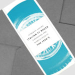
Lagotto by Studio Hi Ho
Lagotto is a new all-day café, wine bar and food store situated inside Nth Fitzroy, a residential property development project from Milieu located at the heart of Melbourne’s, inner north. Named after the truffle-hunting Italian dog breed, the café offers a relaxed European surrounding in which to enjoy an Italian menu with a “joyful vibrancy that avoids kitschiness or pastiche”. Studio Hi Ho,...

BP&O Collections — Best Awards Winners 2019
The Best Awards is an annual celebration of interactive, graphic, product and spacial design work from New Zealand and Australia, run by The Designer’s Institute. This year’s event took place on Friday the 4th October at Auckland’s Spark Arena where winning studios where awarded a Gold Pin for best in category, a Supreme Pin for best in discipline or a Purple Pin for those considered to...

Freadman White by Studio Hi Ho
Freadman White is a Melbourne-based architectural practice, led by Ilana Freadman and Michael White, that seeks to embed a curiosity-driven and experientially charged tension into their architectural work, reveal beauty in simple and overlooked settings, and design contextually informed structures with a disciplined whimsy. Further, rather than responding literally to physical surroundings, the practice develops spaces that are visually intriguing,...
Ascari by Blok Design
Ascari is an Italian restaurant which two locations, one on Queens Street East and another newly opened establishment on King St West. Toronto, Canada. It is named after the proprietor’s hero, Formula 1 legend, Alberto Ascari, (who was also known for his love of food). To reflect both the passion for good simple food and racing, design studio Blok developed an identity that brings together...

LogoArchive Issue 5
The technical limitations of the mid-century—the need for a steady hand and a precise mind for mechanical reproduction—demanded that an exceptional level of care and creativity be given over to shape and space, association and perception. These considerations created a rich corporate and consumer form language and range of graphic techniques. These have been partly marginalised, usurped by modern print...
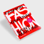
Fashion Central Saint Martins by Praline
Fashion Central Saint Martins documents and celebrates what has become one of the most influential fashion courses in the world. It is a collaboration between publisher Thames & Hudson and Central Saint Martins, and co-authored by Programme Director of Fashion Hywel Davies and Cally Blackman, lecturer in Fashion History and Theory. The Central Saint Martins Fashion Course has a legacy...