Richard Baird
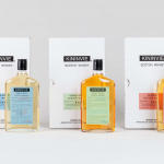
Kininvie by Here Design
The Kininvie distillery was established in 1990 as a third home for William Grant & Sons – it was initially built to relieve pressure on stock at neighbouring sites in Dufftown. Kininvie Works is a more recent development, created as an innovation arm to develop new recipes and processes. As such it is liberated from the rules and regulations that...
Metamorphoses by A Practice For Everyday Life
Metamorphoses is a contemporary art gallery that curates unique pieces by makers who turn one thing into another. It takes a special interest in works that are inspired by the past while displaying keen attention to present issues. These pieces, selected by the gallery, are often drawn from a body of work by artists who reflect on aspects of cultural...
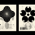
LogoArchive – Akogare 憧れ by Hugh Miller
LogoArchive returns with its fourth collaborative Extra Issue and first bi-lingual release, documenting the forms of Japanese logo design. Through the distinctive smaller format of the bound booklet LogoArchive seeks to surprise and delight with each new issue, introducing new collaborators to offer unexpected interpretations of the ubiquitous logo book. For this Extra Issue, Hugh Miller orchestrates graphic impact and...

OMA NY Monograph by Studio Lin
The Office for Metropolitan Architecture (OMA) is an international architectural practice operating within the traditional boundaries of architecture and urbanism. It was founded in 1975 in Rotterdam by architects Rem Koolhaas and Elia Zenghelis and alongside Madelon Vriesendorp and Zoe Zenghelis. OMA now has seven offices. This year saw the launch of OMA New York’s self-published monograph, designed by Studio Lin, that takes a look...
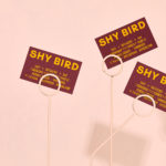
Shy Bird by Perky Bros
Shy Bird is a all-day café, rotisserie and bar in Cambridge, Massachusetts. Its core mission is to elevate chicken, and the experience of eating chicken into the realms of the exceptional through gastronomic know-how, a beautiful interior and a visual identity designed by American studio Perky Bros. Drawing their inspiration from the red junglefowl, the “original chicken” and descendant of the domestic chicken, and...
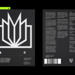
LogoArchive Issue 8
Inspired by a panel discussion that took place at London’s Somerset House in 2018 as part of the exhibition Print! the first issue of LogoArchive was conceived, designed and sent to print the following day. Channeling the independent spirit of niche publishing the LogoArchive zine series seeks to surprise and delight within the context and practice of mid-century logo archival...
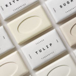
Tangent GC Organic Soap by Carl Nas Associates
Tangent GC began as a Scandinavian organic garment and shoe care company developing products that intended to increase the life of clothing and footwear, and entered the organic skincare market in 2016. The concern given to the longevity of skin becomes an understandable extension of that original intention. Carl Nas Associates, who have been working with Tangent GC on their packaging treatments for...

Ekta: 160 Faces by Lundgren+Lindqvist
160 Faces is a new publication from Swedish artist Daniel Götesson working under the name Ekta, designed by Lundgren+Lindqvist and distributed under the studio’s publishing arm ll’Editions. The book collates 160 drawings made by the artist in 2019, and sequenced, rather than in logical pairs and with a curated rhythm, but by using an algorithm developed by the studio. Applied...
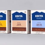
Ediya Beanist by Studio fnt
EDIYA is a well-established South Korean coffee brand, with franchised stores and array of drinks and branded products. It has the largest number of stores, exceeding that of Starbucks and any other international brands, opening its 3000th store at the end of 2019. With such a strong foothold in the market, and with the rise of at-home and ready-to-drink variations...
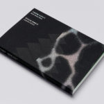
Leandro Erlich: Both Sides Now Catalogue by Studio fnt
Both Sides Now was an exhibition of works by Argentinian contemporary artist Leandro Erlich. This took place at the Seoul Museum of Art between December 2019 and March 2020. Erlich’s installations employ mirrors, reflective surfaces, water and other materials to form optical illusions with the intention of transforming familiar, everyday spaces. Studio fnt worked to develop an identity for the exhibition that would...
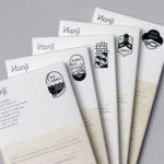
Hanji by Studio fnt
Hanji is a new brand of traditional Korean papers from KCDF created to, not just inspire interest in both professionals and the general public nationally and internationally, but to also serve as a symbol of the craft inherent to the paper making workshops. And further, to promote the paper’s potential and excellence internationally. Hanji began as a basic paper, a material...
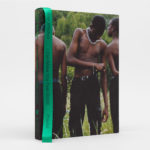
Tyler Mitchell ICMYFG by Studio Lin
“I often think about what white fun looks like and this notion that Black people can’t have the same. Growing up with Tumblr I would often come across images of sensual, young, attractive white models running around being free and having so much fun – the kind of stuff Larry Clark and Ryan McGinley would make. I seldom saw the...