Richard Baird
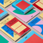
Arper 2018 by Clase bcn
Arper is an Italian furniture company producing chairs, tables and furnishings for community, work and home spaces. They seek an elegant resolution of function, form and finish which is founded on a total design philosophy that covers design, production and long-term impact. Arper commissioned Spanish studio Clase bcn to develop and design a new on and offline graphic identity for all...

Baluna by Grupa by Bunch
Grupa is an award-winning design studio and manufacturer of handmade furniture and lighting products for home, office and hospitality spaces. Building on over a decade worth of experience Grupa branched out into own brand products in 2012. From drawing board to design and development, production, packaging and distribution, the company has developed a total design philosophy and a product range that...
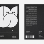
LogoArchive Issue 1
This first edition of LogoArchive in print was conceived, designed and sent to the printers for quotation within a day. It was inspired by a panel discussion that took place the day before at Somerset House as part of the exhibition Print! Tearing It Up. Today’s zine format and the revival of the independent publishing spirit of the past is a...
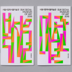
Buk Seoul Museum of Art 2018 Season by Studio fnt
Buk Seoul Museum of Art is an art museum and park where art, community and nature coalesce. It promotes cultural activity and interaction and brought cultural spaces and facilities to the North-eastern part of Seoul where they were previously lacking. The museum is marked not only by its distinctive forms, designed by Samoo Architects & Engineers and completed in 2013,...
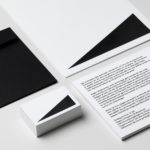
Hages by The Studio
Hages began selling shortwave radios in Stockholm during the 1940s and is one of the oldest of its kind in Sweden. While the retailing of electronic goods has changed dramatically, sold increasingly online and on price by large chains, Hages has remained true to an independent spirit and established and developed a solid reputation. To coincide with the opening of their second store,...
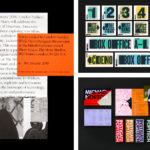
BP&O Collections — Events & Exhibitions
A continually updated collection of some of the best graphic identity design work created for events, conferences and festivals, reviewed and published on BP&O. This post features work by Pentagram, Collins and Toko, and includes simple postcards and poster sets, and extends to those that cover signage, lanyards, t-shirts and tote bags. Projects typically share a strong visual impact and...

The Clydeside Distillery by Manual
The Clydeside Distillery was set up in 2014 with the intention of reviving distilling in Glasgow and telling the story of Scottish Whisky through a visitor’s centre. The distillery was set up by the Morrison’s, a family with a century-long history within the Scottish Whisky industry as both owners and operators. San Francisco based Manual travelled to Glasgow to work closely with founders, architects...
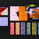
PopTech by Collins
PopTech is an annual three-day conference that takes place in October in the American town of Camden, Maine. It is an occasion where people from across many different fields meet with the intention of discovering and exploring a shared potential that reaches far beyond individual aspirations and goes on to inspire positive collective action. Attendees include scientists, technologists, humanitarians, designers, artists,...

Feroz by Mucho
Feroz, located on Barcelona’s Carrer Tuset, is described as being a fashionable destination that transitions from evening restaurant into late-night club. It features a distinctive interior design created by Pablo Peyra Studio. This exists in the grey area between something close to period colonialism, moments of kitsch and modern luxury. It has an undeniable character and specificity, one that is fully committed...

FranklinTill by Commission
FranklinTill is a futures research agency working with lifestyle brands, design-orientated businesses and organisations in a variety of sectors to explore and implement design, material and colour innovation. Their services include conducting, analysing and communicating research and bringing this to life through strategic insights, publications and experiences. FranklinTill’s clients essentially turn to them for insight into form, colour and material, and their...
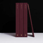
Christopher Hall Somata Collection by Two Times Elliott
Christopher Hall is an internationally renowned furniture and interior designer from New Zealand with studios in London and Istanbul, with a third due to open in Barcelona soon. His interiors and bespoke furniture collections are characterised by a sensitive integration of the classical and the contemporary, a material refinement and sculptural elegance. Somata, his latest collection of 32 handcrafted pieces, is an...
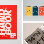
BP&O Collections — Brochures No.7
The seventh collection of brochures, annual reports, catalogues and event programmes published on BP&O. These mix layout, material choice and print finish, and between them effectively utilise colour, type, proportion, image, texture and paper contrast to communicate, compel and contribute to a distinctive graphic identity. This selection features uncoated and coated papers, spot colours, blind deboss and die cuts, and includes...