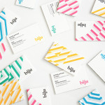
Biju Bubble Tea by ico
Biju is bubble tea brand and cafe located in London’s Soho district that looked to bring and translate a product and experience well-established in South East Asia to the UK in a way that would appeal to a modern discerning market. This was achieved by focusing on fresh, natural and high quality ingredients, a simple menu with an emphasis on taste, a focus on the social aspects...
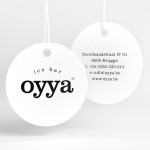
Oyya by Skinn
Oyya is an ice bar located in the Belgium city of Bruges that retails a variety of frozen yoghurts, yoghurt drinks, waffles and 28 ice creams — the most in the city. Its brand identity, which included logotype, print, signage, uniforms and interior design created by local studio Skinn, while largely logo-centric and having a strict consistency across stickers, tubs,...
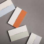
Tamarindo by La Tortillería
Tamarindo is a kitchen and bar with an international menu due to open in October 2014. Located in Ourense, Spain, Tamarindo was created as a refreshing alternative for local walkers who are used to traditional bars and restaurants, and is described as a place with two distinct moods and spaces, the casa cocina or house/kitchen, a place for coffee and...
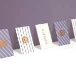
Violeta by Anagrama
Violeta is described by Anagrama, the design studio behind its new brand identity and packaging treatment, as an Argentinian bakery, named after its founder, that creates hand-crafted breads, cakes and pastries from its location in the Buenos Aires district of Las Lomas de San Isidro. Following more than 30 years of business and in lieu of a plan to begin...

The Empire Café by Graphical House
The Empire Café is a pop-up venue located in Glasgow’s Merchant City that looks to explore Scotland’s relationship with the North Atlantic slave trade through coffee, sugar, tea, cotton, music, visual art, poetry, debate, workshops, walks, film and literature. The café’s brand identity, a ship-like logo, bold sans-serif typography and both a limited and rich approach to print, designed by Graphical House, is described as linking a contemporary ‘artistic programme...
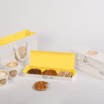
Waffee by A Friend Of Mine
Waffee is an authentic Belgian waffle and coffee chain with locations across Melbourne and Altona. Developed by holistic design practice A Friend Of Mine, Waffee’s brand identity, which included logo and packaging design, menu boards and a signage system created in collaboration with architects Hecker Guthrie and Foolscap Studio, mixes a typographically adventurous logotype with an illustrated character to establish a rich communicative duality and contrast...

Casa Virginia by Savvy
Casa Virginia is a restaurant and culinary project in Mexico City, created by chef Mónica Patiño, that mixes the highest quality cuisine and meticulous processes with the familiarity of eating at home. This fusion of restaurant quality and easiness is perhaps most acutely manifested throughout its interior design, a space that juxtaposes the modesty and simplicity of wooden and basketweaved furniture...
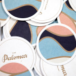
The Palomar Restaurant by Here
The Palomar Restaurant is located at the heart of London’s Soho district with a menu that is described as being reflective of the foods of modern-day Jerusalem and influenced by the cultures of Southern Spain, North Africa and the Levant. Its interior features a zinc kitchen bar, mosaic marble and reclaimed parquet floors, marble surfaces, oak panelled walls, a skylight providing natural light and royal blue...
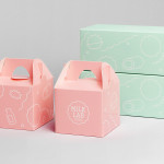
Milk Lab by Studio fnt
Milk Lab is a 100% pure milk dessert, flake and roll cake restaurant located in the South Korean city of Busan. The restaurant’s visual identity, designed by Studio fnt, conveys some of the chill and smoothness of its desserts through the rounded terminals of a slab serif logotype, its container, similarly styled monolinear icons, icy photography and a milky pastel colour palette, and...
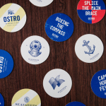
Seafarers & Ostro by Inhouse
Seafarers is a recently rejuvenated seven floor habour front building located in Auckland’s Britomart precinct that will house, over two floors, Michelin starred chef Josh Emett’s flagship restaurant, due to open in stages throughout 2014, as well as brasserie and bar Ostro. The brand identity for the building, restaurant and brasserie, developed by Inhouse, draws on the rich history of the space—once known as...
Persillade by Clear Design
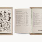
Persillade is a Melbourne cafe opposite Jolimont Station with a large double shop front and an interior of reclaimed wood and bottles, white tiles, steel, glass and classic furniture. Design studio Clear were commissioned by owners Aidan and Tanya Raftery to develop a graphic identity for the cafe that would bring some “much needed soul, texture and community to the very private...

Taco República by Bielke&Yang
Taco República is described by Bielke&Yang, the design studio behind its visual identity, as Norway’s very first genuine taqueria. Wanting to avoid some of the Mexican restaurant clichés, Bielke&Yang juxtaposed classic typography and a guacamole based color scheme with a colourful and contemporary illustrative panel created by Uglylogo, which offers a humorous take on the “enthusiasm and craziness” of the local community prior...