Design Inspiration
JKR overhauls football club Sporting CP by doing what it does best : plundering heritage to build a robustly simple, contemporary brand identity
JKR is perhaps – in recent-ish years at least – best known for its work with Burger King, undoubtedly one of the most oft-cited rebrands of the last decade in design circles. Then it did KFC; before that, the RSPCA, alongside a raft of other household name entities which aren’t acronyms – Uber, Boddingtons, Yahoo, Billington’s sugar. In short, hugely...
Studio Blackburn’s branding for Ellis Butchers is unflinchingly carcass-centric, yet somehow so full of warmth
As a vegan of two decades, and a squeamish one at that, the thought alone of a “whole-carcass butcher business” makes me feel rather queasy – so it’s a testament to Studio Blackburn’s incredible skill that despite my personal nonsense, I absolutely adore this branding project. And I love it not in spite of things like the utterly unflinching, raw-flesh-laden...
Exemplary brand collabs don’t compromise: the joyful designs for Midnight Hotdog ‘dog fur mist’ by SMLXL
Back in February, we covered a project that was so delightful I still think of it often (not least thanks to its utterly ridiculous, ingenuously earwormish jingle): HotDog, with its branding by SMLXL. There was, and is, so much to love about this identity: there’s the logo formed of two dogs, one sniffing the other’s bum, reduced to its most...
If you’ve visited an off-licence, you’ve heard of Lebara – now thanks to Verve, the brand finally makes sense
Lebara. Le-ba-ra. It’s a word that’s become so familiar to many of us, sonically at least, as to have become almost part of the wallpaper. But semantically, conceptually, literally – do many of us really know what it is? If you’re anything like me or the very small sample of around five to six people who just happened to be...
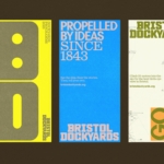
How & How takes a smart, bright collage-based approach to overhauling Bristol Dockyards
For those outside of Bristol, it’s all too easy to assume that the city is merely a place where Triphop and Dubstep were born; a Mecca for trustafarian types on a perennial ‘gap yahhh’ wearing those trousers that make people look as if they’ve had some sort of toilet issue; a place where the streets are paved with ketamine and...
Base’s brand for smalltown ’80s seafood spot Ray’s is a masterclass in earnestness done well
It’s always a joy to see an international design agency lavish the same respect, care, and craft on a relatively unknown, thoroughly local, but much-beloved brand as they would on, say, a household name product or world-renowned institution. And that’s exactly what Base Design (Kanal, 4P’s, The Huntington) – which has outposts in New York, Brussels, Melbourne, Geneva, and Saigon...
Studio Gruhl’s Global Hypercolour-esque brand identity for Rerun looks to “see what robots see”
Rerun is described as “a unified data layer for physical data that helps teams build smarter robots” which consists of two parts: Rerun SDK, “an open source library and tools for logging, storing, querying, visualising, and training on multi-rate, multimodal data”; and Rerun Hub, a “data catalogue and backend for large scale storage, access, and streaming of robotics data from...
Who knew a spiral could do so much? Pentagram did, in this joyful Tokyo museum identity
The Museum of Narratives (also known as MoN Takanawa) is located in Tokyo’s Takanawa Gateway City, and opened a couple of months ago in March 2026. It’s something of an experimental museum with a cross-disciplinary programme spanning visual art, installations, and performances themed around everything from society to art to science, manga, and anime; merging traditional Japanese culture with hyper-modern,...
Creative Spark’s bold, no nonsense identity for hair loss brand Leo
Leo is billed as a “hair rejuvenation brand”, founded by duo Jason Saks (who carries the rather sweet, and quite funny job title of Director of Hair Loss) and his son Joe, with the broad aim to make hair loss feel “less isolating and less complicated”. According to Manchester-based design agency Creative Spark, which has created the superb new identity,...

Another Collective’s identity for smash burger brand Brusco deftly reinvents classic burger joint design tropes
Food trends are a funny old thing aren’t they. And just as design trends are never just about ‘aesthetics’ – the ‘what something looks like’ divorced from the world around it, food trends aren’t just about ‘edible stuff’, or ‘what things taste like’. Such movements both hold up a mirror to, predict, and feed back to us (literally, in the...
Koto breathes new life into Floridian arts institution The Norton
The Norton Museum of Art began life in 1941 in West Palm Beach, Florida, and in the near-century since, its whole raison d’être has been based around its role as a place where “art and life meet as a part of everyday art”. As such, it acts as more than a look-don’t-touch-style gallery space: the garden, gallery and restaurant are...
OlssønBarbieri rewrites the rulebook on ‘formality’ in its melodrama-infused Theaterbaren identity
Oslo’s Nationaltheatret (simply translated to English as National Theatre) first opened its doors more than a century ago in 1899, and has since come to not only reflect, but actively shape cultural identity in Norway. Having staged everything from more traditional Norwegian dramas from the likes of Henrik Ibsen to experimental contemporary works, the building itself is also a marriage...