Logo
The Stack Group
Fourth Canvas
2026, Nigeria, Technology, Finance
BP&O Voices
Packaging:
Now You See It
Packaging expert Lisa Cain shares her opinion on Studio Bland’s work for Australian butter brand Bu Deli....
Koto breathes new life into Floridian arts institution The Norton
The Norton Museum of Art began life in 1941 in West Palm Beach, Florida, and in the near-century since, its whole raison d’être has been based around its role as a place where “art and life meet as a part of everyday art”. As such, it acts as more than a look-don’t-touch-style gallery space: the garden, gallery and restaurant are...
Logo
Smart Stream
Pony
2026, UK, Finance
Logo
Escola + Natureza
Polar
2026, Brazil, Conservation
BP&O Voices
Packaging:
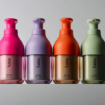
Friction Kills Fantasy
Packaging expert Lisa Cain shares her opinion on Beta Design’s work on Fussy’s refillable hand soap....
OlssønBarbieri rewrites the rulebook on ‘formality’ in its melodrama-infused Theaterbaren identity
Oslo’s Nationaltheatret (simply translated to English as National Theatre) first opened its doors more than a century ago in 1899, and has since come to not only reflect, but actively shape cultural identity in Norway. Having staged everything from more traditional Norwegian dramas from the likes of Henrik Ibsen to experimental contemporary works, the building itself is also a marriage...
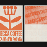
Mecca Coffee by Christopher Doyle & Co.
Sydney-based Mecca Coffee started life in 2005, and has since become one of the city’s leading specialty coffee roasters, importers, and retailers. To mark the company’s 20th anniversary, Christopher Doyle & Co. (Ortto, Machine Screen Printers, New Aim), which is also based in Sydney, was brought in to evolve its brand identity across “packaging, merchandising and collateral systems,” Doyle explains....
BP&O Voices
Packaging:
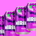
Loud Mouth
Packaging expert Lisa Cain shares her opinion on PepsiCo Design and Innovation’s work on Mirinda....
Logo
Machine Screen Printers
Christopher Doyle & Co.
2026, Australia, Printing
Logo
MaxiHealth
M/OTG
2026, USA, Health
Strangers by Auge Design
Strangers is a new confectionery brand created by Valgosa, a family company dating back to 1912 and seemingly best known as purveyors of saffron. It seems an unlikely starting point for such a boldly positioned brand – and one boasting an exquisite visual identity thanks to Milan-based Auge Design (Erbert, Ginori 1735). According to Auge – which worked across everything...