
Leandro Erlich: Both Sides Now by Studio fnt
Both Sides Now, a title borrowed from Joni Mitchell’s famous song, is a solo exhibition of Argentinian contemporary artist Leandro Erlich’s work that took place at the Seoul Museum of Art between December 2019 and March 2020. Erlich’s installations, often receiving international acclaim, mirrors, reflective surfaces, water and other various materials to create optical illusions to transform familiar, everyday spaces such as...

Tangent GC Organic Detergents by Carl Nas Associates
Tangent GC began as a Scandinavian organic garment and shoe care company developing products that intended to increase the life of clothing and footwear, and entered the organic skincare market in 2016. The longevity of skin being an understandable extension of that original intention. The company’s graphic identity, a typographical system designed by Essen International under the creative direction of Carl Nas, established...
Vessel Floats by Order
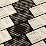
In the Brooklyn neighbourhood of Greenpoint sits Vessel Floats, a new flotation and deprivation therapy spa that draws on the continuing interest in concepts such as mindful living and wellness. Through considered interior design and visual identity, the latter developed by New York-based studio Order, Vessel Floats intends to further develop and bring to modernity an experience that has been around...
LogoArchive Issue 6
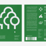
LogoArchive was conceived, designed and sent to print in a day. It was inspired by a panel discussion at Somerset House as part of the exhibition Print! Now on to its sixth numbered release, LogoArchive continues to reconfigure itself with each new issue with the intention of surprising and delighting, particularly at a moment of intentional difficulty. This issue, launched...
Queremos Sonreír by Mucho
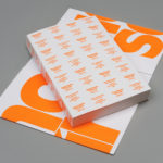
Queremos Sonreír – Activar la Cultura Local (We want to smile – Activating local culture) brings together the voices of a variety of cultural agents–from citizen collectives and activists to artists and managers of cultural programmes–who are generating actions that intend to stimulate local culture, empower citizens, develop learning processes and further critical thinking. Through these voices the book explores questions around citizen...
Northstar Film Alliance by Bond
North Star Film Alliance (NSFA) is a joint venture between Estonia, Latvia and Finland. The Alliance intends to develop and promote themselves as one filmmaking region to international film and TV productions. It is a competitive marketplace, with other countries provide low tax rates and incentives to film big-budget spectacles on their stages using local crews. Together, the three countries...
Norwegian Banknotes by Metric Design
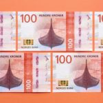
If you consider all the tangible expressions of a country’s brand, money, with its essential function as a measure of value, could easily be considered one of the most important touchpoints. In this sense a country’s banknote is often the first point of physical contact with that place prior to travel. The shape, feel, colour, language, security features, artwork and heritage of...
LogoArchive ExtraIssue – Past & Present
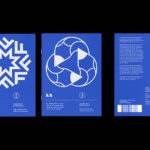
The distinctive smaller format of LogoArchive–a zine on mid-century symbols that channels the independent spirit of niche publishing–has created a space for experimentation and collaboration with those who also share a similar interest in symbols and corporate identity programmes of the past. BankerWessel is one such studio. Their brand identity work brings the spirit of mid-century form language into the...
OneFourFive Clarendon by Studio Brave
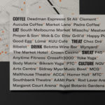
OneFourFive Clarendon is a modern workspace, developed by Salta, designed by Architectus and created for future-focused businesses looking to situate themselves in Southern Melbourne. The development aims to attract like-minded progressive people with a conscious focus on connectivity and local activity. With this in mind, Melbourne-based Studio Brave developed the narrative ‘A Life Unlimited’ as a way to express how the...
MoMA by Order
The MoMA logotype, set in Franklin Gothic No. 2 and designed by Ivan Chermayeff, is an icon, and has been part of the New York urban landscape and international museum graphic vernacular since its creation in 1964. With evolving communicative needs and channels, the MoMA logotype was made a central graphic device as part of a new visual identity launched in...

Self, Made by Collins
Exploratorium is a “public learning laboratory” and San Francisco based museum that enables visitors to question and make sense of the world around them through hands-on exhibits that touch upon science, art and human perception. Its summer 2019 exhibition, Self, Made, continues in the spirit of exploration but turns this inward, tackling the theme of human identity. It did this...
Albert Oehlen Book by Zak Group
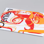
Albert Oehlen is a German contemporary artist. Working with canvas, he brings together a bricolage of figurative, collaged, abstract and computer-generated elements, with a particular focus on process and self-imposed parameters such as limited colour palettes. His work, as described by the Serpentine Galleries, currently running a Oehlen solo exhibition till February 2020, engages with the history of painting through Expressionist brushwork, Surrealist...