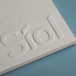
Síol Studio designed by Mucho
San Francisco-based architecture studio Síol recently commissioned multidisciplinary design agency Mucho to develop a new visual identity solution that would embody “their philosophy of conceptual, clean architecture for both interior and exterior design.” Based around a customised sans-serif logotype executed as a blind deboss, the identity conveys the familiar architectural themes of light and shadow formed within three-dimensional space and a practical, corporate efficiency....
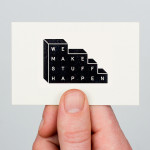
We Make Stuff Happen by Maddison Graphic
We Make Stuff Happen is a London and Brighton-based creative marketing and production company that specialises in exhibitions and events with past campaigns that have included covering an entire building in clothes, placing a car in a block of ice and putting an open air cinema on top of a skyscraper. Their visual identity, created by Maddison Graphic, features a stacked uppercase...
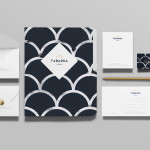
Tabarka Studio by Anagrama
Tabarka Studio specialises in ‘detail-oriented’ and handcrafted tiles made from terracotta, a ‘clay-based ceramic earthenware that becomes porous when fired creating a worn-out, antique finish’. Anagrama, the design agency responsible for the studio’s visual identity and collateral, describe their approach as embracing an ‘archaic timelessness’ that reflects the products through the use of a blue and white scale pattern, tiled icon...
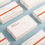
Mark Cappellino by Perky Bros
Mark Cappellino is described by Perky Bros, the Tennessee-based studio behind his new logo and stationery, as a leadership consultant who travels the worldwide helping individuals and teams better communicate through stronger relationships. Their design solution, “based on the behavioural beliefs that shape his practice”, “plays on the typographic device called the em dash, meaning an interruption of thought” and...
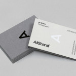
Ali Sharaf by Mash Creative
Ali Sharaf is a Bahrain-based commercial photographer who specialises in fashion, beauty and lifestyle images for the advertising and editorial markets. He describes himself as contemporary, upbeat, outspoken and edgy. Inspired by a shared interest in Swiss modernism and adopting a less is more approach, design studio Mash Creative developed a new brand identity for Ali that combines an iconic...
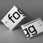
Fogg by Bunch & Kurppa Hosk
By purchasing overcapacity from international telecom networks, Fogg Mobile provides a fixed cost mobile data traffic service for people who want to avoid unexpected roaming bills when travelling abroad. Through the animate and evolving qualities of computer generated imagery and a combination of unbleached paper, stitching, flat coated colour and silver polypropylene, Fogg’s visual identity, created by Kurppa Hosk and developed by Bunch, delivers...
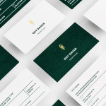
Guy Bauer by Anagrama
Guy Bauer is a Chicago-based video production company ‘committed to creating stories that elicit feelings’. The company’s new visual identity, based around a quill logo – conveying their story-telling philosophy – a stationery solution that references the film industry in its layout and a deep green color palette, designed to convey depth and reliability, was recently developed by independent design agency Anagrama....
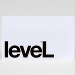
Level Improvements by Studio Hi Ho
Level Improvements is a small-scale builder that possesses, in the words of Hi Ho – the studio responsible for their new identity – a characteristic often lacking in others in their field — a high level of craft and attention to detail. To reflect these values, Hi Ho developed a ‘easily managed and straight talking’ visual identity solution that leverages the...
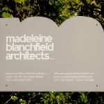
Madeleine Blanchfield by A Friend Of Mine
Madeleine Blanchfield is a Sydney-based architectural firm described by A Friend Of Mine, the design studio behind their new brand identity, as having a tactile and understated approach with an appreciation of light and detail. Qualities reflected through the subtle but tactile combination of material, print finish and ample space across the firm’s stationery....
Helsinki Food Company designed by Werklig
The Helsinki Food Company provides design and production services – including consultation, styling, photography and recipe development – to regional broadcast, print and event sectors. Created by visual communications agency Werklig, their visual identity – an economical single colour print treatment of a logo-type constructed from a single consistent line weight and culinary-related letter-forms across a variety of tactile and dyed craft substrates – sets...
Nosive Strukture by Bunch
Nosive Strukture is a structural engineering firm who describe themselves as having a ‘unconventional attitude towards business, working environment and life itself.’ Inspired by their approach and a studio space of angled detail, independent design agency Bunch, “developed a stark, technical identity based around tensegrity structures and a black and white palette” executed across triplexed business cards, cardboard file folders, signage...
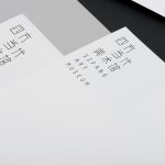
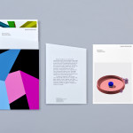
Sifang Art Museum by Foreign Policy
Sifang Art Museum is a gallery and creative space located in the Pukou region of Nanjing, China dedicated to art, architecture and international collaboration. Their visual identity, a bilingual logo-type set across a collateral of unusual trapezoidal cut detail and monochromatic colour palette—developed by Singapore-based creative and strategic design agency Foreign Policy—draws together the themes of architectural space, the dimensionality created by light and shadow,...