
Prism by Matchstic
Prism is a new thermally fused laminate brand from Arauco—a global manufacturer of sustainable wood products—created to appeal to the art and design market currently dominated by well-known brands. Arauco worked with American graphic design studio Matchstic to develop a brand identity for Prism that would communicate the value of a product often perceived as low-value within a market that often favours reclaimed woods and...
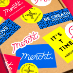
Mercht by Robot Food
Mercht is a UK based custom merchandise business, created by the team at Awesome Merchandise, that offers its customers a risk-free way to design, sell and ship customised t-shirts and wearable accessories, through an online showcase and print on demand service. It is a platform where, if designs sell well, both parties profit, with neither loosing if they do not. Leeds based graphic design...
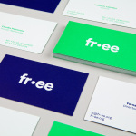
FR-EE by Pentagram
Fernando Romero Enterprise (FR-EE) is an architecture and design firm with offices in New York and Mexico City. The firm was founded by award-winning architect Fernando Romero, and is recognised internationally for their work on projects such as the new Mexico City International Airport and Museo Soumaya. FR-EE worked with Pentagram partner Natasha Jen, plus team, to help them capture and convey their innovative and pioneering spirit and democratic...
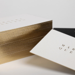
Marquez Quevedo by La Tortillería
Márquez Quevedo is a San Pedro based architectural practice that balances space, proportion, materials, form and colour to compose creative spaces filled with movement. Drawing on what is described as the practice’s sophisticated style and vision Mexican graphic design studio La Tortillería developed a new brand identity for Márquez Quevedo with a sense of space, structure and materiality, both in image and physical texture, that links business cards, stationery...
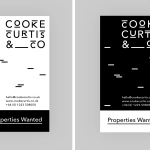
Cooke Curtis & Co. by The District
Cooke Curtis & Co. is an award-winning estate agent with an office in Cambridge, United Kingdom. It has a portfolio and a thorough understanding of properties throughout the city and in neighbouring villages. Although the business was established last year, its founders have over thirty-five years of industry experience. Local graphic design studio The District were commissioned by the estate agent to develop a visual identity that...
Hernesaaren Ranta by Werklig
Hernesaaren Ranta is an outdoor seaside area, located to the south of the Finnish capital of Helsinki, open during the summer months. It has food vendors, boat docks and terraces, and is part of an ongoing development project that also includes residential buildings. Graphic design studio Werklig were commissioned to create a comprehensive brand identity system for the entire area that, alongside...
Have A Great Day Films by Hey
Have A Great Day Films is the production company of French filmmaker Jérôme de Gerlache. Jérôme is said to have a taste for professional risk-taking and a distinct way of making short films, advertisements and TV comedies. Barcelona based graphic design studio Hey recently worked with Have A Great Day Films to develop a brand identity that would reflect Jérôme’s personality, convey a...
Moomin & Moomin Shop by Bond, Finland
The Moomins are characters from a book, picture book and comic book series created by Swedish-speaking Finnish illustrator and writer Tove Jansson. These were published in Sweden and Finland between 1945 and 1993. Alongside the comic strip, the characters have also featured in their own television series and film, and populate the theme park, Moomin World, on the Finnish island...
Tina Frey Designs by Mucho
Tina Frey is an American homeware designer with a studio in San Francisco. She is inspired by the fluid lines of the sea, the curves and contours of nature, objects picked up while traveling, and the translucent colour of ice lollies and jelly beans. The design of each of her products—which include plates, bowls and utensils—is rooted in simplicity and functionality. These are sculpted...
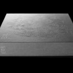
EDL Laminates by Bravo
Working with manufacturers in Italy, Korea and Taiwan EDL provides high pressure laminates for architects and interior designers throughout Asia, and is dedicated to anticipating trends, adopting the latest technologies and introducing its own break-through innovations that amome from a decade of industry experience. To coincide with EDL’s tenth anniversary, and a push further into the international market, the company worked with Singapore and New York...
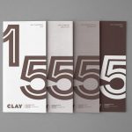
Clay by Studio Claus Due
Clay is a museum of ceramic arts and crafts, located in the Danish town of Middelfart, west of the capital. Exhibits range from a 235 year old plate to more recent and experimental pieces from contemporary artists. The museum worked with Studio Claus Due to develop a new visual identity system. This included business cards, stationery, signage, packaging, print communication and website, unified...
Momento Film by Bedow
Momento Film is a Swedish independent production company working with national and international directors to create compelling and surprising documentaries and fiction films. The company looks to confront subjects from alternative angles with the intention of shifting perspectives. This intention is the basis of its new visual identity, created by Stockholm based graphic design studio Bedow, and conveyed through the three-dimensional qualities...