The Best of BP&O — September 2015
Opinion by Richard Baird Posted 30 September 2015
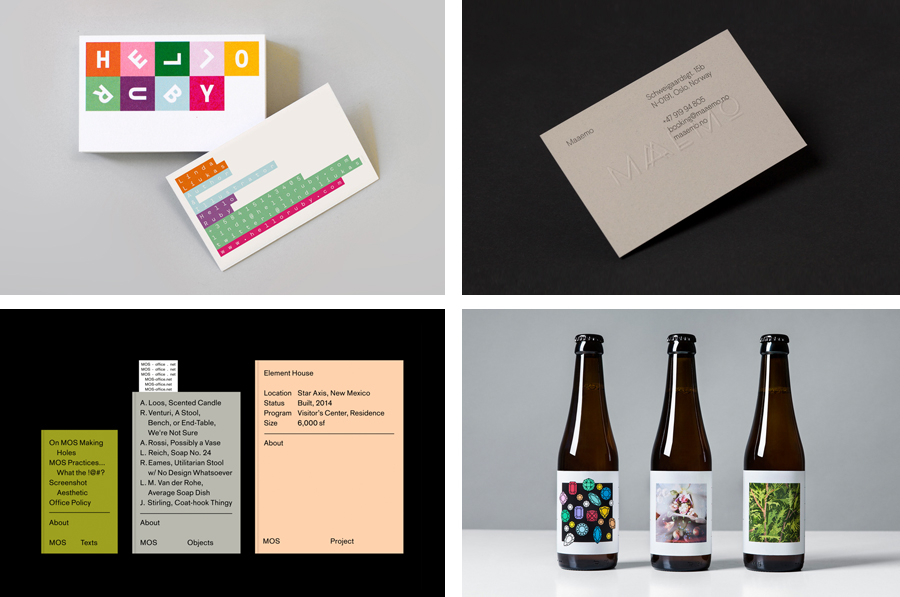
September’s highlights included Bielke&Yang’s work for K. Apeland and Norwegian Presence, Lundgren+Lindqvist’s brand identity for Edouard Malingue Gallery and Snøhetta’s work for Edvard Munch High School. However, there were five projects that stood out and have made it into BP&O’s Best Of Series, a feature that brings together the most interesting and unusual projects published on the site each month for another opportunity to be seen and shared.
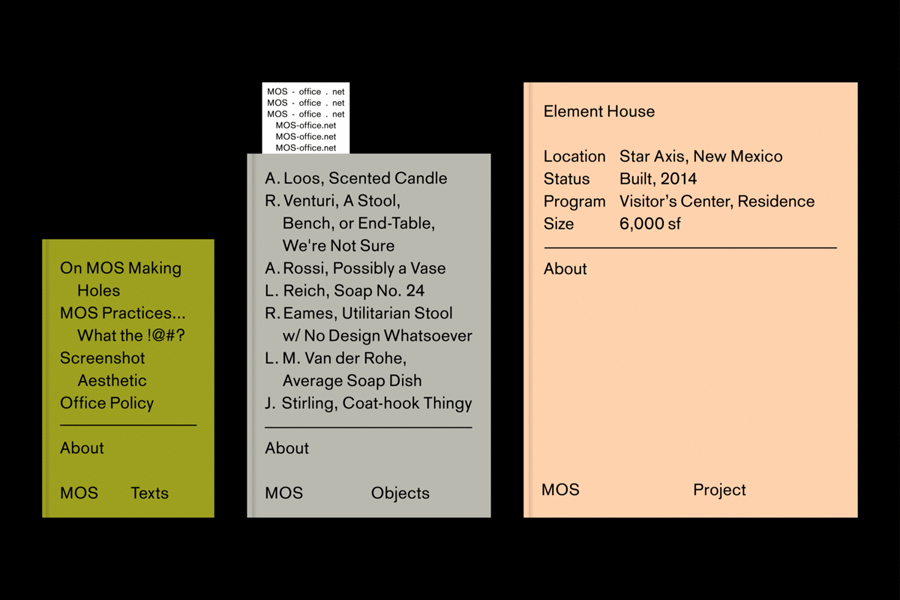
MOS Architects by Studio Lin, USA
MOS is a New York based architectural practice that mixes playful experimentation with serious research. The practice, as it exists now, following two years of what seems to be an informal approach, was established in 2005, and has worked through a range of design experiments it describes as a make-believe of architectural fantasies, problems, and thoughts on what the practice would be building in the future. MOS now has a broad portfolio that includes institutions, housing and retail, installations, furniture, essays, software and film.
MOS Architect’s brand identity, developed by Studio Lin, has a stripped down aesthetic with an intentionally generic quality that uses on-demand printing processes to cover promotional pieces, request for quote documents, publications and stationery.
See more of this project here
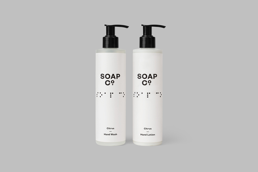
Soap Co. by Paul Belford Ltd, United Kingdom
Soap Co. is a UK based social enterprise, luxury soap manufacturer and brand, that provides employment to people who are blind, disabled or disadvantaged. These individuals make up 70% of their team. All profits go back into the business to create and fund further job opportunities.
Soap Co. recently launched a range of luxury handmade soaps, hand washes and hand lotions, available as Black Poppy & Wild Fig, Citrus, and White Tea varieties, that feature a new brand identity and packaging design treatment developed by Paul Belford Ltd. The launch of this range, and its new design, coincides with a move from the local to the national market.
See more of this project here
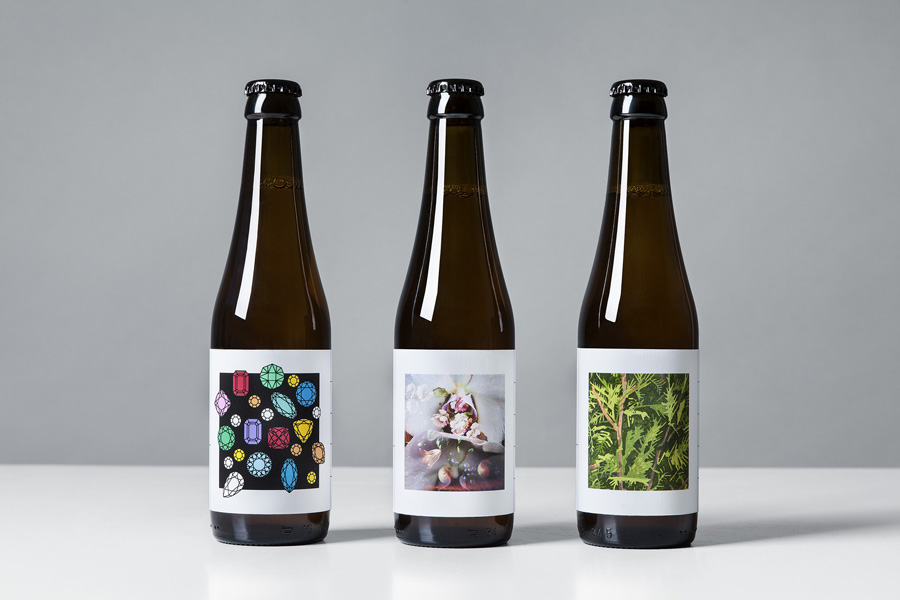
O/O Brewing 2015 by Lundgren+Lindqvist, Sweden
O/O Brewing is a high-end craft brewery, set up in 2011 by Olle Andersson & Olof Andersson, with premises in the Swedish city of Gothenburg. O/O worked with graphic design studio Lundgren+Lindqvist, who had created labels for a variety of other O/O beers, to develop treatments for three new brews for the spring of 2015. The studio revised and simplified the design system from earlier releases but continued to embrace a collaborative approach with artists and designers.
See more of this project here
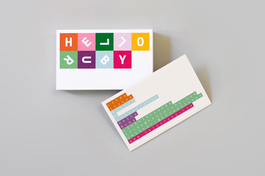
Hello Ruby by Kokoro & Moi, Finland
Hello Ruby offers an accessible and playful way for children to learn about technology, computing and coding, guided by Ruby, an illustrated character, and her animal friends. Founded in 2009, with the intention of being a small art project, and initially limited to a book, Hello Ruby has rapidly grown into a popular and comprehensive children’s computing brand, following a Kickstarter campaign in 2014.
Hello Ruby is a natural progression from the limited brick building tools of early learning and the spontaneity of drawing, to the infinite possibilities and creative freedom of the digital world. This step, and connection, proliferates Hello Ruby’s brand identity, developed by Helsinki based graphic design studio Kokoro & Moi, through brightly coloured blocks, hand cut paper-based type and pictograms, hand drawn illustration, and monospaced font use.
Read more of this article here
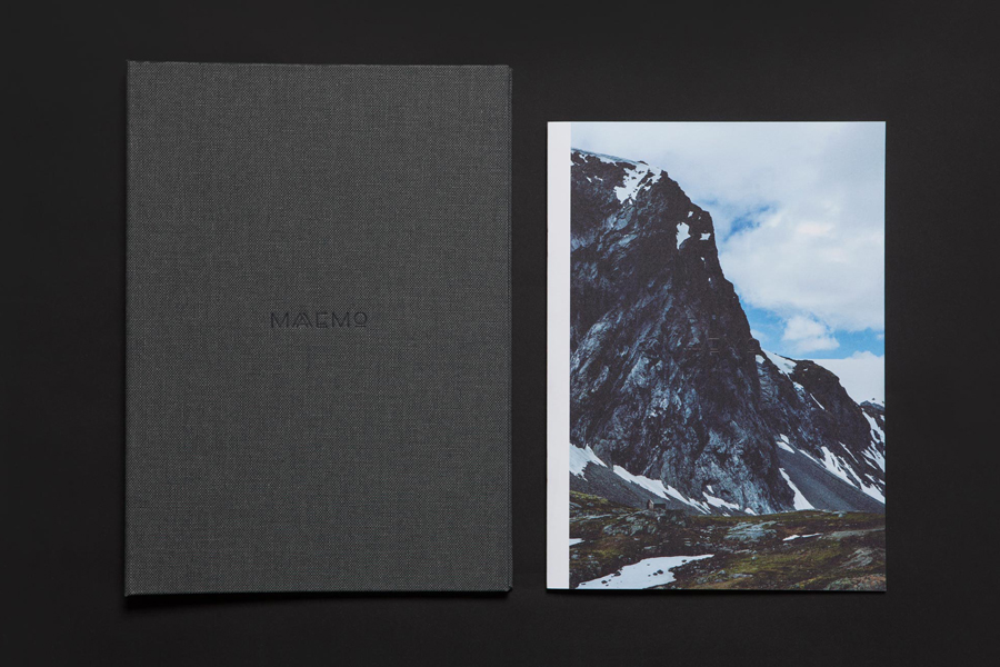
Maaemo by Bielke&Yang, Norway
Design studio Bielke&Yang worked with Norwegian two Michelin starred restaurant Maaemo to develop a holistic brand identity solution informed by the philosophies and creative practices of its unique dining experience and culinary expertise.
The studio’s brand identity design, which encompassed website, custom typography, colour, the tone and content of images, and the tactile finishes of welcome notes, magazines and folders, was created to collectively reflect, contribute to, and communicate Maaemo’s unique philosophy. A philosophy that sees innovative dishes created from organic and seasonal ingredients, farmed in a way that is sensitive to the ecology of their environment, and prepared with an original and creative mindset.
Read more of this article here

