The Best of BP&O — September 2016
Opinion by Richard Baird Posted 29 September 2016

September’s highlights included Franklyn’s work for Vonhof, Uproot by Believe in to celebrate the studio’s expansion into Canada, and Bond’s brand identity for Moi Helsinki. However, there were five projects that stood out, and have made it into BP&O’s Best Of Series.
This feature brings together some of the most unusual / distinctive projects published on the site each month for another opportunity to be seen and shared. These typically balance a strong communicative concept with a compelling aesthetic that appropriately plays with a mix of form, colour, type and layout, as well as material, texture, image and print finish.

London Design Biennale 2016 by Pentagram, United Kingdom
London Design Biennale is the world’s first purely design-focused biennale from the team behind London Design Festival. It will take place between the 7th and 21st of September at Somerset House. The theme of this year’s event, Utopia by Design, will include entries from 37 countries. These intend to interrogate the history of the utopian idea, engage with some of the issues faced by humanity and suggest possible design-led solutions, all in honour of the 500th Anniversary of Sir Thomas More’s political philosophy classic Utopia. Entries will be judged by The London Design Biennale International Advisory Committee and Jury, composed of leading creative design experts worldwide.
London Design Biennale features an impactful and thoughtful brand identity designed by Pentagram partner Domenic Lippa and team, informed by his decade-long relationship with the London Design Festival. This included wordmark, printed collateral and signage based around an expanding and contracting visual device, a bright orange ink and strong typographical contrast.
See more of this project here


Sentralen by Metric Design, Norway
The former building of Norway’s first savings bank, which began as a social initiative to serve the working class people of Oslo, now houses Sentralen, a mixed-use cultural centre. Sentralen continues in the traditions of the bank, functioning as a hub for innovators concerned with and looking to address present day societal issues.
The centre houses over 350 tenants working in cultural production, while also accommodating business needs through small meeting spaces and venues for conferences. It also intends to bring the neighbourhood to life with activities throughout the week in one of its six performing arts venues, a classic cocktail bar and restaurant with a menu of contemporary Norwegian dishes.
Scandinavian studio Metric Design was responsible for the visual identity design of Sentralen (main entity), Sentralen UNG (youth) and Sentralen Restaurant (plus bar & cafeteria), as was well as way-finding program and website which connects guests with all there is to experience at the centre. While a comprehensive project, this article focuses on visual identity and way-finding components, and was kindly written by New York-based Canadian freelance designer, writer and educator Josh Nychuk.
See more of this project here

Stevenson Systems by Socio Design, United Kingdom
Stevenson Systems is an American business that specialises in ‘space accounting’, an industry that measures architectural spaces using a variety of laser scanning and measuring devices, goes on to classify areas within larger spaces and produces reports and offers consultation on how to draw the most value from these.
Stevenson Systems pride themselves on their ability to add value, rather than just delivering data, and providing their clients with an array of services that look at the complete lifecycle of a building, from purchase through development and finally to sale. The company is a leader in its field, a position it has held since its foundation in 1986, however, its brand identity fell short articulating this authority amongst a crowd of newer competitors.
London-based Socio Design recently worked with Stevenson Systems to develop a brand identity that would counter the perception that they just measured buildings and would communicate an authority. The studio was responsible for strategy, logo and iconography design, stationery, brand guidelines, art direction and website, both design and build. Underpinning this rebrand is a new mission statement “Discovering Hidden Value”.
See more of this project here

Primary by DIA, United States
Primary is a new co-working space in New York that introduces health and wellness into the workplace. This can be seen in the approach to interior design; a mix of wood, contemporary soft furnishings and greenery, experienced in the fusion of office space, business events and relaxation classes, and expressed throughout Primary’s brand identity, created by graphic design studio DIA.
DIA were tasked with establishing a sophisticated and approachable system that would appeal to a health conscious and savvy entrepreneurial audience. This is achieved in the simplicity of form, both in type and mark, a generative component that adds a breadth of colour, and the way that this then reaches across lighting, signage, website, scheduling tool, social media, business cards and brochure.
Read more of this article here

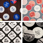
BIFAN 2016 by Studio fnt, South Korea
Bucheon International Fantastic Film Festival (BIFAN) is an eleven day event that takes place each year in a number of locations throughout the South Korean city of Bucheon, a satellite city of Seoul. It celebrates world cinema; specifically those dealing with the themes of love, fantasy and adventure, plays host to international, Asian and national premieres, and includes, alongside the 320 films from 49 countries, a variety of performances, concerts and art and design exhibitions that draw their inspiration from the films being screened.
BIFAN 2016 is the largest festival to date, and features a revised brand identity, designed by Studio fnt. This reaches across a plethora of printed materials that include, by are not limited to, posters, banners, merchandise, tickets, signage and a catalogue to promote its 20th anniversary.
These are linked a by a new logo, the “Cell Of Fantasy”, that hints at the expansion of BIFAN’s fantastic imagination, and implies a close connection with opposing visual cues, such as yin and yang, in order to stimulate the eyes and the creativeness of the audience. This is paired with a graphic system of shapes and illustration that intend to express the energy, adventure and imagination of an event unlike any other.
Read more of this article here