BP&O Collections — Black & White
Opinion by Richard Baird Posted 26 April 2017
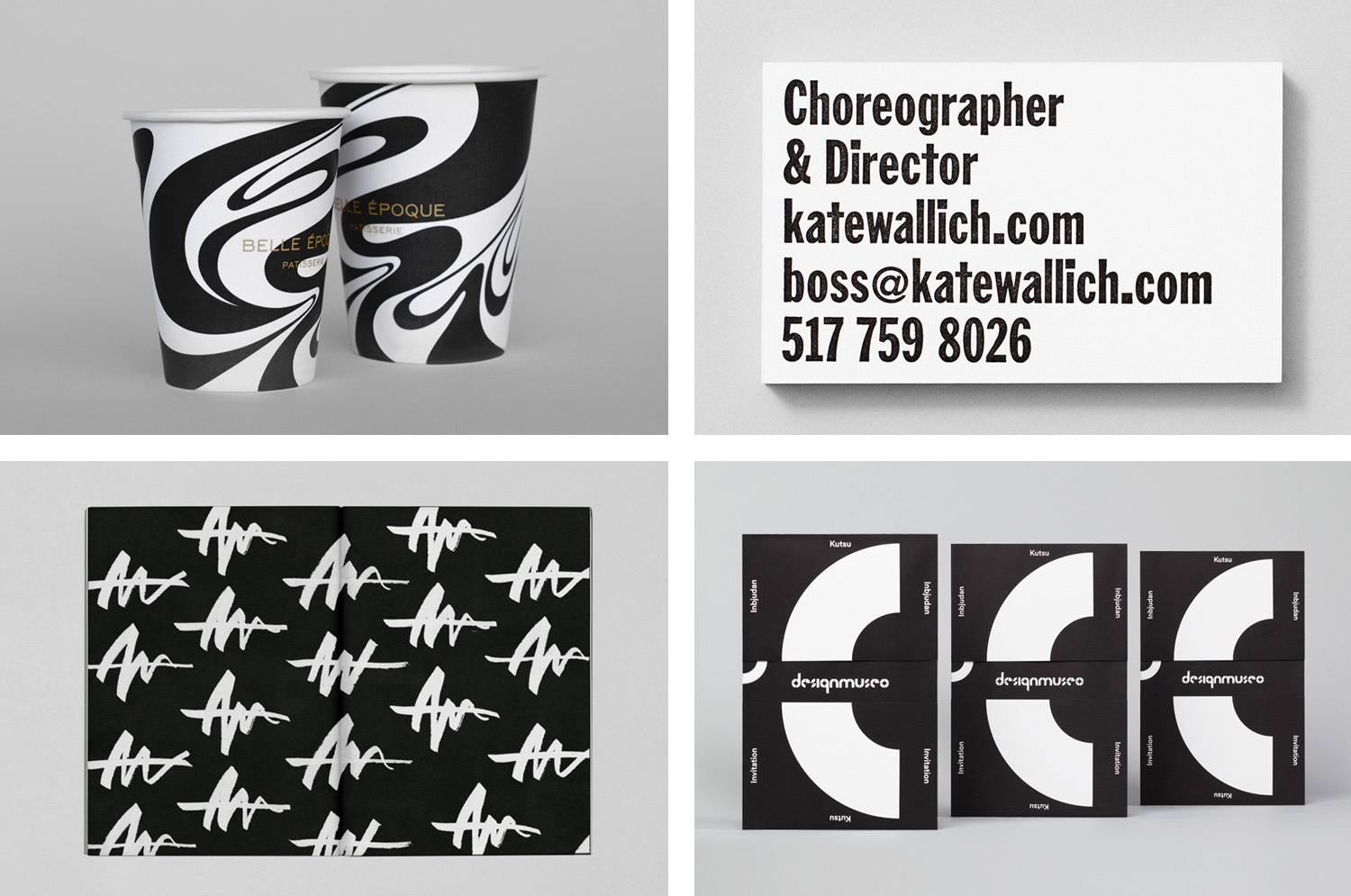
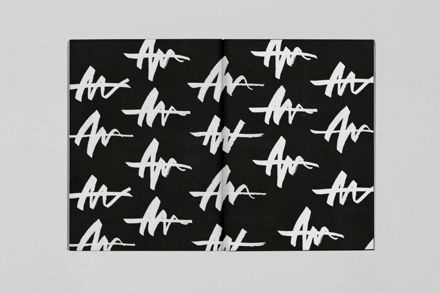
A collection of some of the very best brand identity and packaging design projects, reviewed and published on BP&O, that effectively use black and white as a prominent component. This post features work by design studios Bond, Distil and DIA, and covers simple logo and stationery projects, and extends to broader brand identity programmes that include packaging and print communications. With the reduction of colour comes the emphasis of type, form and pattern, a play with contrast and proportionality, material, structure and finish. Be sure to click the images to read more about the project and the intentions of each design. Also check out Blue in Branding here.
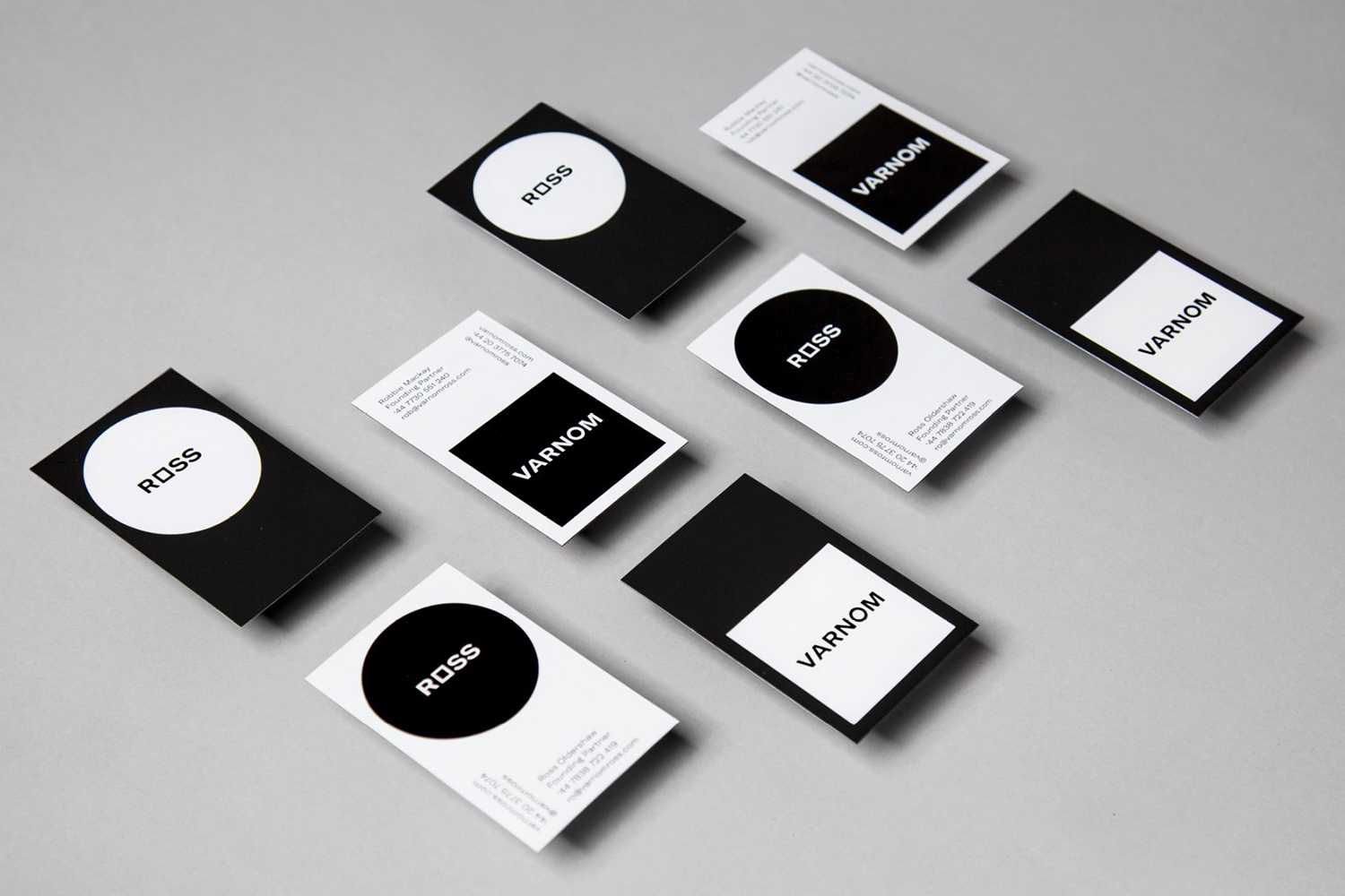
Varnom Ross by Bibliothèque, United Kingdom
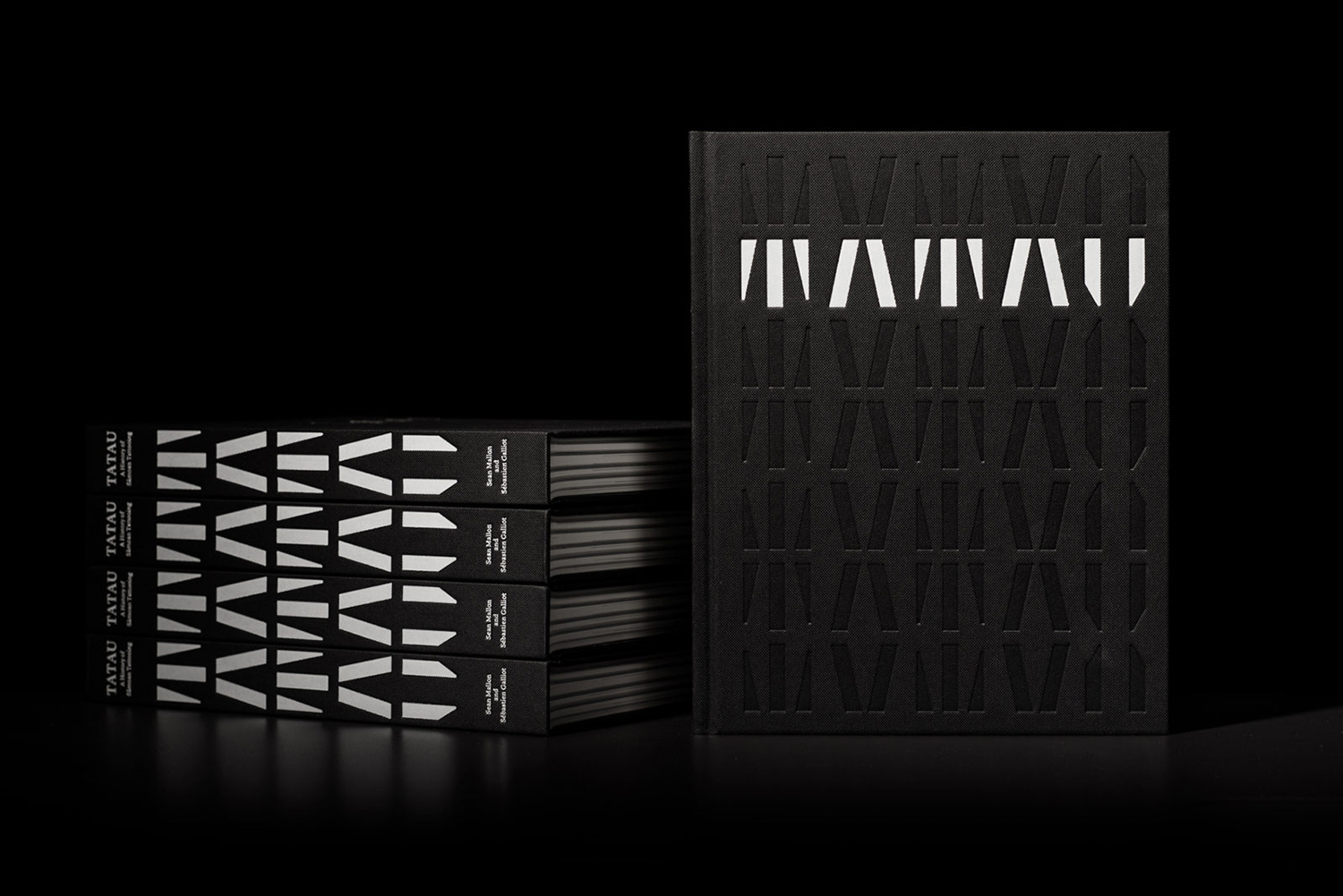
Tatau by Inhouse, New Zealand
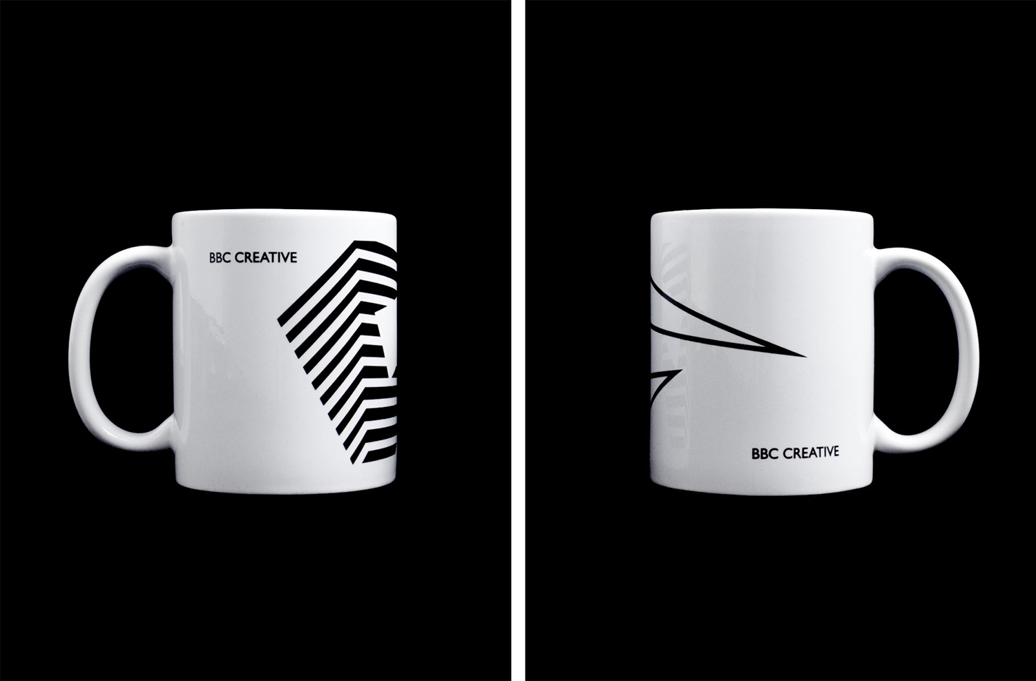
BBC Creative by Spin, United Kingdom
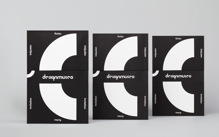
Designmuseo by Bond, Finland
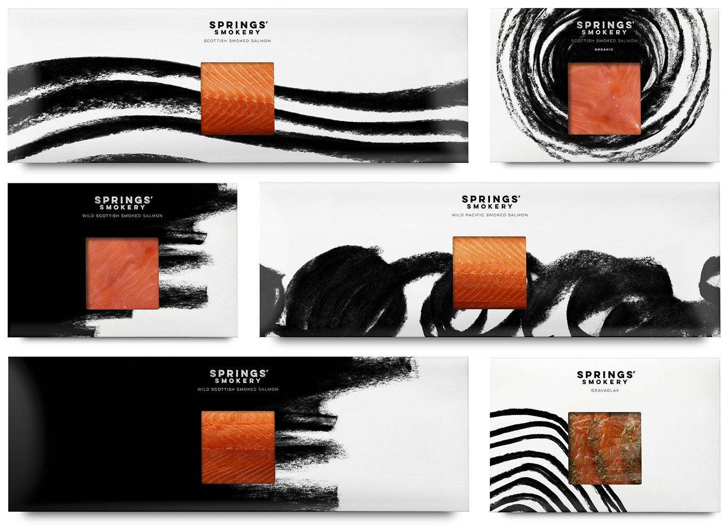
Springs’ Smokery by Distil, United Kingdom
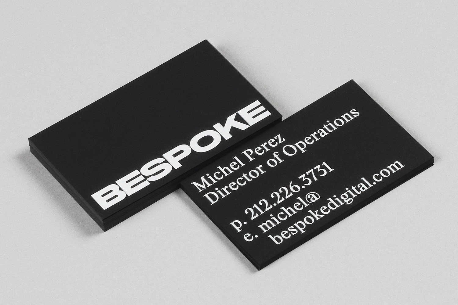
Bespoke by DIA, United States
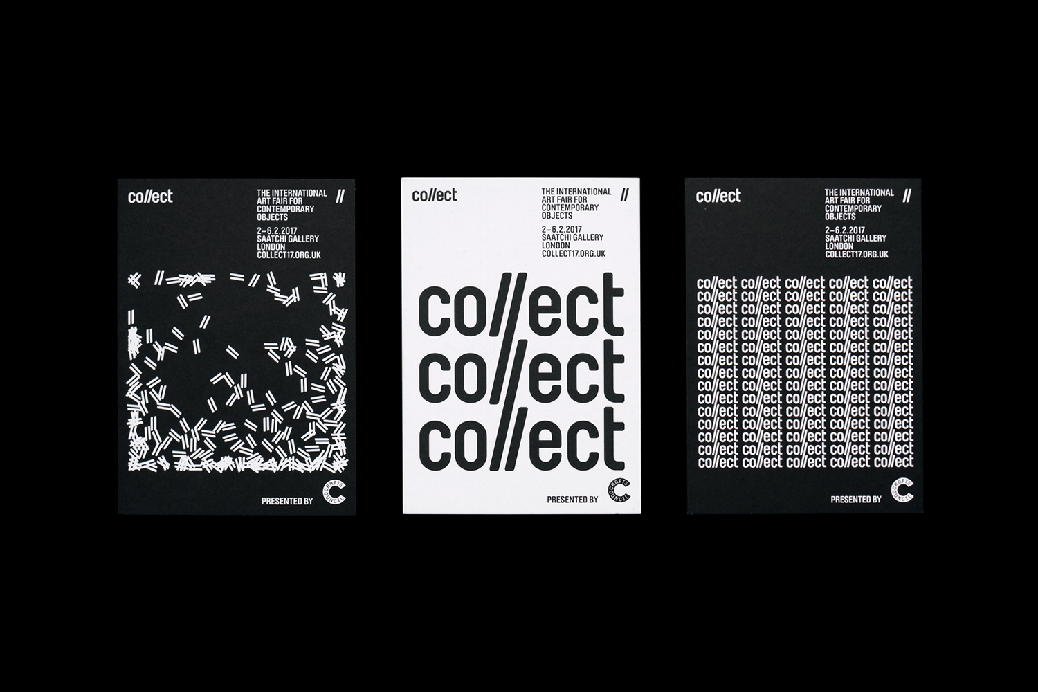
Collect by Spin, United Kingdom
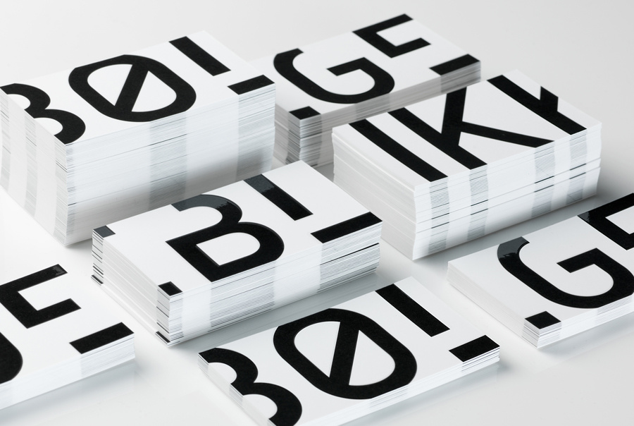
Bølgeblikk Arkitekter by Tank, Norway
Kate Wallich by Shore, United States
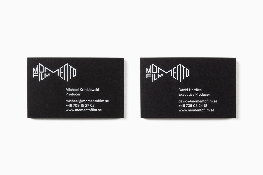
Momento Film by Bedow, Sweden
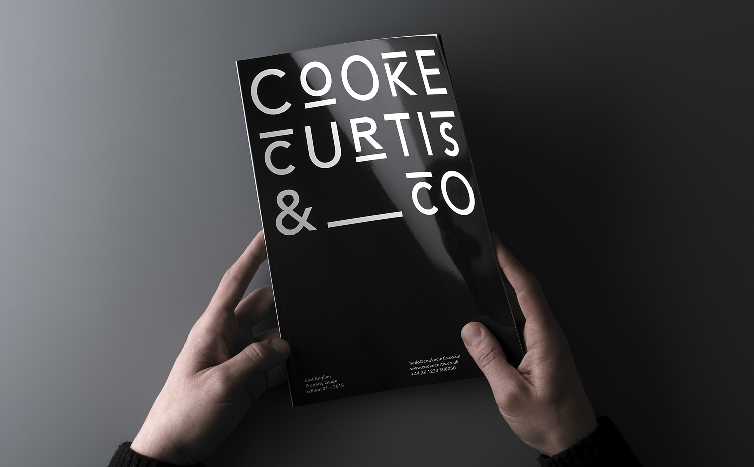
Cooke Curtis & Co. by The District, United Kingdom
Edouard Malingue Gallery by Lundgren+Lindqvist, Sweden
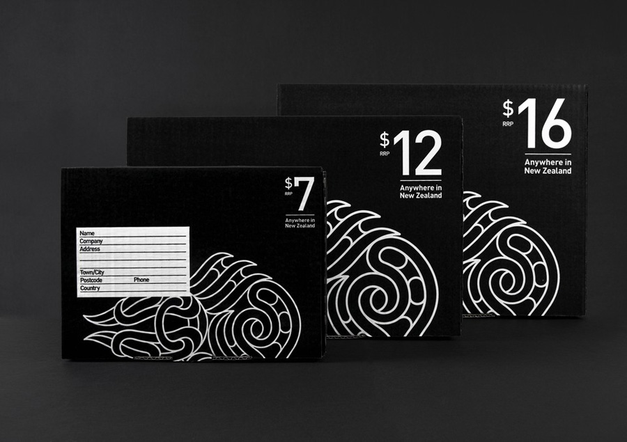
New Zealand Post Simplified Sending by Designworks
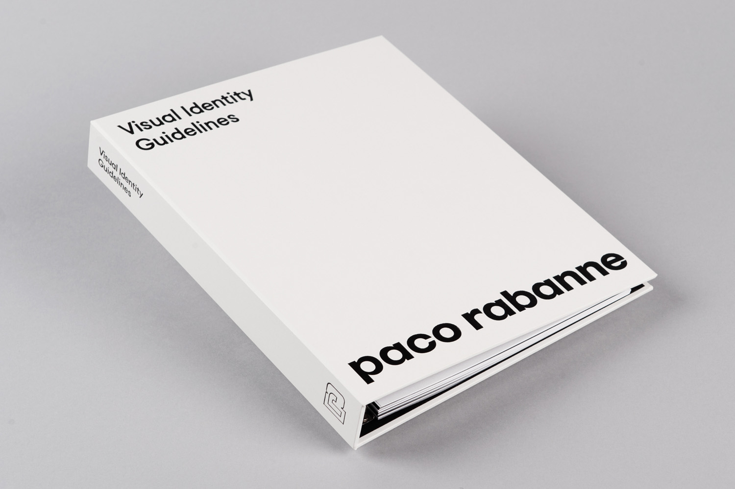
Paco Rabanne by Zak Group, United Kingdom
Life Or Death by DIA, United States
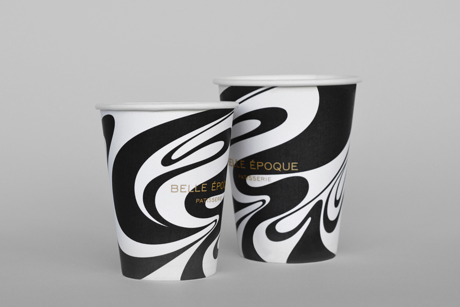
Belle Epoque by Mind Design, United Kingdom
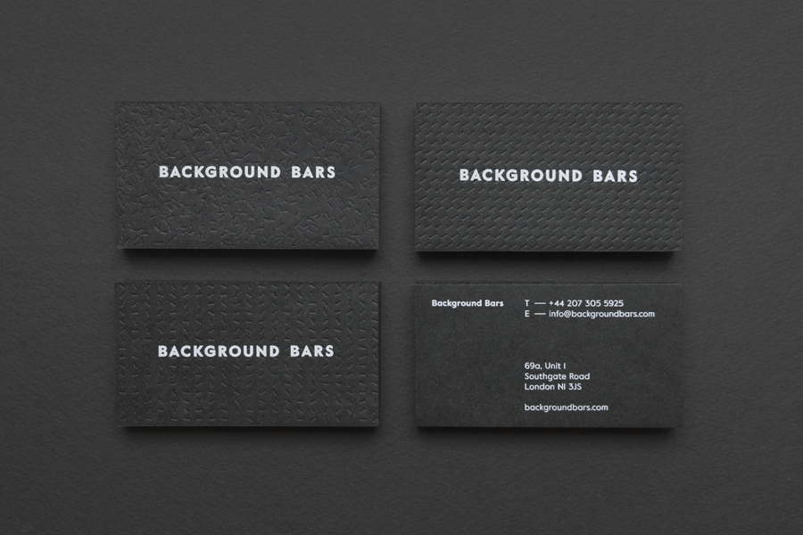
Background Bars by Campbell Hay, United Kingdom
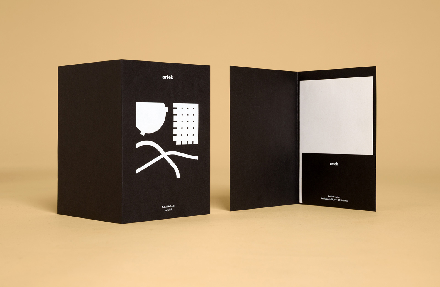
Artek Helsinki by Tsto, Finland
Newscope Films by Karoshi, United Kingdom
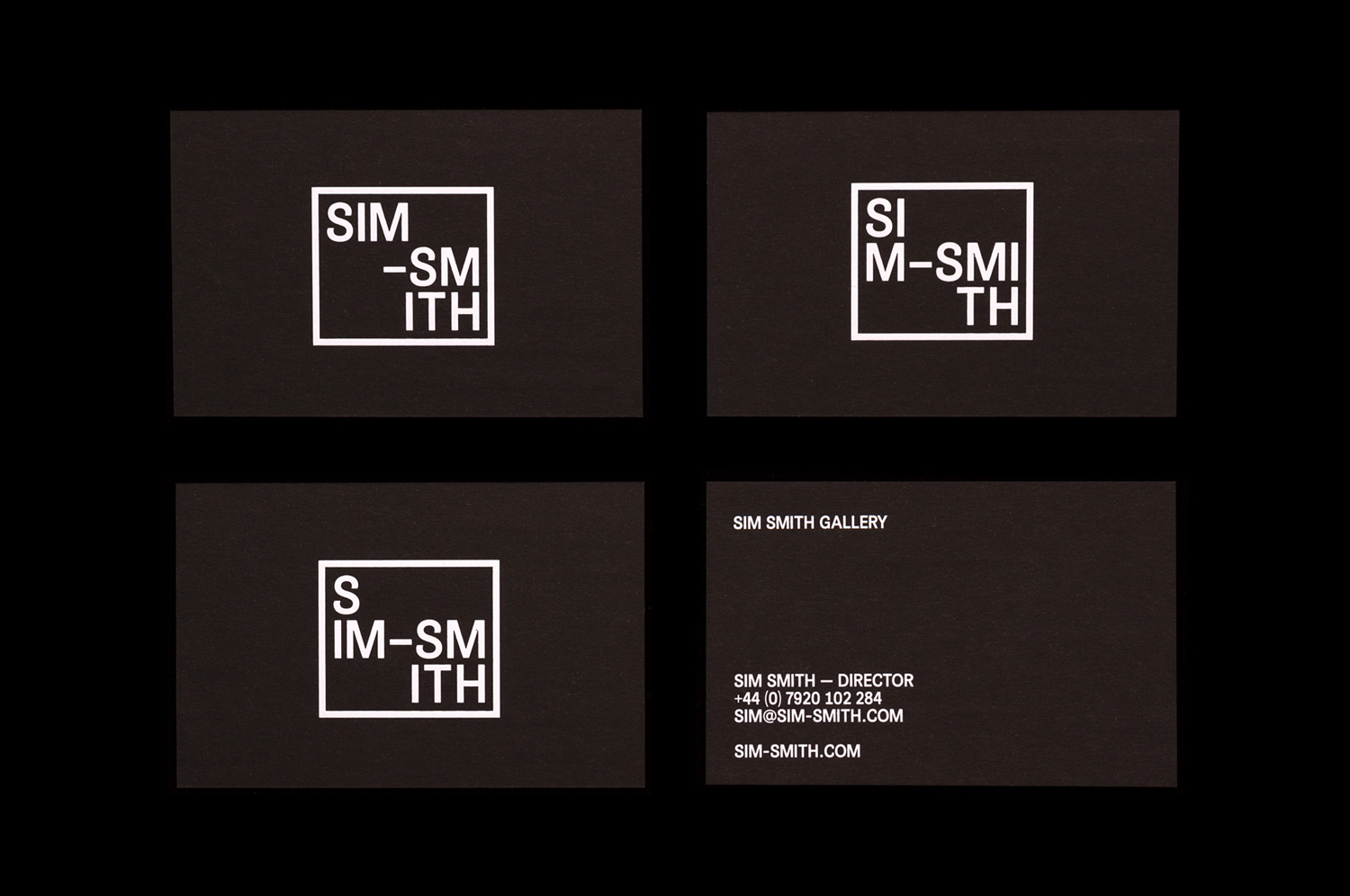
Sim Smith Gallery by Spin, United Kingdom
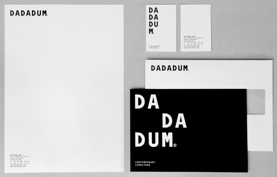
Dadadum by Demian Conrad Design, Switzerland
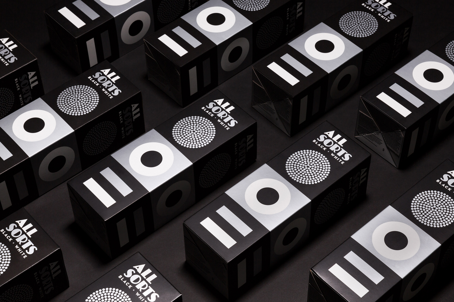
Allsorts Black & White Edition by Bond, Finland
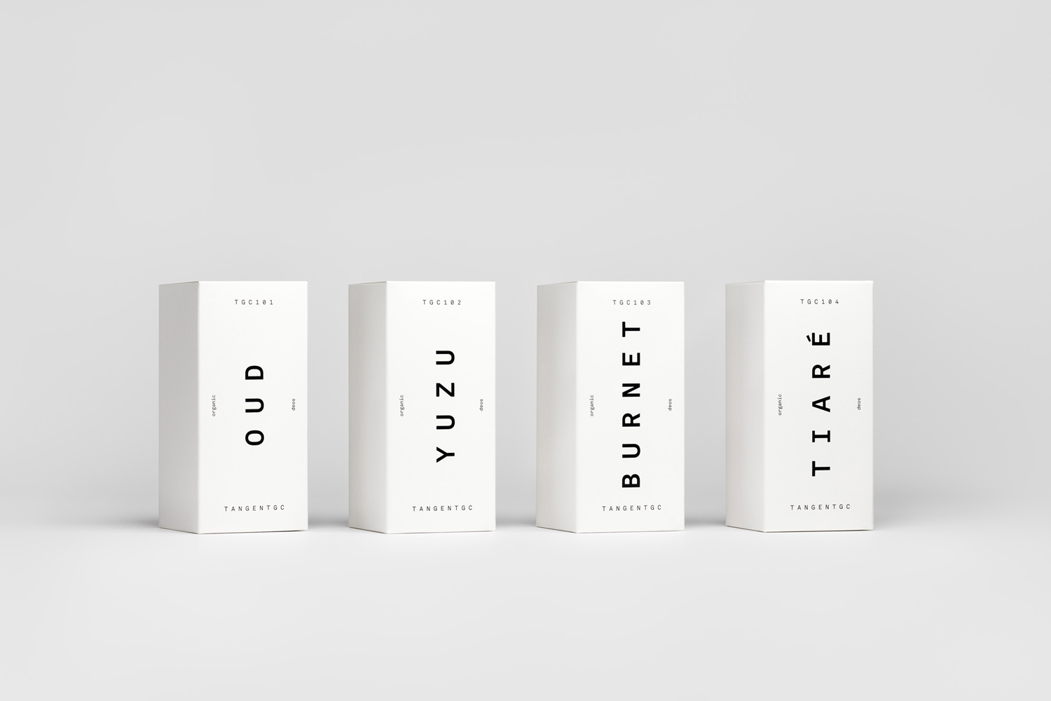
Tangent GC Soap by Carl Nas Associates, United Kingdom
Corps Reviver by Spin, United Kingdom
Institute by Commission Studio, United Kingdom
