The Best of BP&O — Graphic Identities of 2017
Opinion by Richard Baird Posted 20 December 2017

2017 was a fantastic year for graphic identity design. Highlights included Bedow’s work for Swedish photographer Gustav Almestål, Mast’s graphic identity for Colorado Springs coffee shop Loyal Coffee, and Fabio Ongarato Design’s work for Melbourne-based Japanese restaurant Kisumé. There were, however, five projects that stood out, and have made it into BP&O’s Best Of Series. These typically balance a strong strategy and interesting concept with a compelling aesthetic and communicative intention that, between them, appropriately play with photography, colour, texture, layout, form, type and print finish. These are BP&O’s favourites, and are presented in no particular order.
Graphic Identity Shortlist 2017
Superkül by Blok, Canada
Mere by Bibliothèque, United Kingdom
In Search Of The Present at EMMA by Werklig, Finland
Disrepute by Two Times Elliott, United Kingdom
Fabric of Onehunga by Richards Partners, New Zealand
Galerija Kranjčar by Bunch, United Kingdom
Gustav Almestål by Bedow, Sweden
Loyal Coffee by Mast, United States
Edition by South, New Zealand
Campus by MultiAdaptor, United Kingdom
Kisumé by Fabio Ongarato Design, Australia
George + Powlett by Studio Brave, Australia
Paulig Kulma by Bond, Finland
H+J by Spy, United Kingdom


Galerija Kranjčar by Bunch
Galerija Kranjčar is an art gallery, located at the heart of Zagreb, that opened in 2006 to showcase the work of Croatian contemporary artists and function as hub for a variety of cultural activities. The gallery is a long and unique space, one that balances the modern and historic. This can be seen in the meeting of smooth white walls, concrete floor and pillars alongside exposed room-length solid wood beams. Legacy, space and a diversity of artwork is reflected within the gallery’s graphic identity, designed by Bunch, in the choice of type, which links stationery, business cards, print communication, brochures, tote bags and soon to launch website, and in the use of colour, paper choice and print finish.
In Short – The bookending of time, the referencing of past and present, is a recurring visual sentiment in graphic identity design. Finding unique ways to touch upon this, and tie it openly to a genuine experience, can balance a welcoming intelligibility with a visual distinctiveness. Here, Bunch manage to legitimise the retrospective and carved qualities of Albertus, an unusual and surprising choice, by drawing on the unique exposed wood beamed detail of a contemporary art gallery. A bright spot colour introduces a striking and modern counterpoint to type while a framing device, another trope of gallery identities, is given a twist in its blind embossing, a neat and material way to unify a variety of printed assets without compromising or detracting from their graphic qualities.
See more of this project here

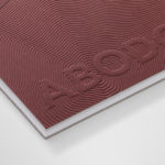
Disrepute by Two Times Elliott
Disrepute is a members-only bar, located in London’s Soho, described by Two Times Elliott, the design studio behind its graphic identity, as having a heritage of “establishment and scandal”. The bar features a rich interior design of high quality material detail that elegantly plays with shape, pattern and symmetry, solid colour and texture, the geometric and the organic. There is an element of period theatricality, yet a contemporary eye for unique character, comfort and visual and thematic continuity throughout.
Two Times Elliott’s approach takes these qualities and focuses them into a quieter but distinct expression that favours commonality with interior and, taking inspiration from Soho’s “most notorious eras of concealed communications and discrete symbols”, layers this with a narrative component that calls to light the loves, intimacy and people of the venue’s past, alongside a historical notoriety, one of secrecy, seduction and the clandestine.
In Short – The suggestion of an interesting story, tied to the history of the building, expressed through layout, image and words, brings a conceptual depth and intrigue to a visual simplicity. There is a sense of period continuity between interior and the materiality and colours employed by graphic identity, yet the choice of just a few small details, rather than sharing a similar abundance, allows identity to punctuate interior and create a momentary pause.
See more of this project here

Mere by Bibliothèque
Mere is a modern two-storey restaurant and bar, located in London’s Fitzrovia, developed by chef Monica Galetti and sommelier David Galetti, working in collaboration with Westbury Street Holdings.
The restaurant has a menu of simple dishes made from seasonal produce using classic techniques, and influenced by the French and South Pacific heritage of David and Monica, respectively. It also features a warm interior of rich material detail and pattern, created by Softroom.
Mere’s brand identity, developed by Bibliothèque, brings these interior details together and draws a sense of refinement, craft and character from the intersection of materials and the use of unusual typographic form across menus, receipt holders, business cards, cloakroom tags and signage.
In Short – Mere, at its heart, is an exploration of cultural intersections, the European and South Pacific heritages of its two founders. This is expressed through the inlaying and union of different of materials and the use of pattern—hand painted and precise—to connect the space with printed assets and form a satisfying and evident connection between culinary and design craft in the production of menus.
See more of this project here

Superkül by Blok
Superkül is an Canadian architectural firm with a portfolio that is described as having an understated boldness, subtlety and spacial richness, and a process that intends to find the essence of each project and remain true to this throughout design and development. Superkül has won many awards and is considered one of Canada’s most progressive architecture firms.
To celebrate their first ten years Superkül worked with Blok on a book that would both serve as a collection of work but also as a reflection of the firm’s unique philosophy and design approach. This was an exercise in discovery and a clarity of positioning which was then expressed materially through subtle paper transitions, finishes and printing techniques. This can be seen here.
Blok follows this up with the launch of Superkül’s new brand identity next week. Where book, in its comprehensive yet singular form could be seen as the strategic component of branding, one that clarified approach and direction, visual identity is the distillation and expression of this across of variety of new assets. These included wordmark, business cards, notebooks, packaging, stationery and website.
In Short – Blok’s graphic identity work for Superkul stands out for two reasons. Its strategic foundations, built on a book also designed by Blok that functioned as a collection of work and a tool to articulate the firm’s unique philosophy and design approach. And the way it fully embraces, through abundance, nuance and clarity, the visual language of architecture, some of it channelling an element of construction, in form and in the layering of ink, others playing with themes such as structure, perspective, light and shade.
See more of this project here

In Search Of The Present at EMMA by Werklig
In Search Of The Present is a new series of exhibitions on a 3–4 year cycle held at Helsinki’s Espoo Museum of Modern Art (EMMA). These intend to tackle many of the existential questions that we face in an ever changing world. The first exhibition, inspired by Olavi Paavolainen’s essay collection from 1929, took place between October ’16 – January ’17 and was a study in the representations and expressions of human identity in the digitalized world.
Drawing on the themes of change and the passage of time, Finnish graphic design studio Werklig developed a brand identity connected by a sense of movement, implied in the cropping of text across posters, books, and supergraphics, physically in the motion of outdoor campaign posters, and digitally in the scrolling of social media content.
In Short – Its expression of time, and the continuity between and sensitivity to different contexts, print and digital, balances an intelligible and accessible concept with a visual impact. There are some neat ideas at play, particular within the context of social media platforms, but also in the rigging of scrolling posters to keep them from pausing.
See more of this project here