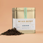
No. Six Depot by Perky Bros
“No. Six Depot is a family owned, small-batch coffee roaster and café nested in the beautiful Berkshires. Located in a historic train station on 6 Depot St, they serve teas, salts and coffee from small farms and roast on location. Their identity [designed by Perky Bros] juxtaposes a mix of unique rural and modern elements — drawing inspiration from their own backyard railroad...
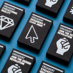
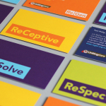
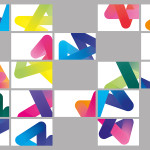
Creagent by Bond
Creagent is a Finnish ‘design broker’ that provides a “unique pool of talented designers from all fields and a wide range of expertise to match various business needs.” Creagent’s new brand identity and website, developed by multidisciplinary design studio Bond – currently on a roll with new work for Allsorts and the University of the Arts Helsinki – utilises a bold, brightly coloured set of pictograms and...

Weekend by RoAndCo
Inspired by ‘cartoonish film titles from the 1980’s’, design agency RoAndCo recently developed the brand identity for Dallas coffee shop Weekend, an extension of their retail store “which has become a relaxing everyday haunt for vacationers”. Based around a tightly spaced Cooper Black logotype, a “minimal and refined typographic system” and a striking but restrained red and white colour palette, Ro&Co created a solution...
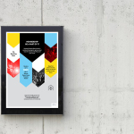
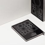
Insiders by Garbett
Insiders is the membership program of Sydney Opera House launched to nurture customer loyalty, increase market share and raise the frequency of attendance through priority booking, discounts, dress rehearsal ‘sneak peeks’ and invitations to meet staff and artists. Multidisciplinary design agency Garbett were commissioned to ‘evolve’ the Insiders visual identity, positioning it as a retail product with greater focus on communicating the value proposition for members,...

Popchips by Marx
Popchips is a four flavour range of potato chips from Ping which have been popped—much like popcorn—rather than backed or fried to create a healthier snack. New Zealand-based Marx Design were responsible for developing a new mascot for Ping that could work across multiple products in the snack food category and a packaging solution for the Popchips brand that would “avoid the clichés...
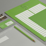
Treadwell by Perky Bros
Treadwell is a Kansas-based floor installation business that specialise in no-nonsense solutions that last. Perky Bros, the agency behind their name, visual identity and website, describe Treadwell’s philosophy as about ‘standing upright, walking the walk and empowering clients to move forward with confidence, secure in the knowledge that they’ve chosen the right product and the right people for the job’. The...
Storyline Studios by Work In Progress
As well as providing space, Storyline, Norway’s largest film studio, offers a wide range of services which include, but are not limited to, set building, lighting, VFX, audio and video post production as well as costume and equipment rental. Developed by Work In Progress, Storyline’s visual identity brings together the classic flourish of a script, the humanist qualities of hand drawn detail, a sense...

Crabapple Kitchen by Swear Words
Located on Hawthorn’s Glenferrie Road, Victoria, Crabapple Kitchen is a ‘high-end café/wine bar’ with an ever-changing menu of simple, rustic and seasonal Italian, French and Spanish cuisine created from local produce and served in a ‘homely and light-hearted environment’ – derived from the French and Italian countryside – made up of ‘beautiful fabrics, French pantries, hanging copper pots, comfy banquettes and...
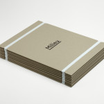
Milieu Property by Studio Hi Ho
According to Studio Hi Ho, the branding and communications partnership responsible for this project, Milieu Property is a Melbourne-based ‘boutique developer with an emphasis on creating spaces of influence’. The moniker ‘Milieu’ immediately positions the brand at the cerebral end of the property development spectrum. Indeed, for those without a thesaurus brain, the highfalutin’ vocabulary is even explained on the minimal...
ReGen by Studio Brave
ReGen, formerly known as Uniting Care Moreland Hall, is a not-for-profit drug and alcohol treatment and education agency established in 1970 for the Victoria and Tasmanian regions of Australia. Following the recent name change Studio Brave developed a new visual identity that would better reflect the ReGen’s evidence based practices and the positive, practical outcomes it achieves, through a combination of...

Plow by Perky Bros
Plow is a Tennessee based customer acquisition service and telecom/energy contractor for the large to mid-size business sector. Their identity, created by multidisciplinary design agency Perky Bros, neatly communicates the experience, professionalism and advisory nature of Plow’s service, the commodities they manage and their renewable energy options through a logo-type built from a stencil cut serif typeface and apostrophe detail set...

Nuts.com by Pentagram
Originally established in 1929 as the Newark Nut Company, Nuts.com is a family owned on-line retailer of nuts, dried fruit, snacks, chocolate, tea and coffee. Following a recent url change, international design agency Pentagram, lead by partner Michael Bierut, created a new visual identity and packaging solution ‘that would help establish Nuts.com as a distinctive brand’. Based around a bright and distinctive colour palette,...
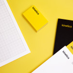
Kinetica by Face
Kinetica is an international industrial design studio located in Santa Catarina, Mexico, that specialises in non-standard architectural projects. Their new visual identity, created by ‘supermodernist’ design agency Face, utilises a bold black and yellow colour palette, a straightforward sans-serif logo-type, plenty of space and a grid based collateral layout to establish a restrained and contemporary interpretation of heavy industry infused with subtle architectural cues....
Ideo Architekci by For Brands
Polish design studio For Brands (formerly Artentiko) have published images of their latest visual identity project commissioned by Wrocław based architectural studio Ideo Architekci. Based around a modular and dynamic grid based framework, modernistic typeface and a bright industrial colour palette, Artentiko’s solution manages to capture the fundamental aspect of architectural planning and a consistent but expansive approach....

Etxe by Blok
“Etxe is a small, innovative industrial design studio based in Mexico City. Their philosophy is to design to the very essence of a product. There is no room for extraneous elements; they believe that the beauty and artfulness of a product lies in its purest functionality. The identity itself is thus a distillation of their unique approach.” – Blok...
Architecture PLB by Sea
Architecture PLB is a design-led practice working across both the public and private sectors with offices in Winchester and London. Their new brand identity, designed by communications agency Sea, unites the three dimensional aspect of the architectural world and a sense of sculptural creativity with a gradated ‘A’ logomark and the utility and corporate neutrality of a well-spaced, light grey san serif...

Sellar by Campbell Hay
Sellar Development is a privately owned property investment, development and management business based in London and responsible for such high profile projects as The Shard and London Bridge Place. The company approached brand design agency Campbell Hay to develop an identity that would reflect their ongoing partnerships, collaborative process and involvement with the architectural world....
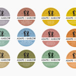
Adams & Harlow by Designers Anonymous
Adams & Harlow is a brand of Lincolnshire made pork pie that has a rich heritage dating back to 1910 and continues to bake on its original premises under the management of the founder’s granddaughters. The brand’s new packaging and identity, created by London based Designers Anonymous draw together the personalities and history that underpin the brand with a quirky but traditional illustrative and typographic...
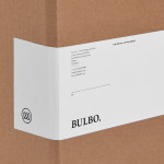
Bulbo by Anagrama
Bulbo is a San Pedro, (MX) based boutique lighting shop that specialises in high-end products and interior planning. The brand approached independent design agency Anagrama to develop a visual identity that would unite the company’s experience of light and space with the contemporary elegance of their products....
Bricos by Anagrama
Bricos, originally named Mayoreo Electrico Monterry, is an electrical hardware store servicing the North East and Monterry regions of Mexico. As part of an expansion plan the company approached design agency Anagrama to create their new identity, packaging propositions and retail environments with the consistency expected from international customers....
The Lollipop Shoppe by Studio Makgill
Established in 2007 The Lollipop Shoppe is a contemporary retailer designer furniture and accessories located in Brighton, UK. With its own range in development and another store set for London they challenged Studio Makgill to develop an identity that could reflect their growing ambitions, convey a straightforward business nature and unify the shop’s modern and classic product ranges....
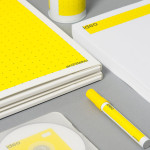
Windmade
Windmade is a new not-for-profit organisation launched by Vestas Wind Systems to brand products that have been made using energy sourced from wind farms on the back of a survey of 25,000 consumers and has already garnered support from companies such as Lego, WWF and PWc. Although the standards have yet to be defined they have released the visual identity...
Škoda
Škoda is a Czech car manufacturer established in 1859 which started producing bikes, motorcycles and then automobiles at the start of the 20th century. In 1990 they were purchased by the Volkswagen Group and saw significant growth of 51% in 2010 compared to the previous year. As of March 2011 they will introduce a new identity to better represent their more ecological, innovative and aspirational...
Monsoon by Pompei A.D.
Monsoon is a women and children’s clothing retailer based in the UK which began trading in 1972 and delivered a pre-tax profit of £32.96 million in 2010. They also own the retailer Accessorize and have a combined 425 stores in the UK and over 1000 worldwide. In December 2010 they started rolling out a logo and visual identity system across their stores...