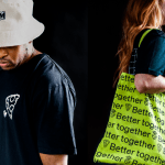
Mr Yum by Re Design
Sometimes a project comes along that doesn’t just make you think about how nice its typography is, or ponder if millennial pink is making a comeback (or indeed,, if it ever went away), or why suddenly a branded bucket hat seems to be a key facet of any company/product/concept’s ‘swag’. Sometimes, it makes you think about what ‘branding’ even means,...
Logo
Instacart by Wolff Olins, 2022
The guidelines designed by Wolff Olins define the Instacart logo in terms of symbolism. Arrows symbolising ease of adding items to cart and carrot root representing enjoyment and nourishment. And execution in terms of impression. Clean, straight lines convey efficiency and soft curves evoke enjoyment of food. This is all well and good in a client presentation, but is it...
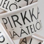
Pirkkalan by Werklig
It’s been years since millennials were first accused of buying too many avocado toasts and expensive coffees. The stereotype of young people loving handmade, refined and artisanal products holds true in their spending patterns, and today, that generation has matured into business leaders, reshaping the world’s mindset to align with these priorities. As consumers, Gen Z seem to be picking...
Chilli Bomba by New Genre
Based in what’s been optimistically named London’s ‘Design District’, New Genre is a pretty youthful studio that’s racked up an impressively broad range of projects and clients in its short life. Just shy of two years old, the studio has thus far worked across fintech, a non-profit art organisation, a pub, a beauty brand, and a campaign for Jamie Oliver...
Upgrade to
BP&O Plus
Read more
Omlet by Ragged Edge
We’re undeniably in an age of pet care 2.0: the post-fur-baby era, where people are finally beginning to see their animals’ needs and wants as independent to their own (i.e. dried pigs ears over vegan dog treats, eschewing leads for cats, and so on). These shifts in how we think about what it means to have and look after animals...
Kettle Kids by Two Times Elliott
The once laudable claim to have started a thriving business with ‘a small loan’ from a doting family member may have been muddied beyond recognition by the truth-stretching of serial tax-offender and part-time Presidential candidate Donald Trump. Despite this, turning ‘one thousand pounds from nan’ into a luxury watch and diamond dealership with a sparkling flagship store in Mayfair remains...

BP&O Voices
Rich Baird on Design History:
Canadian National Railway by Allan Fleming, 1960
The story of Allan Fleming’s 1960 logo for Canadian National Railway....
Logo
Honda EV by In house, 2024
Honda’s iconic ‘H mark’ has undergone a transformation to symbolise the brand’s commitment to next-generation electric vehicles. The redesigned logo, to be used alongside its current logo, is said to resemble outstretched hands. This intends to signify Honda’s unwavering determination to ‘transcend its origins’, ’embrace challenges’ and ‘advance mobility possibilities’. That’s all well and good, but will it look cool...
Logo
Bookish by Mucho, 2024
Putting two motifs together is as old as logo design itself. It certainly increases the chance of hitting on something distinctive, relying on pairings rather than singular images or abstract geometric forms. It also doubles the meaning which aids memorability. However, finding a natural synergy between two motifs, whilst sustaining legibility requires care. Mucho’s marque for Bookish lands on love,...
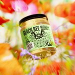
Black Bee Honey by OMSE
It was yesterday I made a run to the local supermarket to pick up some essentials. I had two choices, turn left to Waitrose or right to Morrisons. Despite being somewhat price conscious, I enjoy looking at the packaging at the higher-priced Waitrose, so went left–let’s say it’s the cost of being a designer. Anyway, honey was on the list....
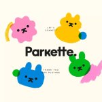
Parkette by Kinoto
Cute, bright, and striking; there’s very little not to love about this identity for Parkette. Based in Hamilton, Canada, Parkette is billed as a boutique shop ‘dedicated to kids and the kids at heart’, selling crafts kits, clothes, accessories, books, homeware, toys, and ‘other treasures’. The name is taken from a term many locals in Hamilton use to describe a...