Sans-serif Logotypes
Barnardo’s by The Clearing
Barnardo’s is the UK’s largest children’s charity, and it undoubtedly does much good in the world. However, its history up to this point is also littered with uncomfortable controversies. Certainly, the most outlandish transgressions are concentrated in the late-19th and early-20th centuries. Founder Thomas John Barnardo was taken to court 88 times for kidnapping children (or ‘philanthropic abductions’, as old...
Qasa by Bold
Now that the likes of ed-tech (education technology) and fin-tech (financial technology) have become a natural part of everyday parlance, it was surely only a matter of time before prop-tech (property technology) entered the equation, too. Proptech largely refers to platforms and services that use tech to help people buy, sell, research, market, and manage a property – ranging from...
Crumbl by Turner Duckworth
While we speak the same language, the cultural differences between us here in the UK and our pals in the US can feel vast. There’s pavement vs sidewalk, fringe vs bangs, ‘flavour’ vs ‘flavor’. There’s also biscuit and cookie – though where we draw the line between the two is another debate for another time. And seemingly at the forefront...
De-Extinction by Koto
Koto’s new work is undoubtedly gorgeous – after all, what’s not to love about a suite of very cute dinosaurs? Especially when they’re rendered in a charming faux naif sort of style, and the whole colour palette is based around Barney & Friends purpley pink and the effervescently Gen Z-baiting neon of ‘terminal green’. The project in question is Koto’s...

Black Bee Honey by OMSE
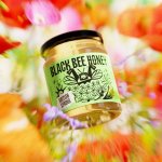
It was yesterday I made a run to the local supermarket to pick up some essentials. I had two choices, turn left to Waitrose or right to Morrisons. Despite being somewhat price conscious, I enjoy looking at the packaging at the higher-priced Waitrose, so went left–let’s say it’s the cost of being a designer. Anyway, honey was on the list....

Casa Malka by Nihilo
Branding agency Nihilo is more adept than most at shattering stereotypes – both in the work they make, and in terms of who the agency is, and what it’s all about. Founded by designer Emunah Winer and writer Margaret Kerr-Jarrett in Israel in 2021 and now based in Columbus, Ohio, the agency takes its name from the Latin term ‘creatio...
Beams by Only Studio
The Beams is ‘an expansive new venue and event space on the Royal Docks in the heart of East London’ (that’s as long as you prefer your cartography loosely impressionist). Manchester-based Only Studio was tasked with branding the former Tate & Lyle sugar factory. The award-winning agency has previous form in the field of London industrial-eyesores-turned-cultural-juggernauts: it was also responsible...
Philharmonie Luxembourg by NB Studio
It is fair to say that rebrands of music organisations, of which there have been a number in the past few years, have benefitted from the recent explosion of graphic design into the world of sound and motion. Music has always inspired other forms of art, but these new digital tools are uniquely suited for producing design solutions for these...
GUT by &Walsh
Guts aren’t exactly glamorous. And the connotations of the word ‘gut’ are multifarious: there’s the gory (‘blood and guts’); the Germanic ‘good’; the straightforwardly corporeal; or for those with an interest in newer psychological findings, it’s a wondrous ‘second brain’. Ad agency folk, however, have long taken the word ‘guts’ far outside of the bodily. For many of them, ‘guts’...

Miles by Buddy Buddy
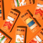
Deodorant isn’t traditionally a hotbed of innovation: for the most part, ‘women’s’ products don an unremarkable raft of white packaging (freshness!); blue, pragmatic type; and vague, rarely-kept promises about lasting for 72-hours. For the men, packs are sombre shades of black, dark blue, or grey (manly!) and just as drearily practical as the women’s. Deodorant, for the most part, has...
Curve Club by Wildish & Co.
For a type-nerd (hello!) there are few things more seductive than a beautiful, beguiling letterform. But what makes such shapes even more siren-like is when they leap off the page and come to life, not just in motion, digitally; but in a physical environment. The branding for new private members club Curve Club, then, certainly ticks a lot of boxes...
Mill by Manual
There’s a lot to be said for the Instagram-worthiness of, say, a faux-futuristic beauty brand identity that’s all gloopy, metallic, kinetic typography, ‘terminal green’, and unabashedly Gen Z-baiting ‘y2k’ art direction. It’s easy to assume that projects that allow designers the creative freedom for unabashed experimentation – playing fast and loose with legibility and lofty conceptual thinking – are the...