Ridley by RE:
Ridley is a pioneer of digital architectural services and operates as a central hub from which builders, developers and architects can collaborate. Originally established, and continuing to operate as an architectural documentation specialist, Ridley, from its premises in Australia and the Philippines, has also grown to become a leader in Virtual Design Construction. This is a practice that involves attaching live...
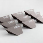
Mitsuori Architects by Hunt &Co.
Mitsuori Architects is an architectural design studio that creates high quality structures and spaces that merge aesthetic beauty with careful planning and thoughtful detailing. Their large scale project experience is combined with the flexibility of a smaller practice allowing them to provide big clients with a personalised service. Mitsuori’s visual identity, designed by Melbourne based Hunt & Co. and informed by a name that translates from Japanese as...
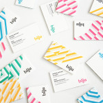
Biju Bubble Tea by ico
Biju is bubble tea brand and cafe located in London’s Soho district that looked to bring and translate a product and experience well-established in South East Asia to the UK in a way that would appeal to a modern discerning market. This was achieved by focusing on fresh, natural and high quality ingredients, a simple menu with an emphasis on taste, a focus on the social aspects...
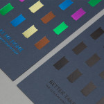
Folk by IYA Studio
Folk is a British contemporary menswear, womenswear and footwear brand, founded in 2001, with stores across London, one in Amsterdam and collections that are stocked internationally. Folk describes its pieces as simple everyday wear with subtle, innovative and playful detailing with a focus on custom fabrics and unique trims. These values are reflected throughout its brand identity, created by IYA Studio over the...
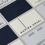
Aspira Urval by BVD
Aspira Urval is a banking, finance and insurance recruitment specialist with offices in the Swedish city of Stockholm. Its new brand identity, designed by BVD, draws its inspiration from the name and the themes of ‘elevated ambitions’ and ‘reaching new heights’. These are visualised as a generously spaced, uppercase, sans-serif logotype with an adaptive ascender that changes depending on its context. It is...
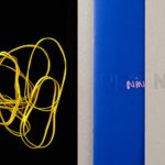
Neometro & Nine Smith Street by Studio Hi Ho
Nine Smith Street is the latest residential property project from Neometro, a company that describes itself as having a reputation as Melbourne’s most design-focused development group and recognised as one of the first holistic design and construction businesses in Australia. Neometro are dedicated to creating architectural buildings that are beautiful, functional and timeless, and have a sense of place and belonging. Neometro’s brand...
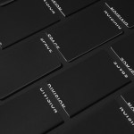
Space Division by Inhouse
Space Division is an architectural studio established in 2010 with an office in Auckland, New Zealand. It looks to contribute to and positively impact on the lives and environments of its clients and the communities it serves by producing simple and succinct spaces. The studio describe their projects as being inclusive and client-focused with physical constraints, budgets, time frames and compliance being...
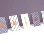
Violeta by Anagrama
Violeta is described by Anagrama, the design studio behind its new brand identity and packaging treatment, as an Argentinian bakery, named after its founder, that creates hand-crafted breads, cakes and pastries from its location in the Buenos Aires district of Las Lomas de San Isidro. Following more than 30 years of business and in lieu of a plan to begin...
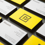
Ritualize by Shorthand
Ritualize is a cross-platform fitness and lifestyle app that utilises leaderboards, education, challenges and exercises to establish and track small habits that should lead to improved physical and mental health, and a sense of well-being over time. Shorthand, an independent brand identity and graphic design studio based in Newcastle, Australia, were recently commissioned to help bring the app to market. This included naming,...
Making: by Garbett
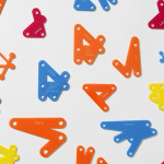
Making: is the Australian Institute of Architects’ 2014 conference. Working in collaboration with creative directors Sam Crawford, Adam Haddow and Helen Norrie, Sydney based design studio Garbett developed a brand identity for the conference, which included logo, lanyard, merchandise and print design, that explores the role of the architect as maker of environments and connections that extend beyond the bounds of traditional practise. This was expressed...
Buena C by Tres Tipos Gráficos
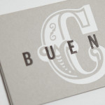
Buena C is an event planning agency, founded by Carolina Arjones, with offices in Madrid and Alicante. The agency provides both individuals and businesses with exclusive, individualised and detail orientated event consultation and organisation services that include, but are not limited to, sourcing locations, photographers, catering, stationery, transportation and accommodation for presentations, conventions and weddings. Alongside event planning the agency...
Waffee by A Friend Of Mine
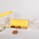
Waffee is an authentic Belgian waffle and coffee chain with locations across Melbourne and Altona. Developed by holistic design practice A Friend Of Mine, Waffee’s brand identity, which included logo and packaging design, menu boards and a signage system created in collaboration with architects Hecker Guthrie and Foolscap Studio, mixes a typographically adventurous logotype with an illustrated character to establish a rich communicative duality and contrast...