
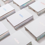
Waffee by A Friend Of Mine
Waffee is an authentic Belgian waffle and coffee chain with locations across Melbourne and Altona. Developed by holistic design practice A Friend Of Mine, Waffee’s brand identity, which included logo and packaging design, menu boards and a signage system created in collaboration with architects Hecker Guthrie and Foolscap Studio, mixes a typographically adventurous logotype with an illustrated character to establish a rich communicative duality and contrast...
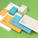
Dosatres by Comite Studio
Dosatres is a Spanish company that connects and manages a wide network of creative and strategic business centres that help brands to discover the best way to grow and communicate. Created by design studio Comite and based around the name ‘two to three’ — informed by the company’s ability to broaden communicative opportunities and paths to growth, and the concept of moving from two to three-dimensional...

Kid O by Studio Lin
Kid O is a modern American toy company that creates products that engage and stimulate children through a rich variety of shapes, colours, and sizes. Designed by Studio Lin, Kid O’s new packaging treatment — which included over 50 boxes — takes the vivid colours of the industry, reduces these down to four, contains them within geometric boundaries and pairs...
The Confidante by RE:
The Confidante is a group of CEOs who draw on their extensive networks to provide business leaders with tailored executive coaching and mentoring services. Designed by Re: Sydney, The Confidante’s new brand identity effectively visualises the confidential and discretionary nature of their work and the executive level of their service through a simple negative space keyhole logo that has been given...
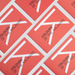
Colours Of The Kalahari by Believe In
Believe In recently published images of their print and brand identity work created for the Mall Galleries’ exhibition Colours Of The Kalahari, the first major display and sale of southern African Bushman art ever to be held in London. The exhibition represents the latest generation of contemporary San artists from an unbroken line that stretches back 20,000 years, and includes 150...
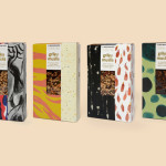
The Beginnings by Asketic
The Beginnings is a Latvian raw food and ingredients business creating and sourcing a variety of mueslis, jams, honeys and spices from around the world. Developed by multi-disciplinary design firm Asketic, The Beginning’s brand identity and packaging treatment goes all in for handcraft and contrast, mixing a variety of patterns and images informed by the origins of each ingredient to establish an ever changing and...
Lorient — Aura by Believe In
Aura is a new range of high end products from door sealing system manufacturer and specialist Lorient. These include drop seals, perimeter seals, door bottom seals, threshold plates and ramps designed with a distinctive curved profile that is described by Lorient as creating a sophisticated visual aesthetic that also spreads and diffuses sound. Design studio Believe In recently worked with Lorient to develop a brand identity for...
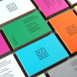
KVGD by Kerr Vernon
KVGD is a Glasgow based graphic design studio run by Kerr Vernon that works within the fields of brand identity design and print, has a ‘be nice, do good work’ philosophy, and a reputation for producing engaging, thoughtful and crafted projects. The studio’s client base is diverse, local and national, and includes businesses such as gallery, event and creative workspace The Whisky Bond,...
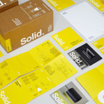
Terence Woodgate by Charlie Smith Design
Terence Woodgate is a lighting design and manufacturing business, founded by industrial designer Terence Woodgate in 2014, that looks to “fully optimise the benefits of LED technology”. Charlie Smith Design recently worked with Terence Woodgate to develop a visual identity for the business and modular packaging treatment for its first line of products as well as manuals, fitting instructions and website....
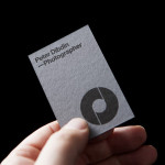
Peter Dibdin by O Street
Peter Dibdin is a photographer who brings creativity, technical knowledge, professionalism and a personal approach to both studio and location shoots for clients working within the commercial, private, arts and editorial sectors. Following a recent move to a studio in Edinburgh’s creative hub of Summerhall, Peter commissioned long-term collaborator O Street to refresh his brand identity in a way that would reflect his...

Eika by Mission
In response to the financial crash the Terra-Gruppen, a Norwegian financial group owned by and in alliance with 80 local banks, looked to take positive steps to reaffirm its commitment to local customers and the continued contribution it makes to the growth and development of the communities it serves. This came in the form of a rebranding exercise that led to the name Eika and...
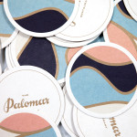
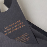
The Palomar Restaurant by Here
The Palomar Restaurant is located at the heart of London’s Soho district with a menu that is described as being reflective of the foods of modern-day Jerusalem and influenced by the cultures of Southern Spain, North Africa and the Levant. Its interior features a zinc kitchen bar, mosaic marble and reclaimed parquet floors, marble surfaces, oak panelled walls, a skylight providing natural light and royal blue...