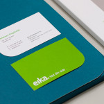
Eika by Mission
In response to the financial crash the Terra-Gruppen, a Norwegian financial group owned by and in alliance with 80 local banks, looked to take positive steps to reaffirm its commitment to local customers and the continued contribution it makes to the growth and development of the communities it serves. This came in the form of a rebranding exercise that led to the name Eika and...
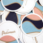
The Palomar Restaurant by Here
The Palomar Restaurant is located at the heart of London’s Soho district with a menu that is described as being reflective of the foods of modern-day Jerusalem and influenced by the cultures of Southern Spain, North Africa and the Levant. Its interior features a zinc kitchen bar, mosaic marble and reclaimed parquet floors, marble surfaces, oak panelled walls, a skylight providing natural light and royal blue...

Iona Brown by Sam Flaherty
Iona Brown is a London based contemporary jewellery designer who favours classic simplicity, understated detail, precise finishes and minimalist lines, shapes and materials. Graphic designer and art director Sam Flaherty recently worked with Iona to develop a new visual identity for her expanding collection. Built around a customised logotype and a simple print and packaging treatment that uses few but good quality and contrasting...
Persillade by Clear Design
Persillade is a Melbourne cafe opposite Jolimont Station with a large double shop front and an interior of reclaimed wood and bottles, white tiles, steel, glass and classic furniture. Design studio Clear were commissioned by owners Aidan and Tanya Raftery to develop a graphic identity for the cafe that would bring some “much needed soul, texture and community to the very private...
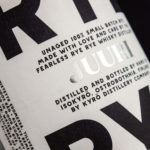
Kyrö Distillery Company by Werklig
Kyrö is a Finnish distillery, housed in a former dairy in the region of Isokyrö, that will yield a high quality 100% rye whisky in 2017 for national and international markets and currently batch produces a root variety for cocktails. Design studio Werklig was hired by the distillery to create their brand identity, which went on to include a logotype and custom typeface,...
G . F Smith by Made Thought
G . F Smith is an independent British paper merchant with a heritage dating back to 1885 and a loyal staff, some of whom have provided over 20 years of loyal service. Made Thought, the design studio behind the visual identity for G . F Smith’s distinctive Colorplan range, were recently commissioned to develop a new brand identity for the company that would better...
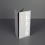
Collective Gallery by Graphical House
Collective is a contemporary visual arts organisation founded in 1984 to help new and emerging artists exhibit their work in Scotland’s capital city Edinburgh. The organisation delivers a diverse programme of new exhibitions and commissions, and is described as being “fundamental to the cultural vitality of the country”. Following a move to The City Observatory, Glasgow based design studio Graphical House worked with...
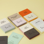
Molly Watson by Studio Blackburn
Molly Watson aids business leaders in the development and deployment of communication strategies that ‘accelerate and enrich the delivery of their goals’. Molly recently commissioned London-based design agency Studio Blackburn to help articulate this business proposition and to stand out through the creation of a new brand identity that included a logotype, yet-to-launch website, stationery, business cards, templates and CV...
Bølgeblikk Arkitekter by Tank
In response to a change in leadership and the acquisition of new staff, Norwegian architectural firm Ottar commissioned Tromsø and Oslo-based design studio Tank to develop a new name and brand identity—which would go on to include a logo, stationery set and responsive website—that would better reflect the quality, professionalism and scale of the firm’s work within the health and education sector, whilst...
Fazer Café by Kokoro & Moi
Established in 1891 by Karl and Berta Fazer and located in Helsinki district of Kluuvikatu, Fazer began life as a French-Russian conditory that has grown to become one of Finland’s largest food companies, working within the bakery, confectionery, and work-place restaurant sectors. Summer 2013 saw the return of Fazer’s café chain to Helsinki with locations in the centre of the city and in the...
Cerovski by Bunch
Cerovski is a young Croatian print production studio that revels in the challenge of “nebulous finishing, microscopic editions, absurd materials and crazy deadlines”. Bunch worked with Cerovski to develop a new brand identity for the studio—which included a custom logotype and typeface, website, and a variety of printed collateral—that delivers a distinctive contrast of utility and creative flourish, technology and individualised service...
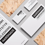
Hardhaus by Heydays
Hardhaus is a Norwegian specialist mountain sports retailer located in the alpine municipality of Sykkylven. Based around the concept of ‘technical durability’, Heydays developed a new brand identity solution for Hardhaus—which included a logo, stationery and website—that juxtaposes the utility of a heavy uppercase and stencil cut sans-serif—bold and ‘oversized’ in its execution in print—and the robust and hardy aesthetic of chipboard imagery, with...